User Testing How-To Links

Links for guides on usability testing – for HCD documentation

Treejack – online tree testing software

Know where and why people get lost in your content.

Take the guesswork out of information architecture with Treejack – the usability testing tool you can use to test your IA without visual distractions. Treejack helps you prove your site structure will work before you get into interface design.

Tree testing is a usability technique for evaluating the findability of topics in a website. It’s also known as ‘reverse card sorting’ or ‘card-based classification’. Tree testing is done on a simplified text version of your site structure – without the influence of navigation aids and visual design.

source

The Power of Minimalism: A Story of Redesigning Yelp

Excellent article – highly recommended.

Design by committee is death by a thousand cuts.

It kills slowly, as more and more people weigh in with their opinions, until the “revised” design looks like a stew of lesser parts. It certainly doesn’t need to be that way, especially for large companies like Yelp.

We chose to redesign their site to show how usability testing done properly can unleash the power of just one. Based on our experience as designers at different companies, we found usability testing to be the best defense for design decisions.

When in doubt, let the user stand between you and overbearing stakeholders and the evidence will speak for itself.

redesigning-yelp-jc-repainted


source

How to give useful design feedback – for clients

DO point out and go into as much detail as possible as to why you feel something is not working. More than anything, your reasoning is critical to solving the problem.

DO tell us why we’re wrong about certain design and development decisions we’ve made. Part of the process is finding those holes.

DON’T mock up designs or alterations to our designs or code in photoshop, word, or any other program. Doing so is counter productive because we then must reverse engineer the whole thing to find out what you were trying to solve. This results in lost time, and budget.

source

Ideo Human Centered Design Toolkit

Primarily focused on low-income communities in developing nations but some general-use themes. Example:

BEST PRACTICES FOR INNOVATION

MULTI-DISCIPLINARY TEAMS

The challenges you face are very complex and are likely to have been explored by predecessors. You will have a higher likelihood of success at solving such complex, difficult, and already-examined problems by intentionally assembling the right team of people. This team will work best if it consists of a core group of 3-8 individuals, one of whom is the facilitator. By mixing different disciplinary and educational backgrounds, you will have a better chance of coming up with unexpected solutions when these people approach problems from different points of view.

DEDICATED SPACES

having a separate project space allows the team to be constantly inspired by imagery from the field, immersed in their post-it notes, and able to track the progress of the project. If possible, find a dedicated space for your design team to focus on the challenge.

FINITE TIMEFRAMES

Many people notice that they work best with deadlines and concrete timelines. Likewise, an innovation project with a beginning, middle, and end is more likely to keep the team motivated and focused on moving forward.

source (pdf)

Principles of Mobile Site Design

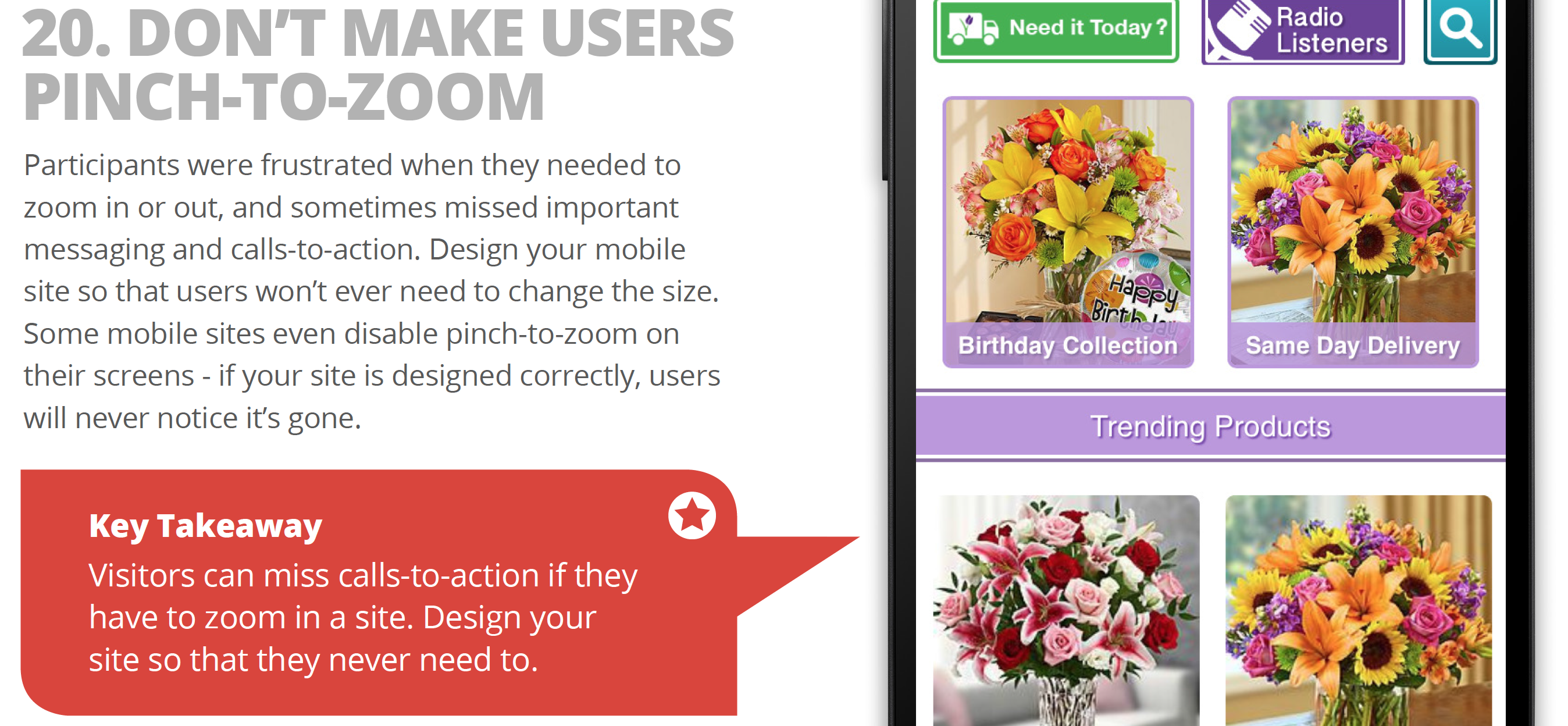
Principles of Mobile Site Design: Delight Users and Drive Conversions (link goes to pdf of study, source button goes to summary)

Google and AnswerLab undertook an intensive research study examining how a range of users interacted with a diverse set of mobile sites. The goal, to answer the question: what makes a good mobile site?

google-mobile-pinch-zoom


source

Survey Priming & Timing: Small Changes Can Have a Big Impact on Bias

SurveyMonkey blog post on survey timing, question order, goals and priming (“occurs when a person is exposed to a stimulus, and it influences how they respond to another stimulus. For example, if you were to see the word “yellow,” you’d be slightly faster than other people (who hadn’t seen that word) to recognize the word “banana.” That’s because people closely associate words like “yellow” and “banana” in their memory.)”

It’s possible you’ve heard this one before: Go hungry to a grocery store and you’re likely to come out with a shopping cart full of everything in the store except the refrigeration cases. Go on a full stomach, and you’re more apt to stick to your grocery list.

Why are we talking about shopping? Well, just as a person’s physical state can influence how they shop, a person’s mental state can influence the way they respond to your survey. Their answers—and your results—might differ dramatically based on priming (psychological effects of question order) and timing (when you send your survey).

source

Are Hollow Icons Really Harder to Recognize Than Solid Icons? A Research Study

CONCLUSION

Johnson’s warning against using hollow icons in user interfaces just isn’t supported by evidence from real users. For one thing, an icon’s style doesn’t exist in isolation, but interacts with other attributes like color to create compounding effects on usability. Furthermore, less than half of the icons in my set of 20 performed better in a solid style than a hollow style. A different set of icons would likely result in a different overall result.

In any case, the small differences in recognition speed that I observed are not likely to cause any lasting fatigue for users. Research has shown that users begin to map the meaning of icons to their positions in the interface, so it’s not like users have to reinterpret each icon during every use. It is also important to consider that a two-style approach may have an accessibility benefit over using color alone to show an icon’s state, since it gives people with color blindness additional visual feedback. Of course, the first image in this article shows that Apple uses a combination of style, color, and labeling to reinforce usability.

My ultimate conclusion is one that most designers probably felt intuitively upon encountering the solid/hollow debate: designing icons to be both semantically clear and visually attractive is a complex exercise that doesn’t lend itself to simple binary rules. In fact, a closer look at Apple’s Human Interface Guidelines, which lay out its recommendations for solid/hollow icon design, acknowledge that some icons simply won’t work well in both styles.

Finally, I hope that this study highlights the importance of using real evidence to back up UI design decisions. Designers of all types need to think critically about best practices and back up their recommendations with solid (pun not intended, but embraced) research.

selection-differences


source