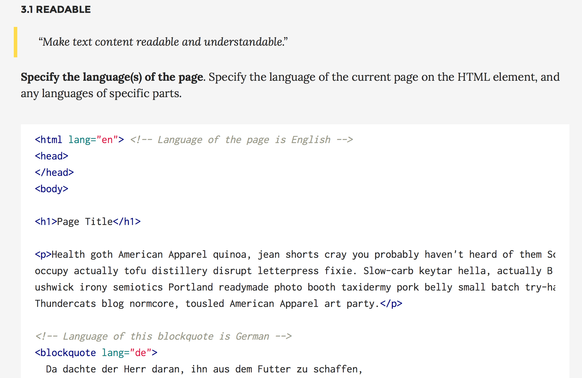
List of accessibility items.
Low-Contrast Text Is Bad for Usability (But You Already Knew That)
Insufficient contrast between the text color and the background degrades the user experience for the following reasons:
- Legibility suffers. When the contrast is too low, users experience eye strain as they try to decipher the words. Research has also shown that people are less trusting of text that is hard to read — a carryover from the age of ‘fine print.’ (More on trustworthiness in our course on Persuasive Web Design.)
- Discoverability and findability are reduced. Users who cannot perceive an element on the page cannot use it. When placed in an unconventional part of the page, a low-contrast element will not stand out when a user scans the page; for example, a gray-on-gray search icon or login link in the upper left instead of the upper right. Keep in mind that testing for discoverability and findability requires more than analytics, because click-through data may tell you what gets few clicks, but it will not reveal why.
- User confidence diminishes. Which would you rather use: a website that makes you feel like everything is working as you expected, or a website that makes you feel like something is wrong with you for not being able to find what you are looking for? In testing, I have observed many users blame themselves when they are unable to accomplish tasks on a modern-looking website, because they cannot see the text or they struggle to read it. When people don’t feel confident on a site, they are more likely to abandon it and go elsewhere.
- Mobile use becomes even more difficult. Imagine trying to read low-contrast text on a mobile device while walking in bright sun. Even high-contrast text is hard to read when there is glare, but low-contrast text is nearly impossible.
- Accessibility is severely reduced for users with low vision or cognitive impairments. As we get older our vision degrades. Millions of people around the world have some type of vision impairment, including presbyopia (difficulty focusing on close objects), macular degeneration, glaucoma, and cataracts. But not only low-vision users are affected: cognitive conditions that impact short-term memory and ability to maintain attentional focus make using hard-to-see text extremely difficult.
- Cognitive strain increases. When users perceive false affordances, or miscues, they take longer to determine the correct interpretation. For example, by convention, disabled features are dimmed or greyed out. Low contrast treatments risk sending users the wrong signal about the availability of an option.
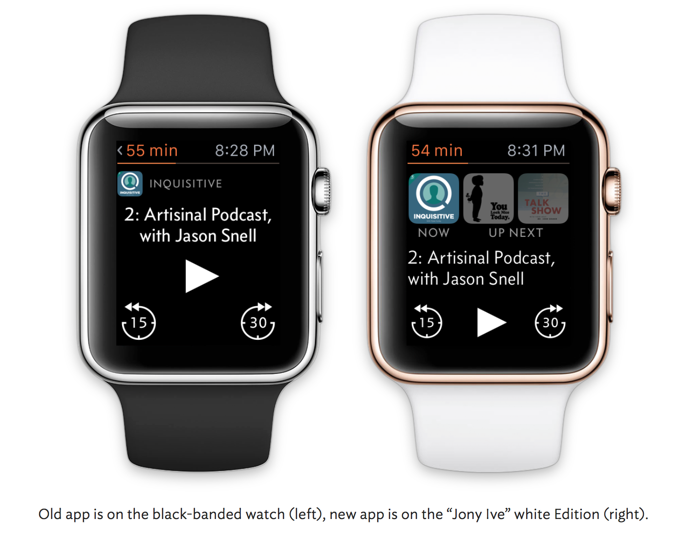
I originally designed the Apple Watch app for my podcast player, Overcast, with a scaled-down version of the iPhone app’s structure.
This seemed like a sensible adaptation of my iOS app to the Apple Watch. In practice, it sucked.
…Trying to match the structure of the iOS app was a mistake. For most types of apps, the Apple Watch today is best thought of not as a platform to port your app to, but a simple remote control or viewport into your iPhone app.
My initial app was easier to conceptualize and learn, and it closely matched the iOS app. But it just wasn’t very good in practice, and wasn’t usually better than taking out my phone.
The new app is a bit weird and polarizing, and has a learning curve, but it’s great in practice if it fits your preferences. (Just like the Apple Watch.)
…It’s unwise and futile to try to shove iPhone interfaces and paradigms into the Apple Watch. Instead, design for what the Watch really is.
65 useful tips as of 5-3-15.
A Good User Interface has high conversion rates and is easy to use. In other words, it’s nice to both the business side as well as the people using it. Here is a running idea list which we discovered.
Low-Friction Design Patterns
Assuming you’re adding features to a product, the following are six design patterns to follow, each essentially reducing friction in your product. They cause the need to learn, consider, futz, or otherwise not race through the product to get something done.
- Decide on a default rather than options
- Create one path to a feature or task
- Offer personalization rather than customization
- Stick with changes you make
- Build features, not futzers
- Guess correctly all the time
Here’s the Gist:
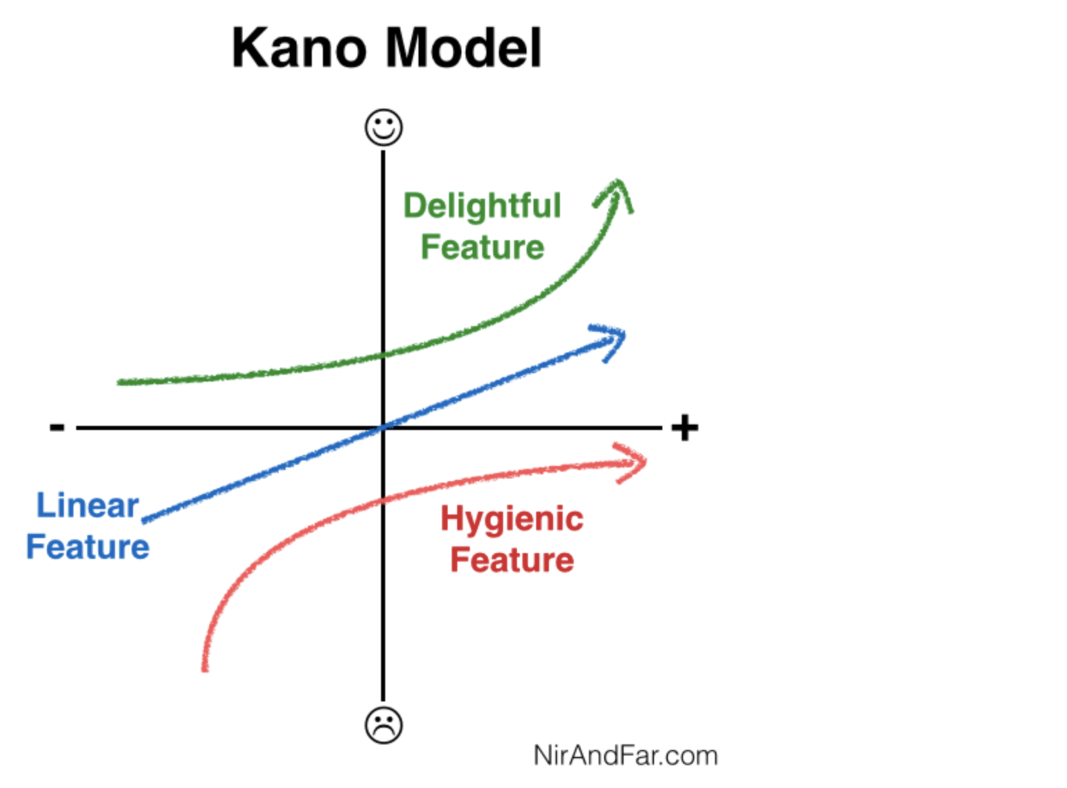
- Dr. Noriaki Kano developed a revealing model for understanding how various product features affect customer happiness.
- A “delightful” feature is an attribute of the product customers love but do not expect — for example, new apps in the app store.
- A “linear” feature is one the user expects and more of that quality increases satisfaction — think more battery life.
- A “hygienic” feature is a must-have. Customers not only expect these attributes, they depend on them — for example, reliably telling the time on a watch.
- To save battery life, Apple designed the Apple Watch to only display the time when it thinks you’re looking at it. This violates a hygienic feature and will annoy users.
- However, like the first versions of the iPhone, users will forgive the watch’s flaws if the delightful features (namely the apps in the App store) knock their socks off.
- Products can win markets by ensuring their “delighter” features compensate for flaws.
Links for guides on usability testing – for HCD documentation
Excellent article – highly recommended.
Design by committee is death by a thousand cuts.
It kills slowly, as more and more people weigh in with their opinions, until the “revised” design looks like a stew of lesser parts. It certainly doesn’t need to be that way, especially for large companies like Yelp.
We chose to redesign their site to show how usability testing done properly can unleash the power of just one. Based on our experience as designers at different companies, we found usability testing to be the best defense for design decisions.
When in doubt, let the user stand between you and overbearing stakeholders and the evidence will speak for itself.
In Silicon Valley’s youth-obsessed culture, 40-year-olds get plastic surgery to fit in. But IDEO, the firm that famously developed the first mouse for Apple, has a 90-year-old designer on staff.
Barbara Beskind says her age is an advantage.
“Everybody who ages is going to be their own problem-solver,” she says. And designers are problem-solvers. Beskind speaks while sitting on a couch at the open office space of IDEO in San Francisco. She commutes to the office once a week from a community for older adults where falling is a problem.
“People where I live fall a lot,” she says, adding, “For a friend of mine, I tried to design air bags of graded sizes that would be activated at a lurch of 15 degrees.” She is stumped on how to find the right power source for her air bags.
Good list of techniques and methods with descriptions. Not too useful for its intended purpose but the collection is a could be useful as a reference.