Toggles using CSS and HTML only (no JS).
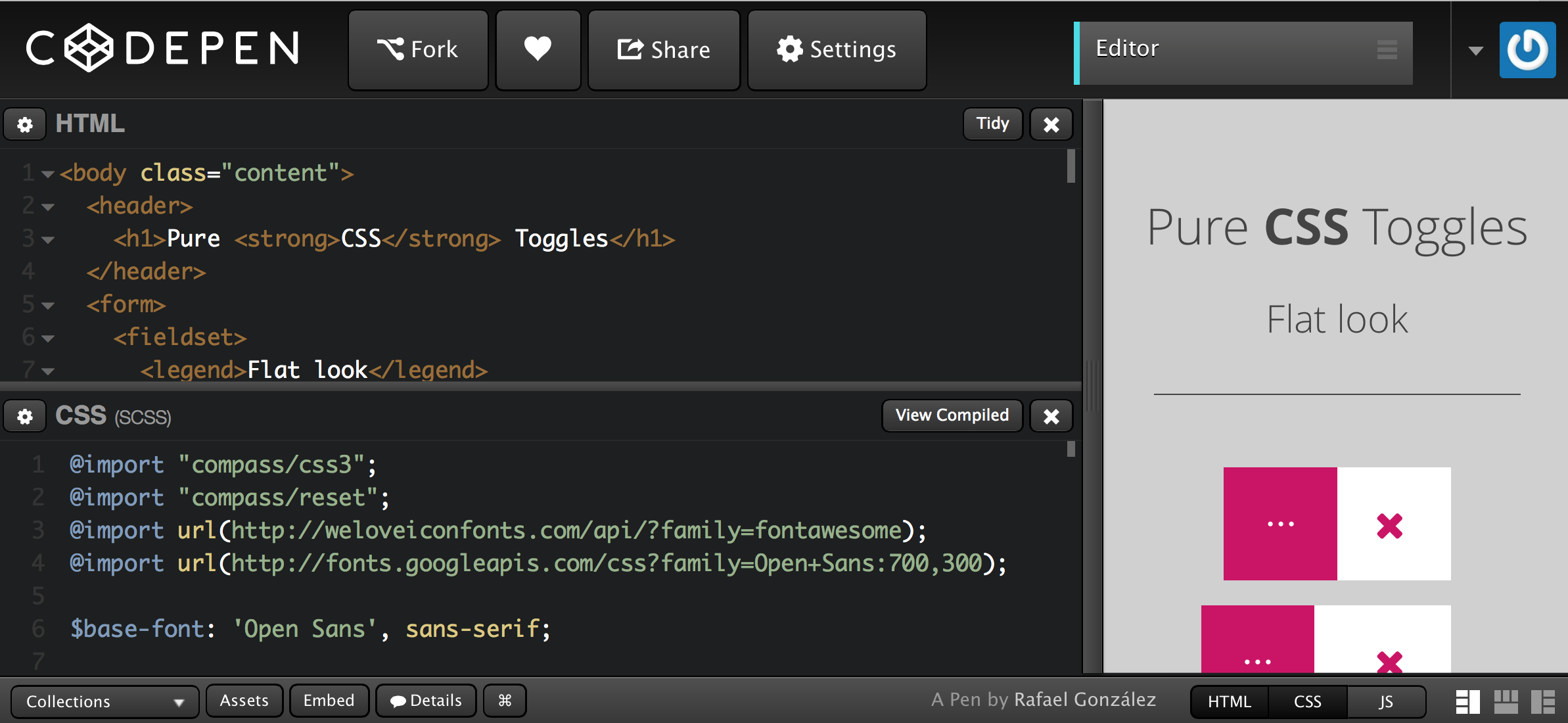
This article aims to showcase some of the creative things you can do with checkboxes. Read on and keep in mind that the demos in this article use no JavaScript.
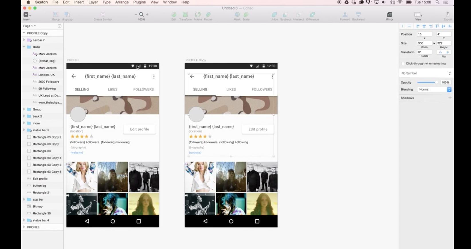
How to use real data with Sketch. Needs plugins.
Using Precious Design Studio and Lukas Ondrej’s Sketch Data Populator plugin we were able to quickly prototype a template for the profile view and use a JSON file to add real data to the design.
Low-Friction Design Patterns
Assuming you’re adding features to a product, the following are six design patterns to follow, each essentially reducing friction in your product. They cause the need to learn, consider, futz, or otherwise not race through the product to get something done.
- Decide on a default rather than options
- Create one path to a feature or task
- Offer personalization rather than customization
- Stick with changes you make
- Build features, not futzers
- Guess correctly all the time
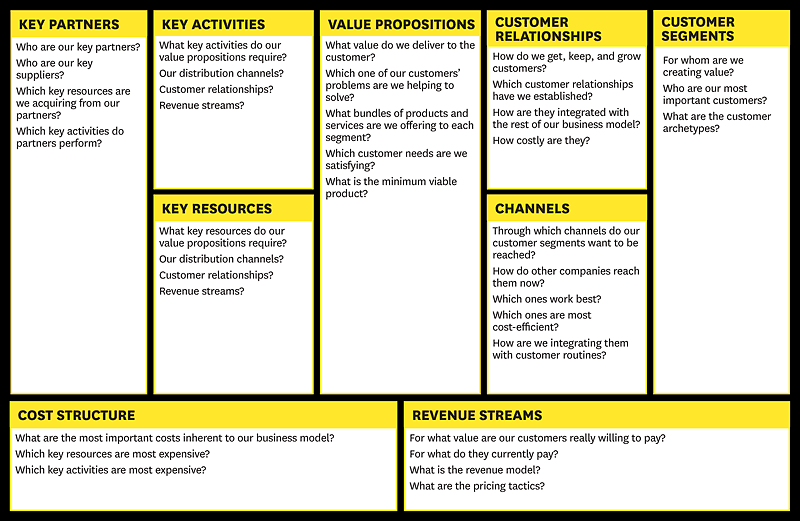
First, rather than engaging in months of planning and research, entrepreneurs accept that all they have on day one is a series of untested hypotheses—basically, good guesses. So instead of writing an intricate business plan, founders summarize their hypotheses in a framework called a business model canvas. Essentially, this is a diagram of how a company creates value for itself and its customers. (See the exhibit “Sketch Out Your Hypotheses.”)
Second, lean start-ups use a “get out of the building” approach called customer development to test their hypotheses. They go out and ask potential users, purchasers, and partners for feedback on all elements of the business model, including product features, pricing, distribution channels, and affordable customer acquisition strategies. The emphasis is on nimbleness and speed: New ventures rapidly assemble minimum viable products and immediately elicit customer feedback. Then, using customers’ input to revise their assumptions, they start the cycle over again, testing redesigned offerings and making further small adjustments (iterations) or more substantive ones (pivots) to ideas that aren’t working. (See the exhibit “Listen to Customers.”)
Third, lean start-ups practice something called agile development, which originated in the software industry. Agile development works hand-in-hand with customer development. Unlike typical yearlong product development cycles that presuppose knowledge of customers’ problems and product needs, agile development eliminates wasted time and resources by developing the product iteratively and incrementally. It’s the process by which start-ups create the minimum viable products they test. (See the exhibit “Quick, Responsive Development.”)
Essentially the design and development phases are merging and if you’re naturally good at design and front-end development you will take to designing in the browser like a duck takes to water.
One major benefit of designing in the browser is that we can design based on realistic expectations. Sometimes designing in software can create unforeseen problems for front-end development. UI elements could be designed wonky or maybe they just don’t make any sense, it’s hard to explain to a client why you changed something, not because they won’t understand but because you’ve already pitched it in the design and had it approved. Designing in the browser lends itself to the idea of simplicity.
I’m not saying that every website should begin life in the browser, but as websites now need to be more adaptable than ever, it seems to make more sense to take this route. Designing in Photoshop (or a similar application) can have benefits, which I’ll look at later, but it can also have its drawbacks. Let’s take a look at some of these.
- Designs in Photoshop are fixed width.
- User experience can’t be demonstrated.
- Work gets repeated.
- Can be time consuming.
- Not an exact representation of how the final design will look.
Good article from TeamTreehouse in 2012.
The next era in designing for the web is a more advanced, mature and intelligent one. It’s about streamlining, semantics, great markup, responsive or fluid design, great typography, web fonts, content first, rapid prototyping and advanced javascript. My argument is that html, CSS and the browser tools we need have all advanced us past the point of needing Photoshop. If you want to be a great designer moving forward, I would start thinking about “Killing Photoshop” …
In the beginning, don’t even think about style. Instead, start with the foundation: the content. Lay the groundwork for your markup order, and ensure that your design will be useable with styles and images turned off. This is great for prioritizing the content, and puts you on the right path for accessibility and search engine optimization.
The main benefit of switching to designing in the browser is that we can deliver better results much faster, and speed up the development process significantly:
- Rapid prototyping with Foundation or Bootstrap allows us to set up website skeletons in hours, rather than days.
- We can see the content in context and decide if it’s the right place at the right time. Content strategy decisions take place at the same time (or earlier) as design decisions – this is the way it should be, but rarely is, when we work with static mockups.
- Since we’re building an interactive prototype, the client can actually click and browse through pages, experience interactions, and give feedback based on real user experience, not a hypothetical end-result.
- Since you are building your application to a fluid grid (and ideally, working mobile-first), you can instantly check and design for different devices: mobile and tablet views.
- It’s extremely fast to explore different colour, layout and typography variations across a whole product. By writing HTML and CSS (Sass, frequently) with frequent code reviews, the prototype’s code can go directly into production – no duplicate effort is required!