Excellent article – covers FOUTs and font loading, ligatures, hyphenation & justification, more
Typography has a long and rich history, but much has been lost in the transition to the web. While browser support for typography has advanced a lot in the last couple years, we still have a long way to go. Features print designers take for granted are either nonexistent on the web or have insufficient browser support in order to be useful. Challenges unique to web browsers such as responsive design and web font loading could use some improvement as well. Let’s take a look at some of the features we need for an optimal and beautiful reading experience.
One well-documented abuse of Sass’s feature-set is the tendency to heavily nest our CSS selectors. Now don’t get me wrong, nesting is beneficial; it groups code together to make style management easier. However, deep nesting can be problematic.
One option is to create rules that act as limits and reign in some of that power. For example, Mario Ricalde uses an Inception-inspired guideline for nesting: “Don’t go more than four levels deep.”
Rules like this are especially helpful for newcomers, because they provide clear boundaries to work within. But few universal rules exist; the Sass spec is sprawling and growing (as I write this, Sass is at version 3.4.5). With each new release, more features are introduced, and with them more rope with which to hang ourselves. A rule set alone would be ineffective.
…[W]e adopted an approach to CSS based on the BEM methodology. Instead of defining styles which apply globally, all styles are siloed into self-contained “blocks” by way of a naming convention. A “block” is defined, more or less, as a single free-standing unit of content that is potentially reusable (although it’s not mandatory that it actually be reused).
For example, let’s take a look at the “featured-sections” block:
According to our naming convention, this block has a root div element with the class name featured-sections. It contains elements with class names such as featured-sections__title and featured-sections__section-link.
We’re using a matching naming convention for our source code, as such all the styles for this featured-section block are stored in modules/featured_section.sass:
1
2
3
4
5
6
7
8
.featured-sections
margin: 0 0 $gutter-width 0
padding-top: 8px
border-top: 4px solid #dae1e5
.featured-sections__title
color: #8fa6b3
font: bold 14px/1.2em $font
This naming convention ensures that styles no longer conflict and intermingle. As long as our naming convention is followed, with the block name at the start of each class name, it’s impossible for a style to affect something outside of its own block.
It also makes it super easy to work out where to look in the codebase for the styles corresponding to an element. You can simply look at the element’s class name, and you’ll know the name of the stylesheet to open.
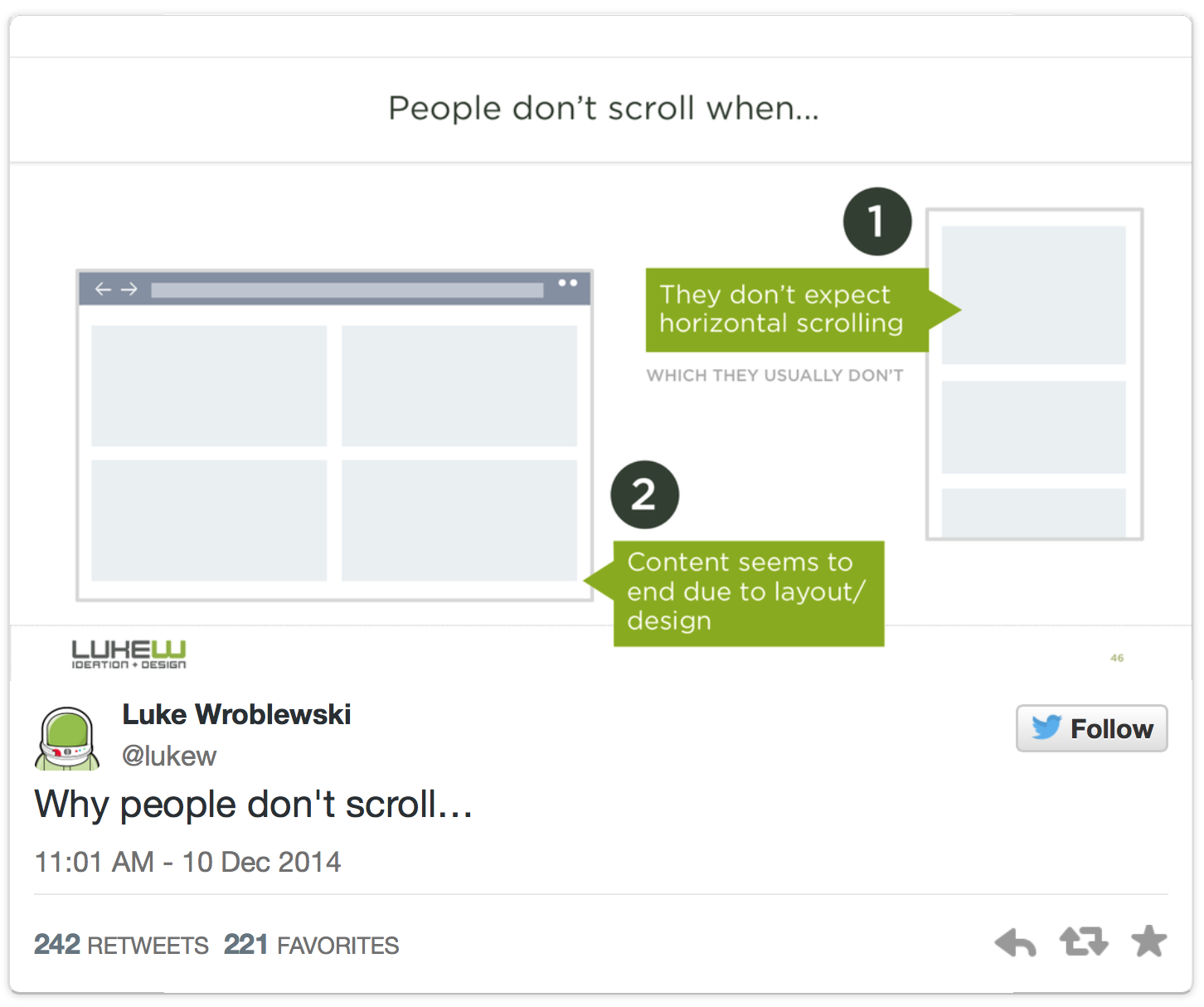
Luke Wroblewski went on a pretty great twitter tear debunking the persistent myth of “the fold” in contemporary (read: multi-device) web design. For posterity, here are all of the tweets including links to the sources.
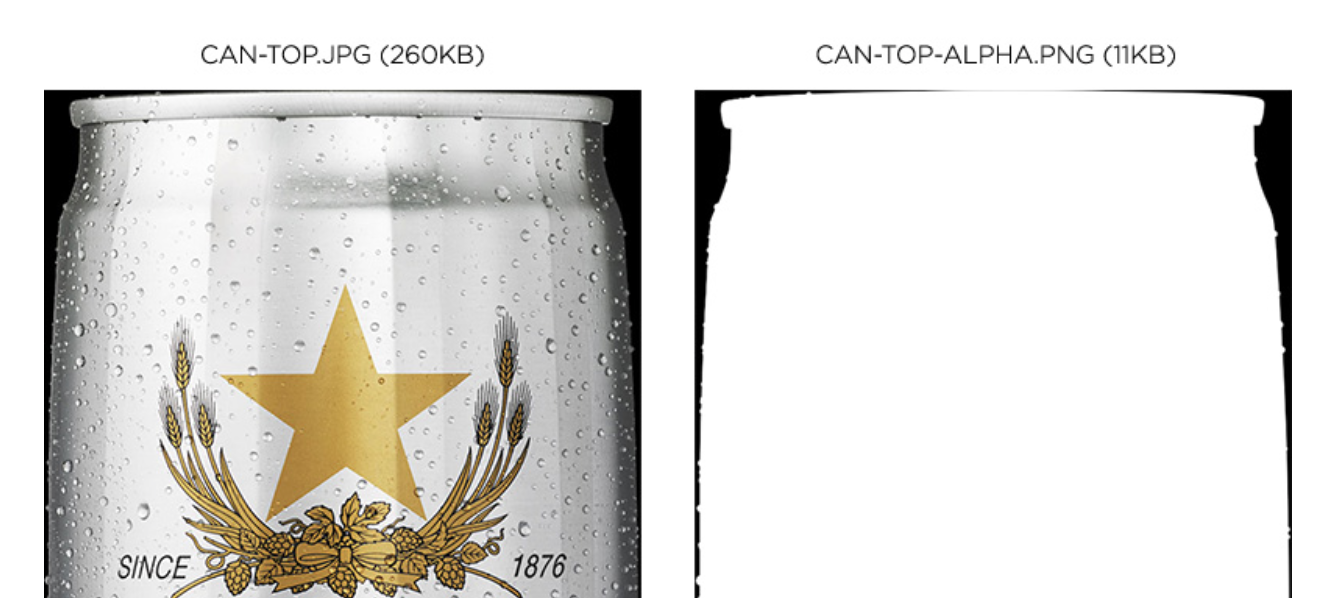
SVG trick with .jpg and .png mask – make big .jpgs have transparent areas
First, I created two files. The first is a regular JPEG without any transparency. You can compress this one as much as you like. The second is an 8-bit PNG (alpha mask). This is just a black and white image that represents the transparent areas of the beer can. Notice how the PNG is only 11KB; that’s because it contains so few colors and no transparency.
In the past year I’ve spent a lot of time researching page loading performance, both for our ongoing client work here at FG and for my soon-to-be-released book for A Book Apart. In the process, I’ve reaffirmed my belief that we don’t need to compromise the well-known benefits of a responsive layout in order to make our sites load as fast as heck.
In this post, I’ll outline some recent observations and approaches to delivering sites for speed and broader access, and link out to various tools we are using to facilitate our approach. All of the tips mentioned in this post are implemented on this very site, and we’ve tested them heavily to ensure that they’re working as well as they can.
Also see Part I. Tools and techniques to optimize and improve speed of responsive web sites.
Building off of my previous post on RWD Bloat, the following is step-by-step how I made my site faster over the course of a few days. For the purposes of this test, I’m hyper-focused on my Speed Index numbers for my Home and Article templates (the 2 most visited templates of my site).
I’ve nearly doubled the speed of my site. Not too shabby for a responsive design with jQuery, two webfonts, third-party ad, third-party comments, all while being tested on a 3G Connection. My Speed Index on Cable is currently 400~414 for both templates.