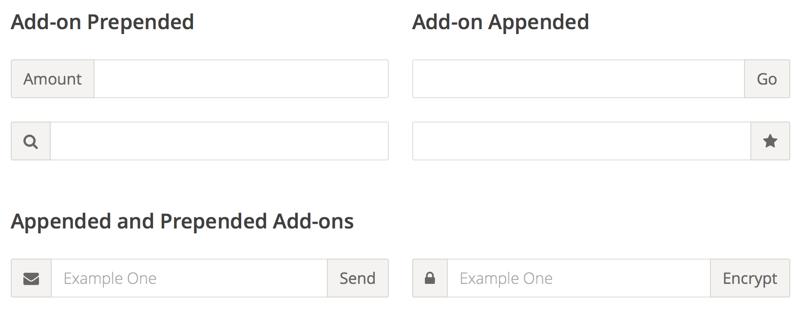
Because of the way input sizing works in CSS, it’s almost impossible to append or prepend another element to it and have the input field behave fluidly and take up the remaining space.
The only existing way to do this is to either know the exact width of the input, or to use something like display:table-cell, which has its own set of problems, most notably the difficulty with positioning anything absolutely inside of the add-on in certain browsers.
With Flexbox, all these problems go away, and the code is trivially simple. In addition, you get the input field and the input add-on to be the same height for free.
The major challenge that I see with Flexbox is that there’s a distinct gap between what we build today and how we’ll approach tomorrow. The prevailing attitude seems to be “Not for another x years”, or “we’ll wait for X browser to catch up”, but we don’t need to think like this anymore.
One well-documented abuse of Sass’s feature-set is the tendency to heavily nest our CSS selectors. Now don’t get me wrong, nesting is beneficial; it groups code together to make style management easier. However, deep nesting can be problematic.
One option is to create rules that act as limits and reign in some of that power. For example, Mario Ricalde uses an Inception-inspired guideline for nesting: “Don’t go more than four levels deep.”
Rules like this are especially helpful for newcomers, because they provide clear boundaries to work within. But few universal rules exist; the Sass spec is sprawling and growing (as I write this, Sass is at version 3.4.5). With each new release, more features are introduced, and with them more rope with which to hang ourselves. A rule set alone would be ineffective.
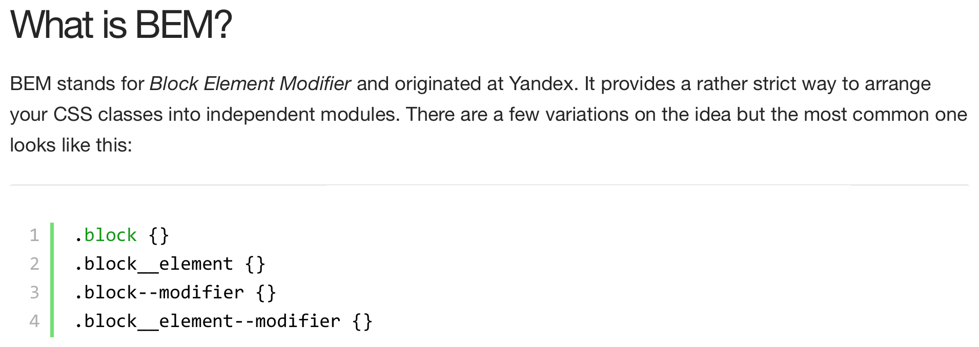
…[W]e adopted an approach to CSS based on the BEM methodology. Instead of defining styles which apply globally, all styles are siloed into self-contained “blocks” by way of a naming convention. A “block” is defined, more or less, as a single free-standing unit of content that is potentially reusable (although it’s not mandatory that it actually be reused).
For example, let’s take a look at the “featured-sections” block:
According to our naming convention, this block has a root div element with the class name featured-sections. It contains elements with class names such as featured-sections__title and featured-sections__section-link.
We’re using a matching naming convention for our source code, as such all the styles for this featured-section block are stored in modules/featured_section.sass:
1
2
3
4
5
6
7
8
.featured-sections
margin: 0 0 $gutter-width 0
padding-top: 8px
border-top: 4px solid #dae1e5
.featured-sections__title
color: #8fa6b3
font: bold 14px/1.2em $font
This naming convention ensures that styles no longer conflict and intermingle. As long as our naming convention is followed, with the block name at the start of each class name, it’s impossible for a style to affect something outside of its own block.
It also makes it super easy to work out where to look in the codebase for the styles corresponding to an element. You can simply look at the element’s class name, and you’ll know the name of the stylesheet to open.
A collection of front-end components focused on simple implementation and easy customization. Carousel, form elements, scroller, pagination, tabbed interfaces, tooltips, more. Mostly jQuery plugins.
Using HTML5 and CSS3 in email doesn’t have to be difficult. It doesn’t require endless hours of troubleshooting in quirky email clients (we’re looking at you, Outlook). All it takes is the proper framework to quickly implement HTML5 and CSS3 without the hassle or fear of running into rendering problems. And, lucky for you, we have that framework!
Here is the single greatest line of code ever made for email designers and developers:
@media screen and (-webkit-min-device-pixel-ratio:0) {
  /* Insert styles here */
}
This media query only targets WebKit-supported email clients—which have incredible support for HTML5 and CSS3. This media query allows you to use of modern techniques like HTML5 video, CSS3 animation, web fonts, and more.
This approach also splits email development for modern email clients and older clients in two. You can use Safari/Chrome to test and develop modern techniques for WebKit-supported clients while using Firefox for your baseline experience for older clients like Outlook.