Used for NYC Agency Quick Comp, with some modifications – larger color cube, changed picker frame colors.
JSColor is a simple & user-friendly color picker for your HTML forms. It extends all desired <input> fields of a color selection dialog. You can pickerize your input fields in two easy steps.
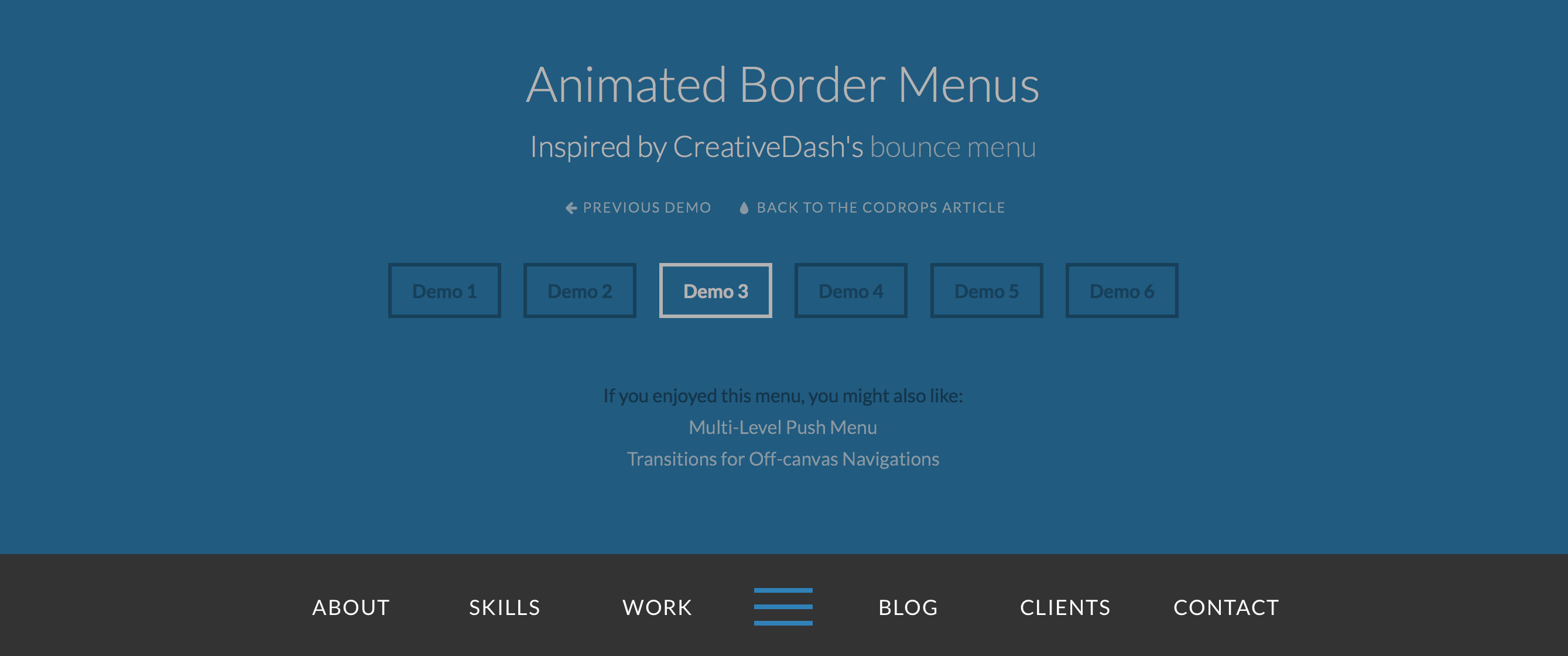
Auto-hide sticky header is a shot that shoots down two rabbits: makes site navigation easily accessible anywhere on the page and saves content space at the same. My client, Easy Shine, was happy to have this type of header for their website. I’ve also implemented this technique here, on my website (you can see it when the width of your viewport is below 768 px).
What is GSAP? Think of GSAP as the Swiss Army Knife of animation…but better. It animates anything JavaScript can touch (CSS properties, canvas library objects, SVG, generic objects, whatever) and it solves lots of browser inconsistencies, all with blazing speed (up to 20x faster than jQuery). See the “Why GSAP?” article for details. Other libraries like jQuery, Velocity, Transit, and Zepto only tween CSS properties. Plus, their sequencing abilities and runtime controls pale by comparison. Simply put, GSAP is the most flexible high-performance animation library on the planet, which is probably why Google recommends it for JS-based animations. And unlike monolithic frameworks like Famo.us or Angular that dictate how you structure your apps, GSAP simply owns the animation layer; sprinkle it wherever you want. The GreenSock Animation Platform includes:
TweenLite: the core of the engine which handles animating just about any property of any object. It is relatively lightweight yet full-featured and can be expanded using optional plugins (like CSSPlugin for animating DOM element styles in the browser, or ScrollToPlugin scrolling to a specific location on a page or div, etc.)
TweenMax: TweenLite’s beefy big brother; it does everything TweenLite can do plus non-essentials like repeat, yoyo, repeatDelay, etc. It includes many common plugins too like CSSPlugin so that you don’t need to load as many files. The focus is on being full-featured rather than lightweight.
TimelineLite: a powerful, lightweight sequencing tool that acts like a container for tweens, making it simple to control them as a whole and precisely manage their timing in relation to each other. You can even nest timelines inside other timelines as deeply as you want. This allows you to modularize your animation workflow easily.
TimelineMax: extends TimelineLite, offering exactly the same functionality plus useful (but non-essential) features like repeat, repeatDelay, yoyo, currentLabel(), and many more. Again, just like TweenMax does for TweenLite, TimelineMax aims to be the ultimate full-featured tool rather than lightweight.
Extras like easing tools, plugins, utilities like Draggable, and more
…[W]e adopted an approach to CSS based on the BEM methodology. Instead of defining styles which apply globally, all styles are siloed into self-contained “blocks” by way of a naming convention. A “block” is defined, more or less, as a single free-standing unit of content that is potentially reusable (although it’s not mandatory that it actually be reused).
For example, let’s take a look at the “featured-sections” block:
According to our naming convention, this block has a root div element with the class name featured-sections. It contains elements with class names such as featured-sections__title and featured-sections__section-link.
We’re using a matching naming convention for our source code, as such all the styles for this featured-section block are stored in modules/featured_section.sass:
1
2
3
4
5
6
7
8
.featured-sections
margin: 0 0 $gutter-width 0
padding-top: 8px
border-top: 4px solid #dae1e5
.featured-sections__title
color: #8fa6b3
font: bold 14px/1.2em $font
This naming convention ensures that styles no longer conflict and intermingle. As long as our naming convention is followed, with the block name at the start of each class name, it’s impossible for a style to affect something outside of its own block.
It also makes it super easy to work out where to look in the codebase for the styles corresponding to an element. You can simply look at the element’s class name, and you’ll know the name of the stylesheet to open.
A collection of front-end components focused on simple implementation and easy customization. Carousel, form elements, scroller, pagination, tabbed interfaces, tooltips, more. Mostly jQuery plugins.
It’s quite remarkable how far we’ve come in front-end over the past few years. What seemed to be quite difficult in the past, can now be solved so easily today (think about responsive image maps, for example). Every other day, there are new techniques that come up — shared and explained publicly — and that is amazing.