
Author: Lois Last
Size Matters: Balancing Line Length And Font Size In Responsive Web Design
PEOPLE READ IN THREE WAYS
In 2006, the Nielsen Norman group released images of heat maps from eye-tracking studies. The areas where people looked at the most while reading are red, areas with fewer views are yellow, and the least-viewed areas are blue. As you can see below, the red and yellow areas form three variations of an F-shaped pattern. These variations aren’t surprising because people read in three different ways.
[1] People read casually, skimming over text, reading words and sentences here and there to get a sense of the content. The heat map below shows the eye movements of someone casually reading about a product. The reader spent time looking at the image of the product, reading the first couple of sentences, then scanning through the bulleted list.

[2] People also scan with purpose, jumping from section to section, looking for a particular piece of information. They might only read a word or the first couple of characters of a word as they scan the screen. The heat map below shows the eye movements of someone scanning the results of a Google search with purpose. The person read the first two results more slowly. Then, their eyes jumped from section to section, looking for the search term. Therefore, we do not see a strong vertical stroke along the left edge of the text.
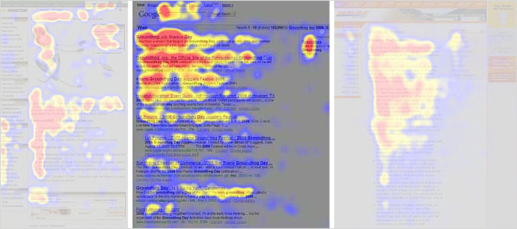
[3] Finally, people read in an engaged manner. When they find an article or blog post they are interested in, they will slow down and read the whole text, perhaps even going into a trance-like state. The heat map below shows the eye movements of a person reading in an engaged manner. The tone is more continuous. There is more red (meaning more time spent reading) and less jumping around the page. When the intensity of reading dwindled because they lost interest (the corporate “About us” page might not have aligned with their interests), their eyes continued along the left edge of the text.

Mastering the Bézier Curve in Sketch
In digital graphics, computers draw vector shapes using a collection of points — a sort of connect-the-dots — and most programs use “Bézier curves” to create curved lines around those vector points. You may be familiar with their appearance in design and motion graphics tools, but understanding how they work will take out some of the pain and confusion when you’re trying to create a particular shape. Building off our understanding of vector shapes, this article will demystify designing with Bézier curves.
Flexbox Cheatsheet
While I am no stranger to the magic of Flexbox, I find that I am not using it very often just yet. As a result I end up pausing and referring back to this post at CSS-Tricks whenever an opportunity to utilize its powers presents itself.
I set out to create a quick visual to summarize Flexbox when I run into these moments of pause in the future. I like to think of it as a little diagram (flow chart? decision tree-ish thing?) that is a cheatsheet…based on cheatsheets.
Anyway, I thought I would share it just in case others may find such a resource beneficial as well. You can also take a look at the demo I used over at CodePen to practice/tinker your flexible heart out.
If you would prefer to have this guy as a PDF you can grab that here.
Advanced SVG, CSS, JavaScript Techniques – Smashing Magazine Newsletter
It’s quite remarkable how far we’ve come in front-end over the past few years. What seemed to be quite difficult in the past, can now be solved so easily today (think about responsive image maps, for example). Every other day, there are new techniques that come up — shared and explained publicly — and that is amazing.
So what about Masking SVG animations using clip-path? Or perhaps using background-clip for transparent borders? Or perhaps cross-browser custom-styled select menus, creating CSS hexagons with transform and calc()? using smart radio buttons? Just a few techniques for your toolbox to have nice, scalable, and fast solutions ready for your next project. Handy! (vf)

Teehan + Lax iOS 8 psd Template
Fully Scaleable Apple iOS Devices for Sketch.app
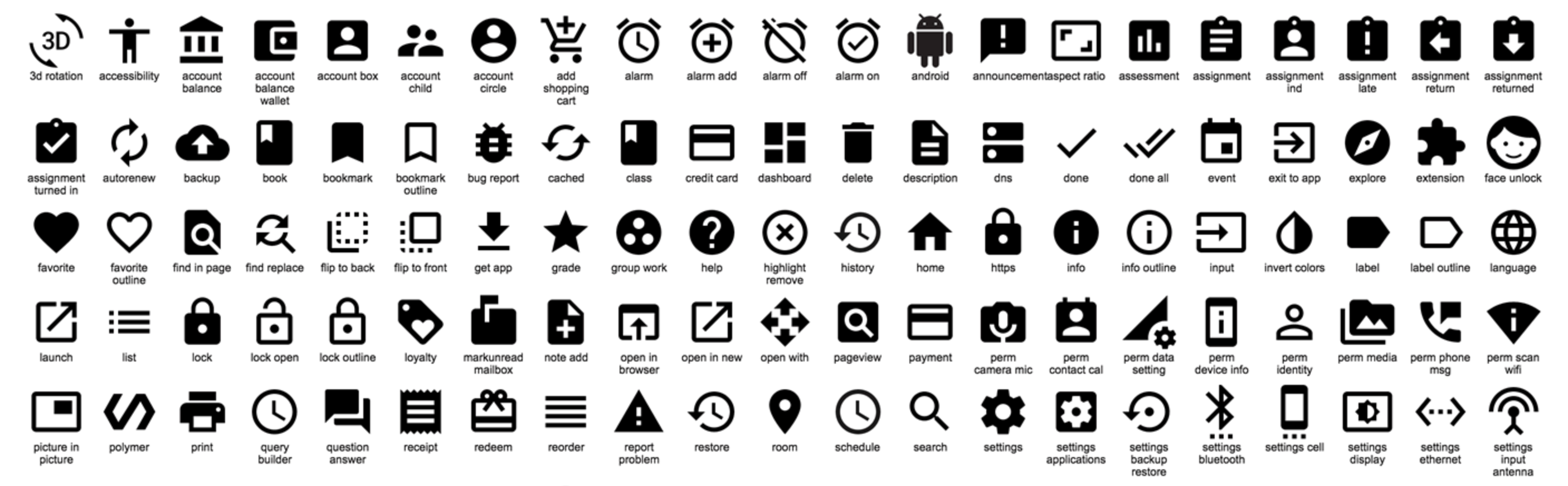
Google Material Design icons
Today, Google Design are open-sourcing 750 glyphs as part of the Material Design system icons pack. The system icons contain icons commonly used across different apps, such as icons used for media playback, communication, content editing, connectivity, and so on. They’re equally useful when building for the web, Android or iOS.
What’s included in the release?
- SVG versions of all icons in both 24px and 48px flavours
- SVG and CSS sprites of all icons
- 1x, 2x icons targeted at the Web (PNG)
- 1x, 2x, 3x icons targeted at iOS (PNG)
- Hi-dpi versions of all icons (hdpi, mdpi, xhdpi, xxhdpi, xxxhdpi) (PNG)
Style Inventory for Sketch
The Style Inventory … gives you an overview of all your used styles and helps you to merge styles of similar layers into one. This repositiory also contains a few other helpful plugins.
Example: Duplicate Artboard (next to the current artboard)
This improves the built in behavior of artboard duplication in Sketch. If the selected artboard is in the middle of other artboards, all artboards on the right side will be shifted to the right before the artboard is duplicated. Requires any layer of an artboard to be selected.
Shortcut: shift + ⌘ + D

Essential Sketch Plugins For Web Design
Sketch Toolbox plugin manager, dynamic buttons, text and image placeholders, more.
Before we get started, go download Sketch Toolbox, which is a simple 3rd-party plugin manager for Sketch.

Swap Fill & Border
Clear Styles
Dynamic Button
Child Layers
Measure
Content Generator
Day Player – placeholder images
Page Switch
Sketch Commands
Sketch Plugins