A fundamental reality of application development is that the user interface is the system to the users. What users want is for developers to build applications that meet their needs and that are easy to use. Too many developers think that they are artistic geniuses – they do not bother to follow user interface design standards or invest the effort to make their applications usable, instead they mistakenly believe that the important thing is to make the code clever or to use a really interesting color scheme. Constantine points out that the reality is that a good user interface allows people who understand the problem domain to work with the application without having to read the manuals or receive training.
User interface design important for several reasons. First of all the more intuitive the user interface the easier it is to use, and the easier it is to use and the less expensive to use it. The better the user interface the easier it is to train people to use it, reducing your training costs. The better your user interface the less help people will need to use it, reducing your support costs. The better your user interface the more your users will like to use it, increasing their satisfaction with the work that you have done.
2. UI Design Principles
Let’s start with the fundamentals of user interface design. Constantine and Lockwood describe a collection of principles for improving the quality of your user interface design. These principles are
- The structure principle. Your design should organize the user interface purposefully, in meaningful and useful ways based on clear, consistent models that are apparent and recognizable to users, putting related things together and separating unrelated things, differentiating dissimilar things and making similar things resemble one another. The structure principle is concerned with your overall user interface architecture.
- The simplicity principle. Your design should make simple, common tasks simple to do, communicating clearly and simply in the user’s own language, and providing good shortcuts that are meaningfully related to longer procedures.
- The visibility principle. Your design should keep all needed options and materials for a given task visible without distracting the user with extraneous or redundant information. Good designs don’t overwhelm users with too many alternatives or confuse them with unneeded information.
- The feedback principle. Your design should keep users informed of actions or interpretations, changes of state or condition, and errors or exceptions that are relevant and of interest to the user through clear, concise, and unambiguous language familiar to users.
- The tolerance principle. Your design should be flexible and tolerant, reducing the cost of mistakes and misuse by allowing undoing and redoing, while also preventing errors wherever possible by tolerating varied inputs and sequences and by interpreting all reasonable actions reasonable.
- The reuse principle. Your design should reuse internal and external components and behaviors, maintaining consistency with purpose rather than merely arbitrary consistency, thus reducing the need for users to rethink and remember.
Author: Lois Last
Using Wireframes or Prototypes to Elicit, Analyze, and Validate Software Requirements
Within the business analysis community, the debate still reigns about whether how the application will look and how the screens will be laid out is technically part of requirements or design. This debate centers around the wrong question.
The right question is “When is the most effective time to introduce visual prototypes into your requirements process?”. My answer: As soon as it makes sense to do so.
Another good question to consider is “What requirements do a prototype or wireframe represent?” My answer: It depends. It depends on where you are at from a requirements process perspective (eliciting, validating, analyzing, or a bit of each), what types of requirements management practices you have in place, and what level of user interface expertise is available across members of the team.
Usability Toolkit – Society for Technical Communication
The Usability Toolkit is a collection of forms, checklists and other useful documents for conducting usability tests and user interviews. MS Office formats. See original article for extensive list. .zip archive of all files is also available.
What is User-Centered Design?
User-centered design (UCD) is an approach to design that grounds the process in information about the people who will use the product. UCD processes focus on users through the planning, design and development of a product.
An International Standard
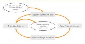
There is an international standard that is the basis for many UCD methodologies. This standard (ISO 13407: Human-centred design process) defines a general process for including human-centered activities throughout a development life-cycle, but does not specify exact methods.
In this model, once the need to use a human centered design process has been identified, four activities form the main cycle of work:
- Specify the context of use
Identify the people who will use the product, what they will use it for, and under what conditions they will use it.- Specify requirements
Identify any business requirements or user goals that must be met for the product to be successful.- Create design solutions
This part of the process may be done in stages, building from a rough concept to a complete design.- Evaluate designs
The most important part of this process is that evaluation – ideally through usability testing with actual users – is as integral as quality testing is to good software development.The process ends – and the product can be released – once the requirements are met.
Usability Resources
A list of resources, articles and do-it-yourself materials for those interested in usability and the user experience.
General
- Affinity diagramming: A simple but powerful technique for grouping and understanding information.
- Facilitation techniques: Tips for running successful workshops.
- Pre-publication checklist: A simple quality control checklist.
- Reading list: A selection of books on usability and related topics.
- Writing Usability Reports: Clear communication when reporting is crucial.
- Handling logged data: How to log and manage large data sets.
- Website Redesign: A case study illustrates suggested steps to take during a redesign.
- Designing for Children: A brief set of guidelines on designing for children.
Design
- Scenarios: A powerful and simple technique for describing user interactions.
- Paper prototyping graphics: A simple low-tech collection of user interface elements for paper prototyping.
- Documenting a user interface: How to communicate your design.
- Card sorting: Exploring how users group items, to help develop a usable structure.
- Participatory design: Conducting design sessions with all stakeholders is higly efficient.
Evaluation
- Conducting Walkthroughs: A simple paper-based multi-participant variation of usability testing.
- Usability Testing Materials: Schedule, guidelines and script – materials you can use when conducting tests.
- Conducting Usability Reviews: How to conduct a usability review (or heuristic evaluation).
- Web Evaluation Materials: Checklists for evaluating websites and online stores, and a sample report.
- Structure evaluation: A simple process for evaluating website or other information structures.
- Usability Testing: The gold standard in usability evaluation, usability testing is a relatively simple technique.
- Usability Testing Mistakes: Usability testing can be simple, but beware of some common pitfalls.
- Usability Review Materials: A simple format and severity matrix for use when conducting a review.
- Voice Interaction Evaluation Checklist: A checklist for evaluation voice user interfaces.
Articles
- The Myth of the Stupid User: If users are “stupid”, then we need to design accordingly.
- Usability for Technical Communicators: Technical communicators are well placed to engage in a usability role.
- Humans – A Designer’s Guide: The quirks and characteristics that present such a fascinating challenge to the designer.
- Apprehending the obvious: Why do organizations fail to take action based on what they already know?
The Unlit Social Graph
A few years ago, it was not uncommon to hear search people talk about The Dark Web (also known as Dark Net or the Deep Web). Basically, the Dark Web is made up pages or files that are unreachable by search engines. Examples of this sort of content include information that sits behind login, or pages without inbound links. Some estimates put the Dark Web at about 400 times the size of the Surface Web (content indexed by search engines).
Google has invested tremendous resources in lighting up, or indexing these hidden pieces of content. An example of their efforts was their 2008 announcement that they could now index the contents of .PDF files, a “feat that requires and an immense amount of processing power.”
The 13 Most Popular Methods for User Centered Design (2008)
List of methods, with links. From 2008, some may be no longer relevant.
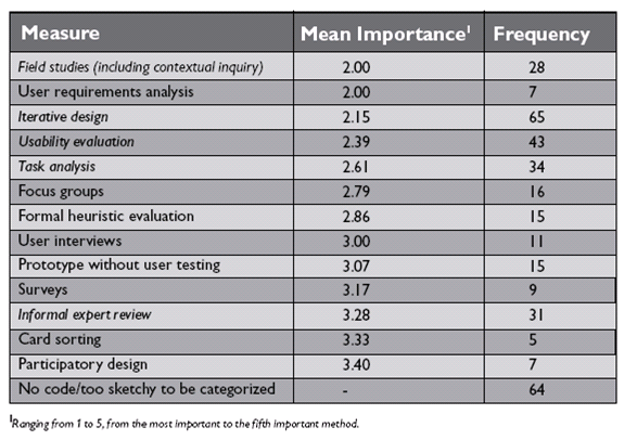
User centered design is receiving increasing attention in recent years. Various methods and tools are used within organizations to improve the understanding of user and task requirements, support the iteration of design and evaluation. Identifying the most important and most used user centered design methods was the goal of the study “The State of User Centered Design Practice.”
In this study the authors surveyed more than 100 experienced practitioners of UCD with at least three years of experience and who considered UCD as their primary job. The following table shows the key results of the survey (Ranging from 1 to 5, from the most important to the least important method):

