Sketch App Sources is a collection of free design resources created by named designers from the Sketch community who wants to show what a wonderful tool, Sketch 3, can be. There are ui, icons, sliders, buttons, website templates, mobile applications and many more free .Sketch files you can download and use on your next web design project.
Author: Lois Last
Marka – JS and CSS Icon Transformations

Sketch iOS Mirror – Preview Sketch Designs on iOS Devices
With Sketch Mirror, you can preview your designs on your iOS devices while you work on them, making it the perfect companion for Sketch.
Made for Sketch.
Sketch Mirror shows a live preview of your document on your iOS device. Because we built Sketch Mirror exclusively for Sketch we’ve integrated it directly into the Mac app.Swipe to Navigate.
An example of this deep integration is that we support Pages and Artboards in Sketch and you can swipe between artboards on your device while you can continue your work on the Mac.Multiple Devices.
Want to preview your iPhone and iPad artboards at the same time? Want to compare standard resolution with retina? Using Wi-Fi, you can connect to multiple Sketch Mirror devices simultaneously.
PixelLove icons
Streamline Icons
Streamline 1600+ vector icons for iOS and Android. Adapt line thickness. Selected (filled-in) states and Sketch format available.
Tablesaw: A Flexible Tool for Responsive Tables
Following lots of early experiments with responsive tables, we came to the conclustion that any approach to “responsive tables” needs to address a few key points:
First and foremost, it needs to flexibly reformat table layouts in a way that’s suitable for compact screens, without removing any data outright from the markup

If any data are hidden by default, it should provide some method to let users to access that information (we can’t make assumptions about what data will be relevant based on the screen size)
Tablesaw lets developers apply rules to determine display presentation layout, data priority, and adds a range of extensions to give users control over data display and interaction.
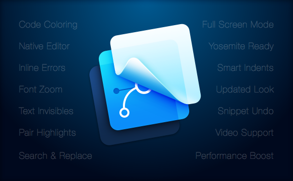
Framer Studio 1.5 (Framer.js)
Today we are happy to announce Framer Studio 1.5. The main focus of this release is a new, native code editor that makes working on your prototypes faster and better. This rewrite allows us to control every aspect of the editor, so we can add more advanced features in the future.
We updated the app to work great on Yosemite, fixing all currently known issues. And a fresh look for the icons make Framer Studio fit right in.
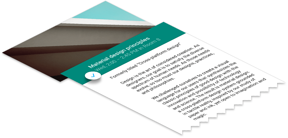
Material design in the 2014 Google I/O app
Every year for Google I/O, we publish an Android app for the conference that serves two purposes. First, it serves as a companion for conference attendees and those tuning in from home, with a personalized schedule, a browsing interface for talks, and more. Second, and arguably more importantly, it serves as a reference demo for Android design and development best practices.
On the design front, this year’s I/O app uses the new material design approach and features of the Android L Developer Preview to present content in a rational, consistent, adaptive and beautiful way.
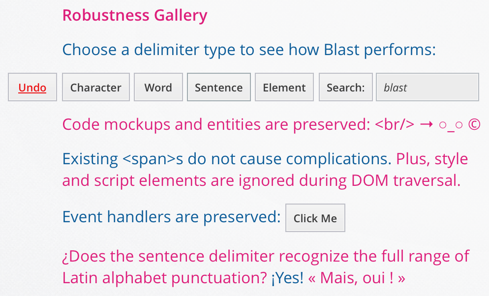
Blast.js: Blast text apart to make it manipulable
View demos at source link.
Overview
Blast.js separates text in order to facilitate typographic manipulation. It has four delimiters built in: character, word, sentence, and element. Alternatively, Blast can match custom regular expressions and phrases.Blast’s uses include typographic animation, juxtaposition, styling, search, and analysis.
Blast is highly accurate; it neither dumbly splits words at spaces nor dumbly splits sentences at periods. Features include: 1) By traversing text nodes, all HTML, event handlers, and spacing are preserved. Thus, you can safely apply Blast to any part of your page. 2) Automatic class and ID generation make text manipulation simple. 4) Blast can be fully undone with a single call. 5) All Latin alphabet languages and UTF-8 characters are supported.
The elements Blast generates can be accessed through both CSS and JavaScript by referencing auto-generated class names or iterating via jQuery/Zepto’s eq() function.
Foundation: A New Grid
New grids for new experiences and applications. Highly recommended.
Using a Hammer When You Need a Nail Gun
Building things is hard. Building things with the wrong tools is even harder. The web has changed over the past several years and will continue to rapidly change. We’re racing away from an advertising web that discusses things to a web of doing and creating things.The shift from native apps to web apps has begun. Yet, we’re using the wrong tool to build these web apps — hacking away at frameworks and grids meant for marketing sites. In other words, we’re still swinging a hammer when we could be shooting a nail gun.
A 960° Look at the Grids of Internet Past
Nearly every grid system today is based on the same principals of the 960 Grid — a grid nearly a decade old — that has affected how nearly every site is coded today. A model that uses rows and columns, set to 12 or 16 numbered increments, to create nearly any layout.The 960 Grid allowed for rapid prototyping on the web and lowered the learning curve for designers to wrangle code. It gave us the start. And more powerful frameworks emerged offering UI libraries, predefined styles and JavaScript capabilities, yet the same grid style remained.
Over the last three years, Foundation has taken this grid style and made huge improvements in functionality. We were the first framework to go responsive with the grid and also the first to take the grid mobile-first. We’ve built upon it, adding offsets, source ordering right-to-left options and block grids. We’ve even harnessed the awesome power of Sass to have powerful Mixins that allow designers to build fully semantic markup with little-to-no presentational classes.
These things are all great, but they were still built for a different type of web experience.
Web Apps are the Future
As we said above, the web is changing. We’re transitioning to a more app-centric web. It’s time our grids followed suit.