I’m not saying that every website should begin life in the browser, but as websites now need to be more adaptable than ever, it seems to make more sense to take this route. Designing in Photoshop (or a similar application) can have benefits, which I’ll look at later, but it can also have its drawbacks. Let’s take a look at some of these.
- Designs in Photoshop are fixed width.
- User experience can’t be demonstrated.
- Work gets repeated.
- Can be time consuming.
- Not an exact representation of how the final design will look.
Author: llast
Responsive Web Design in the Browser Part 1: Kill Photoshop
Good article from TeamTreehouse in 2012.
The next era in designing for the web is a more advanced, mature and intelligent one. It’s about streamlining, semantics, great markup, responsive or fluid design, great typography, web fonts, content first, rapid prototyping and advanced javascript. My argument is that html, CSS and the browser tools we need have all advanced us past the point of needing Photoshop. If you want to be a great designer moving forward, I would start thinking about “Killing Photoshop” …
Make Your Mockup in Markup
In the beginning, don’t even think about style. Instead, start with the foundation: the content. Lay the groundwork for your markup order, and ensure that your design will be useable with styles and images turned off. This is great for prioritizing the content, and puts you on the right path for accessibility and search engine optimization.
Why designing in the browser is the way forward
The main benefit of switching to designing in the browser is that we can deliver better results much faster, and speed up the development process significantly:
- Rapid prototyping with Foundation or Bootstrap allows us to set up website skeletons in hours, rather than days.
- We can see the content in context and decide if it’s the right place at the right time. Content strategy decisions take place at the same time (or earlier) as design decisions – this is the way it should be, but rarely is, when we work with static mockups.
- Since we’re building an interactive prototype, the client can actually click and browse through pages, experience interactions, and give feedback based on real user experience, not a hypothetical end-result.
- Since you are building your application to a fluid grid (and ideally, working mobile-first), you can instantly check and design for different devices: mobile and tablet views.
- It’s extremely fast to explore different colour, layout and typography variations across a whole product. By writing HTML and CSS (Sass, frequently) with frequent code reviews, the prototype’s code can go directly into production – no duplicate effort is required!
Designing in Browser (Part 2): A Real Workflow
I want to dive a little deeper on some real-world design-in-browser instances. I’m designing in browser with my team on a current philosophie project — but there’s a twist: a mobile web application meant to have the look, feel, and behavior of a native iOS application.
It took us some time to figure out the best workflow for this project, but in the end, we chose to go with a happy medium of some traditional design exploration and Adobe Photoshop work mixed with in-browser iteration.
The When, Why and How of Designing in Browser (Part 1)
Rather than spending hours, days, weeks and months designing those pixel-perfect comps in Photoshop, a mainstay in a waterfall-oriented development process, designing in browser allows you to take whatever sketches and preliminary work you’ve conducted and enables you to jump right into the text editor and emerge with shippable code.
…There are many articles in the tech community that sing the praises of designing in browser — it’s future of web design, we should Kill Photoshop — to name a couple.
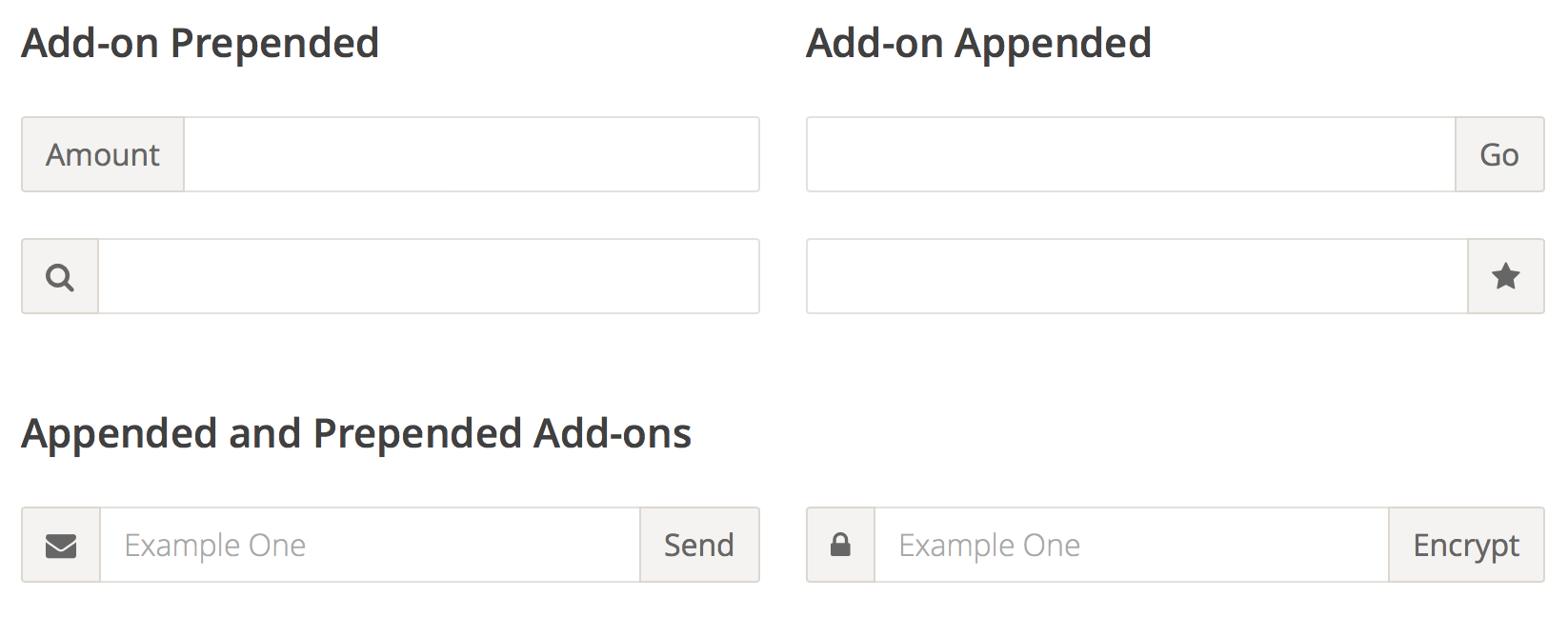
Input Add-ons
Because of the way input sizing works in CSS, it’s almost impossible to append or prepend another element to it and have the input field behave fluidly and take up the remaining space.
The only existing way to do this is to either know the exact width of the input, or to use something like display:table-cell, which has its own set of problems, most notably the difficulty with positioning anything absolutely inside of the add-on in certain browsers.
With Flexbox, all these problems go away, and the code is trivially simple. In addition, you get the input field and the input add-on to be the same height for free.
Mobile, big data, and geo-location: Don’t risk a deadly misfire
Keep in mind for 311?
While recent innovations in mobile and big data have opened up avenues never before seen by marketers, for consumers, they risk quickly turning into just another means for spam. The cause is simple: most businesses simply aren’t diving deep enough; they have mountains of data at their disposal, but they’re only cracking the surface when it comes to making it actionable.
For organizations to really capitalize on this recent stream of innovation, they need to get smarter. The key here is time-based context: a customer could be a business traveler nine out of every 10 times he/she travels. But the one time they’re going on a family vacation, the hotel offers need to be family orientated, or they’re going to fall flat. Even worse: after receiving numerous irrelevant communications from a brand, it’s likely that the consumer will ignore that next email or offer — regardless of the channel it comes through. In this case, the marketing can actually have a negative effect on future sales.
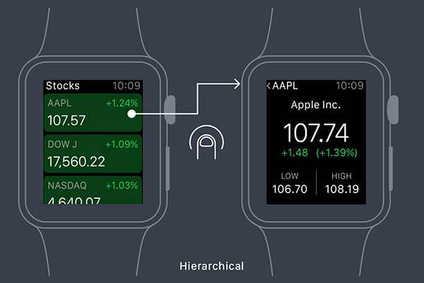
Designing for Apple Watch: Getting Started
In this article you will start to learn how to design an application for the Apple Watch with basic theory and principles to get started in design for wearables.
There are three parts to an Apple Watch app: the WatchKit App, a Glance screen, and Notifications. Each has different purposes and their own design challenges.
Use Flexbox Today, As Progressive Enhancement
From the Smashing Magazine email newsletter.
There is still a common misconception that Flexbox isn’t yet widely supported and can’t be used in real projects. Well, it isn’t true. Flexbox is a standardized specification, it’s well-supported (with Opera Mini supporting it since last Monday) with many ready-to-use solutions and in fact, we can use it today on UI components if we treat Flexbox as progressive enhancement. In fact, we can make boxes automatically grow to fill space, lay out boxes in any direction easily, align boxes on any side and place boxes out of order from HTML without duplicate markup.
We can’t build layouts with Flexbox-first approach, but browsers not supporting Flexbox will ignore Flexbox properties, so i.e. we could use
display: inline-blocktogether withdisplay: flex— with Flexbox-properties listed after the fallback properties. There are many resources on Flexbox and if you’d like to understand how to apply Flexbox in actual projects, Zoe M. Gillenwater’s Flexbox talk (47 min) and recent presentation could be very helpful. So, there is no reason not to use Flexbox today! (vf)

