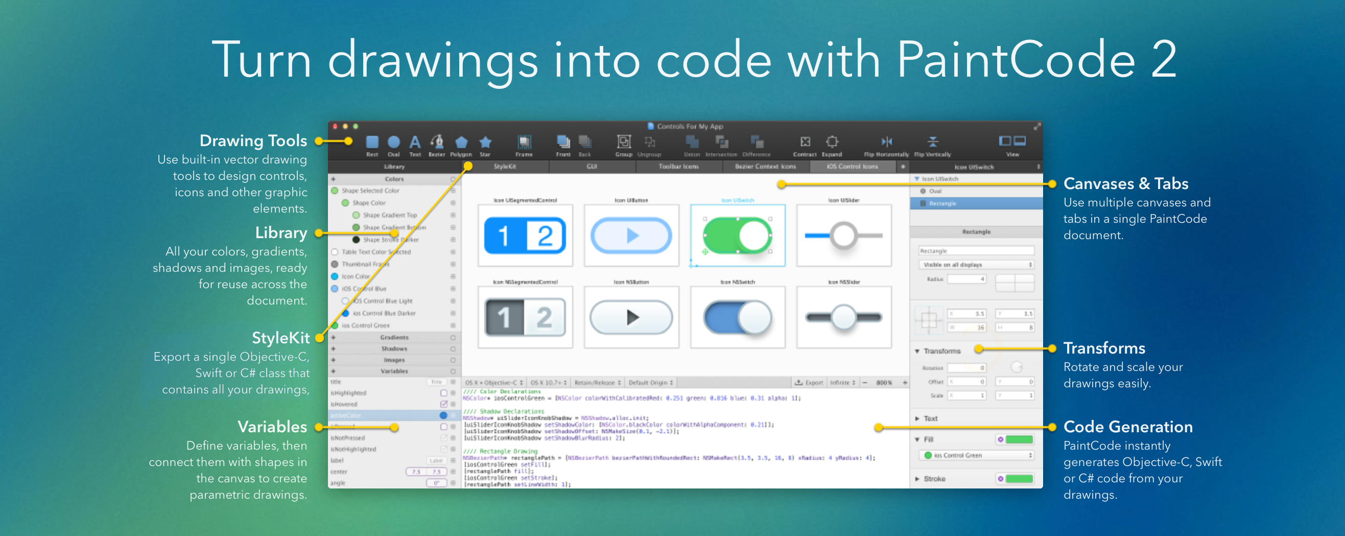
Use the code in your apps
The generated code is clean and readable. You can copy it into your project or use StyleKits.
Resolution independence & other benefits
No more @2x resources. Future proof. Creating dynamic, parametric drawings is easy.
Use the code in your apps
The generated code is clean and readable. You can copy it into your project or use StyleKits.
Resolution independence & other benefits
No more @2x resources. Future proof. Creating dynamic, parametric drawings is easy.
Side, corner, top and bottom off-menu effects created with CSS transitions and animations plus animated SVGs.

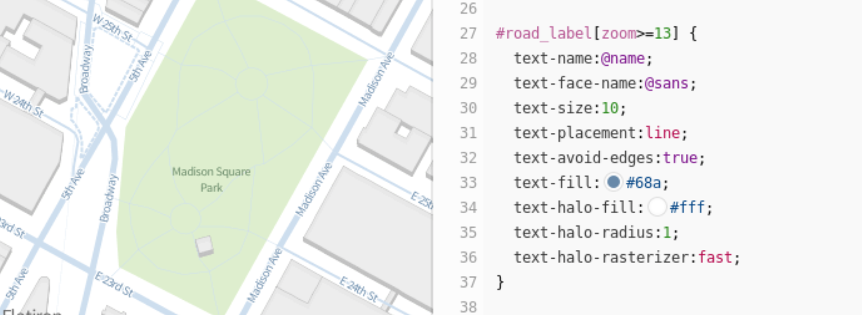
Mapbox Studio uses a language called CartoCSS to determine the look of a map. Colors, sizes, and shapes can all be manipulated by applying their specific CartoCSS parameters in the stylesheet panel to the right of the map. Read the CartoCSS manual for a more detailed introduction to the language…
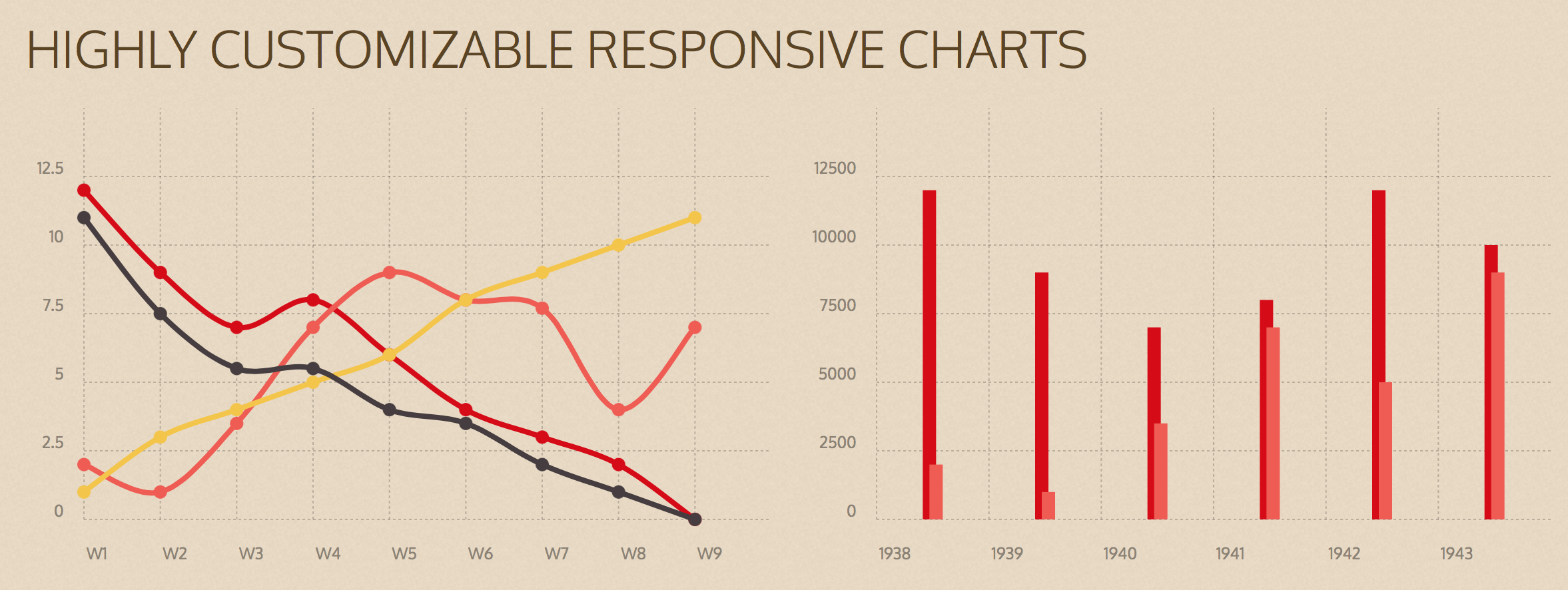
Chartist.js is a simple responsive charting library built with SVG. There are hundreds of nice charting libraries already out there, but they are either:
- not responsive
- use the wrong technologies for illustration (canvas)
- are not flexible enough while keeping the configuration simple
- are not friendly to your own code
- are not friendly to designers
- have unnecessary dependencies to monolithic libraries
- more annoying things
That’s why we have started Chartist.js and our goal is to solve all of the above issues.
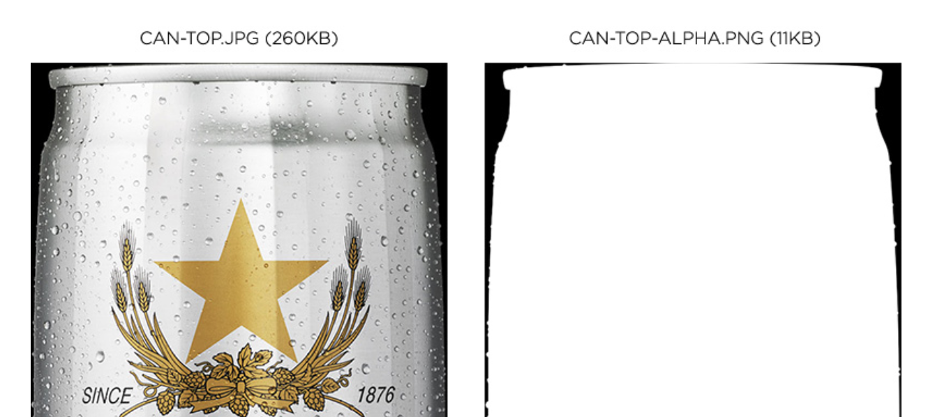
SVG trick with .jpg and .png mask – make big .jpgs have transparent areas
First, I created two files. The first is a regular JPEG without any transparency. You can compress this one as much as you like. The second is an 8-bit PNG (alpha mask). This is just a black and white image that represents the transparent areas of the beer can. Notice how the PNG is only 11KB; that’s because it contains so few colors and no transparency.
<svg preserveAspectRatio="xMinYMin" version="1.1" xmlns="http://www.w3.org/2000/svg" xmlns:xlink="http://www.w3.org/1999/xlink" viewBox="0 0 560 1388">
  <defs>
    <mask id="canTopMask">
      <image width="560" height="1388" xlink:href="img/can-top-alpha.png"></image>
    </mask>
  </defs>
  <image mask="url(#canTopMask)" id="canTop" width="560" height="1388" xlink:href="can-top.jpg"></image>
</svg>
Cross-browser fixes and hacks included. Note Internet Explorer width: 100%; addition to CSS.
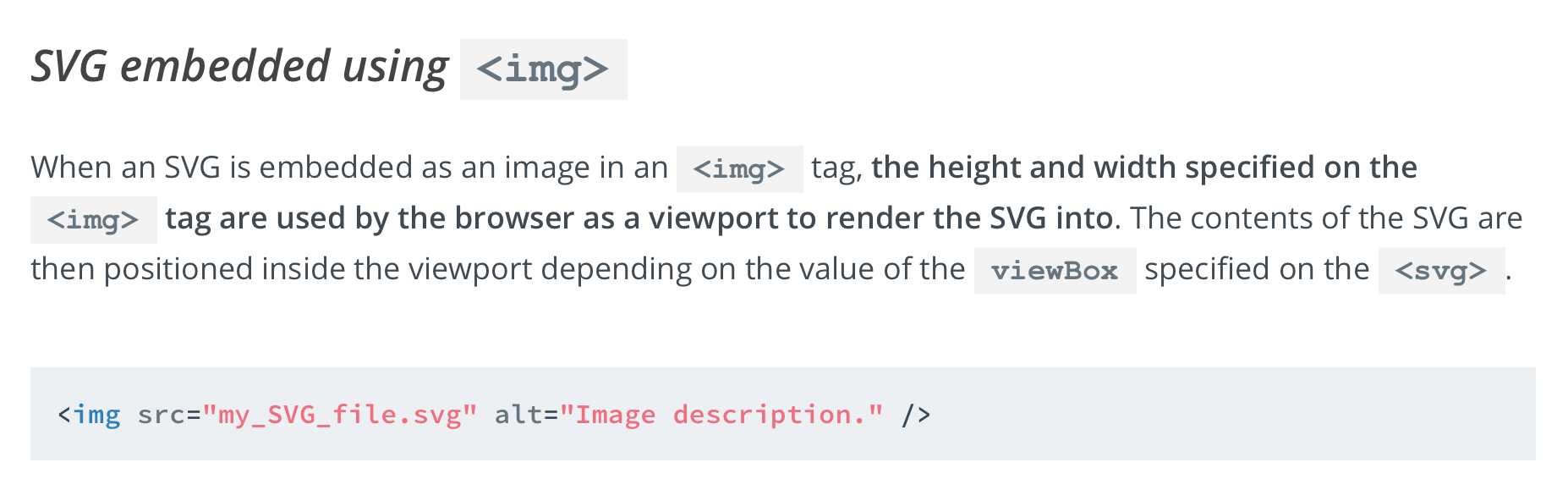
An SVG can be embedded on a web page in many ways; one of which is embedding it inline in an HTML5 page using the <svg&rt; tag. The other commonly used techniques include embedding it as an image using the <img&rt; tag, embedding it using the <object&rt; tag, using an iframe, and as a CSS background image.
At any point in an SVG drawing, you can establish new viewports and user coordinate systems by either nesting <svg>s or using elements such as the <symbol> element, among others. In this article we’re going to have a look at how we can do that and how this can be useful for controlling SVG elements and making them more flexible (and/or fluid).
This is the third and last article in a series of articles about SVG coordinate systems and transformations. In the first article, I covered everything you need to know to understand the basics of SVG coordinate systems; more specifically, the SVG viewport, and the viewBox and preserveAspectRatio attributes. In the second article, you can find everything you need to know about how SVG system transformations work.
SVG elements can be transformed by scaling, translating, skewing, and rotating—much like HTML elements can be transformed using CSS Transforms. However, there are certain inevitable differences when it comes to the coordinate systems used and affected by these transformations. In this article we’ll go over the SVG transform attribute and CSS property, covering how to use it, and things you should know about SVG coordinate system transformations.
SVG elements aren’t governed by a CSS box model like HTML elements are. This makes positioning and transforming these elements trickier and may seem—at first glance—less intuitive. However, once you understand how SVG coordinate systems and transformations work, manipulating SVGs becomes a lot easier and makes a lot more sense. In this article we’re going to go over three of the most important SVG attributes that control SVG coordinate systems: viewport, viewBox, and preserveAspectRatio.
