Interesting effect. Codepen by David Khourshid.
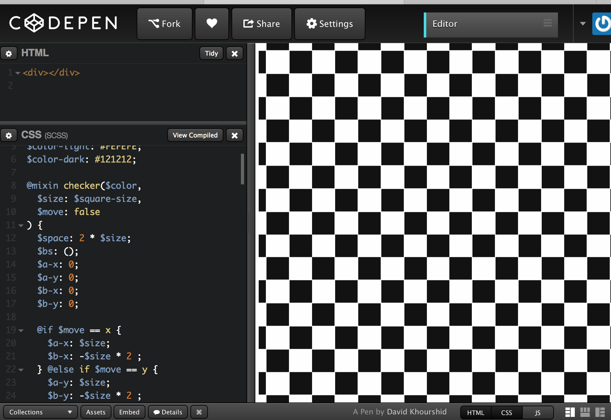
There are 16 blend modes available in CSS: normal (which is the default blend mode and means that no blending is applied), multiply, screen, overlay, darken, lighten, color-dodge, color-burn, hard-light, soft-light, difference, exclusion, hue, saturation, color and luminosity. (For the sake of brevity, I will refrain from going into technical detail about each of these modes, and will recommend this article instead to learn all about them.)
These blend modes will modify the colours of a background image resulting in a different effect for each mode.
65 useful tips as of 5-3-15.
A Good User Interface has high conversion rates and is easy to use. In other words, it’s nice to both the business side as well as the people using it. Here is a running idea list which we discovered.
Essentially the design and development phases are merging and if you’re naturally good at design and front-end development you will take to designing in the browser like a duck takes to water.
One major benefit of designing in the browser is that we can design based on realistic expectations. Sometimes designing in software can create unforeseen problems for front-end development. UI elements could be designed wonky or maybe they just don’t make any sense, it’s hard to explain to a client why you changed something, not because they won’t understand but because you’ve already pitched it in the design and had it approved. Designing in the browser lends itself to the idea of simplicity.
I’m not saying that every website should begin life in the browser, but as websites now need to be more adaptable than ever, it seems to make more sense to take this route. Designing in Photoshop (or a similar application) can have benefits, which I’ll look at later, but it can also have its drawbacks. Let’s take a look at some of these.
- Designs in Photoshop are fixed width.
- User experience can’t be demonstrated.
- Work gets repeated.
- Can be time consuming.
- Not an exact representation of how the final design will look.
Good article from TeamTreehouse in 2012.
The next era in designing for the web is a more advanced, mature and intelligent one. It’s about streamlining, semantics, great markup, responsive or fluid design, great typography, web fonts, content first, rapid prototyping and advanced javascript. My argument is that html, CSS and the browser tools we need have all advanced us past the point of needing Photoshop. If you want to be a great designer moving forward, I would start thinking about “Killing Photoshop” …
In the beginning, don’t even think about style. Instead, start with the foundation: the content. Lay the groundwork for your markup order, and ensure that your design will be useable with styles and images turned off. This is great for prioritizing the content, and puts you on the right path for accessibility and search engine optimization.
The main benefit of switching to designing in the browser is that we can deliver better results much faster, and speed up the development process significantly:
- Rapid prototyping with Foundation or Bootstrap allows us to set up website skeletons in hours, rather than days.
- We can see the content in context and decide if it’s the right place at the right time. Content strategy decisions take place at the same time (or earlier) as design decisions – this is the way it should be, but rarely is, when we work with static mockups.
- Since we’re building an interactive prototype, the client can actually click and browse through pages, experience interactions, and give feedback based on real user experience, not a hypothetical end-result.
- Since you are building your application to a fluid grid (and ideally, working mobile-first), you can instantly check and design for different devices: mobile and tablet views.
- It’s extremely fast to explore different colour, layout and typography variations across a whole product. By writing HTML and CSS (Sass, frequently) with frequent code reviews, the prototype’s code can go directly into production – no duplicate effort is required!
I want to dive a little deeper on some real-world design-in-browser instances. I’m designing in browser with my team on a current philosophie project — but there’s a twist: a mobile web application meant to have the look, feel, and behavior of a native iOS application.
It took us some time to figure out the best workflow for this project, but in the end, we chose to go with a happy medium of some traditional design exploration and Adobe Photoshop work mixed with in-browser iteration.
Rather than spending hours, days, weeks and months designing those pixel-perfect comps in Photoshop, a mainstay in a waterfall-oriented development process, designing in browser allows you to take whatever sketches and preliminary work you’ve conducted and enables you to jump right into the text editor and emerge with shippable code.
…There are many articles in the tech community that sing the praises of designing in browser — it’s future of web design, we should Kill Photoshop — to name a couple.