Apple has always had a funny relationship with responsive design. They’ve only sparingly used media queries to make minor visual tweaks on important pages, like their current homepage.
With iOS 6, and the subsequent release of the taller iPhone 5, Apple introduced something called Auto Layout—a relationship-based layout engine. Unlike the iPad, which required a separate build, apps for the taller iPhone were the same build with layout adjustments applied. Auto Layout was Apple’s first true foray into responsive design within native applications since, much like the web, different layout rules were applied to the same base code.
Last week, Apple introduced iOS 8, and with it, something they’re calling Adaptive UI. The main feature of Adaptive UI is the ability to specify layout rules based on Size Classes, which are really just breakpoints set by Apple.
Developers can now use a single View Controller (or page, in our world) with various layout rules applied across Size Classes (or breakpoints) to accommodate devices of all sizes. While there are only two Size Classes right now, compact and regular, Apple has left a lot of room to add more, or to even let developers set breakpoints themselves in the future.
It may be adaptive in name, and hard-coded breakpoints may seem like adaptive thinking, but the groundwork has been laid for responsive design within native iOS applications. It’s been interesting to watch Apple’s path from static, to adaptive, to responsive, and it’ll be even more interesting to watch third-party developers take advantage of the workflow benefits of responsive design that we’ve become accustomed to.
Category: Visual Design
Grid Style Sheets for Constraint-based Layouts
iOS-like Auto Layout applied to browser displays. Based on the same constraint algorithm.
CSS manages features like color and font selection quite well. But there’s an important fault at the core of CSS that rears its head when designing the actual layout of pages. Despite its declarative syntax it merely describes how a page will fit together, almost in an imperative way. An element will have so many pixels of padding, be a certain width, be floated right – but this doesn’t say anything about where it fits in relation to its neighbours and the page as a whole. It certainly doesn’t account for where it should be displayed on different sized screens, as this requires multiple definitions for a selector with media queries controlling the breakpoints.
Fortunately, there’s a better way. The solution is nothing short of the drastic solution of bypassing the entire browser layout engine, and replacing it with one that doesn’t suck. This way, we get to define what we want the layout to be, not how the layout should be constructed…
The solution is a JS library Grid Style Sheets, and it’s available right now for use in today’s browsers. It’s an implementation of the Cassowary constraint solver algorithm – the very same one used by Apple in its recent Auto Layout tooling – and it feels like something from the future. Note that this has nothing to do with traditional Layout Grids as used by designers, and available in CSS form – The Grid is the startup who has created GSS.
Import web pages into Sketch
Sometimes you need to tweak or slightly redesign an existing web page without original assets. Some common ways to do this would be to recreate a page from scratch, tweak it in a web inspector, or in the worst case make a screenshot and mess with bitmap (if you enjoy pain). Another hacky way to do that is to actually convert the web page to a vector graphic. Here is how I do it:
1. Convert page to SVG
Option one: Use http://derailer.org/paparazzi/ like so https://www.youtube.com/watch?v=9cgHQyXm4_Y to import a page into sketch. If it doesn’t work well try option two.Option two: Go to http://www.hiqpdf.com/demo/ConvertHtmlToSvg.aspx and insert the desired URL of a web page and the screen size.
Note: Sometimes you want to access a page behind a login, or an offline document. You can use this chrome extension http://cl.ly/VRdx to save a webpage as a single document and feed its internal code to hiqpdf converter.
Understanding Vector Shapes in Illustrator
Today’s Syllabus
Understanding Vector Shapes
Selection and Direct Selection Tools
Drawing Rectangles and Circles
Basic Bézier Curve Modification
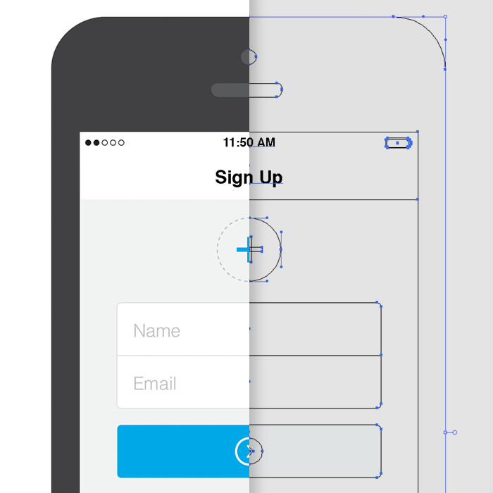
Real World Use Case – iPhone Sign Up ScreenUnderstanding Vector Shapes
Before we jump in too deep, you need to have a basic understanding of vector shapes, points, paths, and the tools used to manipulate them.
First, we’re going to draw a square in Illustrator. To do this, hit the M key on your keyboard. This is the quick key for selecting the rectangle tool. If you’re going to use Illustrator and want to get fast and furious with it, you must learn this quick key along with all of the others I subsequently mention. Don’t you dare go clicking on that tool panel without trying to remember the quick key first.
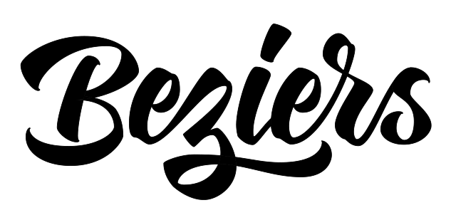
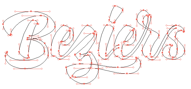
So What’s the Big Deal with Horizontal & Vertical Bezier Handles Anyway?
Have you ever seen Illustrator progress shots from your favourite designers and wondered how and why their bezier handles are so obsessively arranged? We’re hoping to shed a little light on this seemingly unnecessary process. Note: this tutorial assumes a solid grasp of Illustrator & the pen tool.
The Z-Axis: Designing for the Future
Building interfaces as a system of layers.
For years we’ve thought about the web as a two-dimensional space filled with pages that sit side by side on a flat, infinite plane. But as the devices we design for take on an increasingly diverse array of shapes and sizes, we should embrace new ways of designing up and down. By building interfaces using a system of layers, we solve tricky design problems, flexibly adapt to a variety of screens, and create new patterns that will point the way to future interactions.
In geometric terms, the z-axis is the vertex that measures space above and below the x- and y-axes. Translation for those of us who napped through geometry: it’s how we describe panels and layers that sit above or below one another.
Designing on the z-axis simply means incorporating three-dimensional physics—as represented by the z-axis—into our interface designs. Not the faux-depth of skeuomorphic text shadows and button highlights, but an interface made of components that exist on distinct layers and move independently of one another.

Type and font games
List of 18 Insanely Addictive Font Games from Mashable
Notable:
kerntype
7 Top Typography Tools and Resources
Mashable collection of 25 useful resources for typography “from fundamentals to modular scales.”
Typography is the foundation of design on the web. Back in 2006, designer and founder of iA Oliver Reichenstein even went so far as to proclaim “web design is 95% typography.”
It’s imperative, then, to have a thorough, grounded education in optimizing and utilizing typography to create a balanced, harmonious, accessible hierarchy of content, when working on the web.
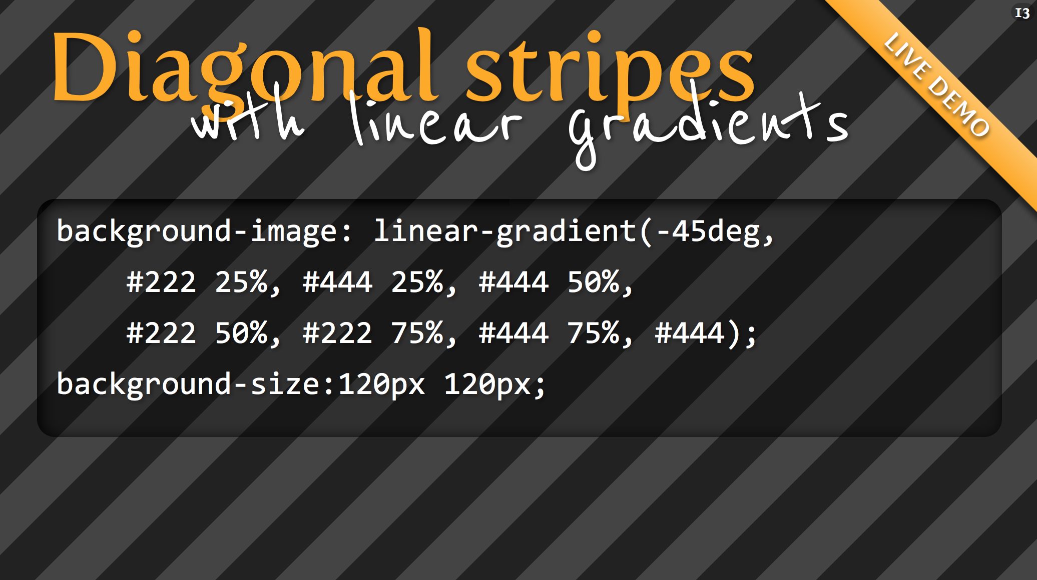
CSS3 gradients: From #000 to #fff in 45 minutes
Illustrator’s Pen Tool: The Comprehensive Guide
Comprehensive guide to vector drawing in Illustrator with the Pen tool. From Tuts+.
If you use Adobe Illustrator, then it’s almost certain that you use the Pen Tool when creating your paths. This comprehensive guide aims to introduce or remind you of features, shortcuts, and methods for working with what is arguably Adobe’s most essential tool.