The State of Web Type

Excellent article – covers FOUTs and font loading, ligatures, hyphenation & justification, more

Typography has a long and rich history, but much has been lost in the transition to the web. While browser support for typography has advanced a lot in the last couple years, we still have a long way to go. Features print designers take for granted are either nonexistent on the web or have insufficient browser support in order to be useful. Challenges unique to web browsers such as responsive design and web font loading could use some improvement as well. Let’s take a look at some of the features we need for an optimal and beautiful reading experience.

source

Harnessing Flexbox For Today’s Web Apps

Although the syntax might be initially confounding, flexbox lives up to its name. It creates intelligent boxes that are stretchable, squeezable and capable of changing visual order. It provides simple solutions to layout paradigms that CSS has always struggled with: vertical centering and equal heights. Flex items are truly accommodating and a pleasure to work with.

source

A Complete Guide to Flexbox

Since flexbox is a whole module and not a single property, it involves a lot of things including its whole set of properties. Some of them are meant to be set on the container (parent element, known as “flex container”) whereas the others are meant to be set on the children (said “flex items”).

If regular layout is based on both block and inline flow directions, the flex layout is based on “flex-flow directions.” Please have a look at this figure from the specification, explaining the main idea behind the flex layout.

flexbox diagram 1


Basically, items will be laid out following either the main axis (from main-start to main-end) or the cross axis (from cross-start to cross-end).

  • main axis – The main axis of a flex container is the primary axis along which flex items are laid out. Beware, it is not necessarily horizontal; it depends on the flex-direction property (see below).
  • main-start | main-end – The flex items are placed within the container starting from main-start and going to main-end.
  • main size – A flex item’s width or height, whichever is in the main dimension, is the item’s main size. The flex item’s main size property is either the ‘width’ or ‘height’ property, whichever is in the main dimension.
  • cross axis – The axis perpendicular to the main axis is called the cross axis. Its direction depends on the main axis direction.
  • cross-start | cross-end – Flex lines are filled with items and placed into the container starting on the cross-start side of the flex container and going toward the cross-end side.
  • cross size – The width or height of a flex item, whichever is in the cross dimension, is the item’s cross size. The cross size property is whichever of ‘width’ or ‘height’ that is in the cross dimension.

flexbox  diagram 2


source

New Features in Sketch 3.3, presented in GIF

  1. Percentage widths
  2. Math in width/height boxes
  3. Suffixes in width/height boxes
  4. Symbols + opacity, blending, shadow
  5. Document color presets

The days of detaching a symbol just to indicate an inactive or some other kinda state are over! With the new update, you can change the opacity, blending mode, or shadows of a Symbol and not muck up the original instance. Huge!

Also, bonus note, there was a visual change in how the symbol groups are displayed. When you’ve got one selected, you get a bright purple active color in the Layers List.

sketch-3.3-new-features


source

Top 20 Secrets of Coda 2

Great collection of tips for using Coda 2.

  1. Open A New File in a Split
  2. Use the Golden HTML + CSS + Live Preview Setup
  3. Explore the Preferences
  4. Create Site Groups
  5. Use Text Tabs
  6. Hide or Show Specific File Types
  7. Preview in a Simulated iPhone/iPad
  8. Access the Code Navigator in the Path Bar
  9. Add Custom Bookmarks to the Navigator
  10. Quickly Jump to Line
  11. Discover the Books
  12. Browse CSS Styles Inline
  13. Preview in a New Window
  14. Quickly Wrap Text in a Tag
  15. Blockedit Multiple Lines at Once
  16. Use Quick Open
  17. Discover the Text Processing Menu
  18. Drag Your Favorite Folders to Places
  19. Quickly Jump to CSS in Preview
  20. Bonus Tip: Customize Keyboard Shortcuts

coda2-splits


source

CSS hue-rotate: Why doesn’t hue rotation by +180deg and -180deg yield the original color?

Scroll down for answer 2. CSS filter: hue-rotate(XXdeg) gives unexpected results. This seems to be why –

Question:

By reading HSL/HSV color theory, I get the impression that hue component is a cyclical attribute that repeats every 360 degrees and can be changed independently of saturation and lightness/value. Correct me if I am wrong, but these statements logically follow the previous definition:

  • Rotating hue by 360 degrees yields the same color
  • Rotating hue by 180 degrees twice yields the original color
  • Rotating hue by 180 degrees followed by -180 degrees yields the original color
  • However, only the option 1 is correct. Rotating hue 4 times by +90 degrees yields a color that isn’t even remotely similar to the original.

Furthermore, using -webkit-filter and SVG’s 

don’t produce the same result for the same rotation. On the other hand, colors produced by SVG filters are consistent across browsers.

Is there any “hidden” property of hue rotation that makes the operation not associative?

Examples of both webkit filters and SVGs can be found here: http://jsfiddle.net/maros_urbanec/ARsjb/5/


Answer:

In both CSS and SVG filters, there is no conversion into HSV or HSL – the hueRotation shorthands are using a linear matrix approximation in RGB space to perform the hue rotation. This doesn’t conserve saturation or brightness very well for small rotations and highly saturated colors – as you’re seeing.

A true hue rotation, would first convert the input RGB color to HSL, adjust the H and then convert back to RGB. Filters don’t do this. And this conversion can’t be accurately approximated with a linear matrix, so while the hue is accurately changed(mostly), the saturation and brightness goes all over the place. These effects are non-linear, so adding smaller ops together results in different colors vs. doing one big operation.

(The difference between huerotation in SVG and CSS filters could be due to using different color spaces (sRGB vs. linearRGB) – these should be the same.)

Update: I got interested enough to go and do a manual comparison. As you can see, filters do a terrible job of hue rotating pure colors in the 0 to 180 degree range. This image compares a manual hue rotation done by plugging in hsl colors manually (outer ring) vs. a filter hue rotation on the base color (inner ring)

hue-css-rotate-bright

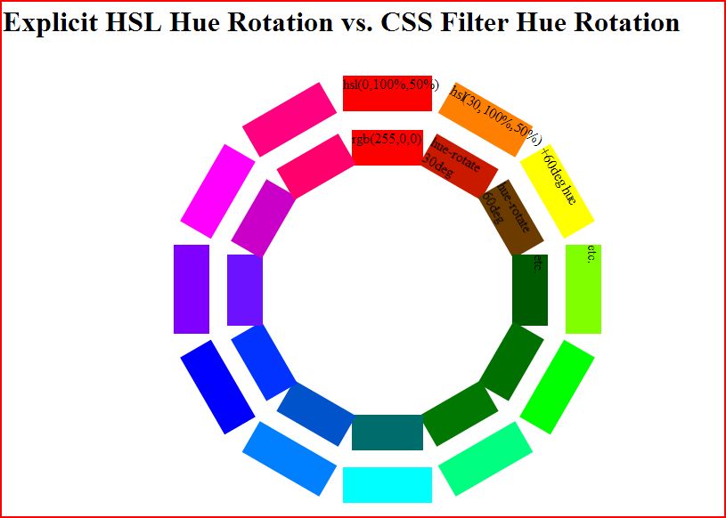
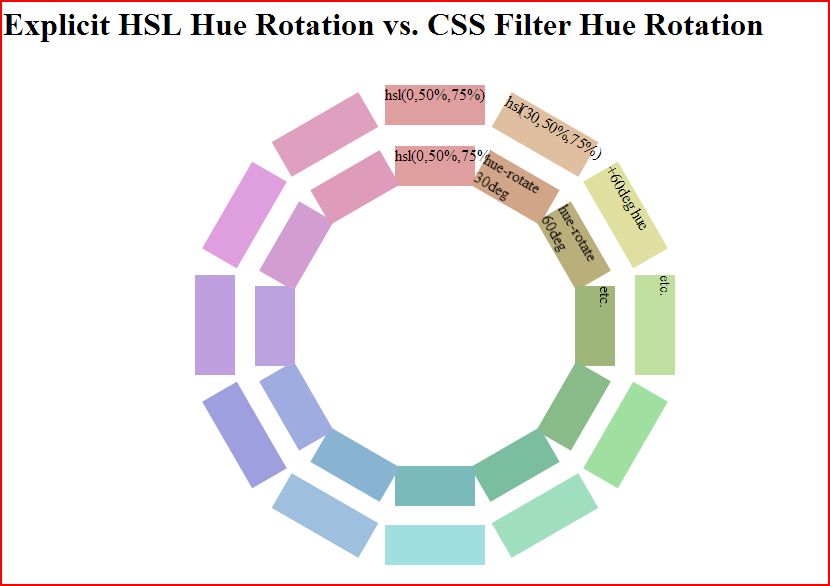
But, they do a better job at less pure colors like hsl(0,50%,75%) as you can see.

hue-css-rotate-faded


source