CONCLUSION
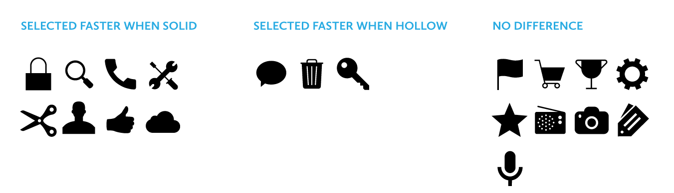
Johnson’s warning against using hollow icons in user interfaces just isn’t supported by evidence from real users. For one thing, an icon’s style doesn’t exist in isolation, but interacts with other attributes like color to create compounding effects on usability. Furthermore, less than half of the icons in my set of 20 performed better in a solid style than a hollow style. A different set of icons would likely result in a different overall result.
In any case, the small differences in recognition speed that I observed are not likely to cause any lasting fatigue for users. Research has shown that users begin to map the meaning of icons to their positions in the interface, so it’s not like users have to reinterpret each icon during every use. It is also important to consider that a two-style approach may have an accessibility benefit over using color alone to show an icon’s state, since it gives people with color blindness additional visual feedback. Of course, the first image in this article shows that Apple uses a combination of style, color, and labeling to reinforce usability.
My ultimate conclusion is one that most designers probably felt intuitively upon encountering the solid/hollow debate: designing icons to be both semantically clear and visually attractive is a complex exercise that doesn’t lend itself to simple binary rules. In fact, a closer look at Apple’s Human Interface Guidelines, which lay out its recommendations for solid/hollow icon design, acknowledge that some icons simply won’t work well in both styles.
Finally, I hope that this study highlights the importance of using real evidence to back up UI design decisions. Designers of all types need to think critically about best practices and back up their recommendations with solid (pun not intended, but embraced) research.