There are 16 blend modes available in CSS: normal (which is the default blend mode and means that no blending is applied), multiply, screen, overlay, darken, lighten, color-dodge, color-burn, hard-light, soft-light, difference, exclusion, hue, saturation, color and luminosity. (For the sake of brevity, I will refrain from going into technical detail about each of these modes, and will recommend this article instead to learn all about them.)
These blend modes will modify the colours of a background image resulting in a different effect for each mode.
Category: CSS
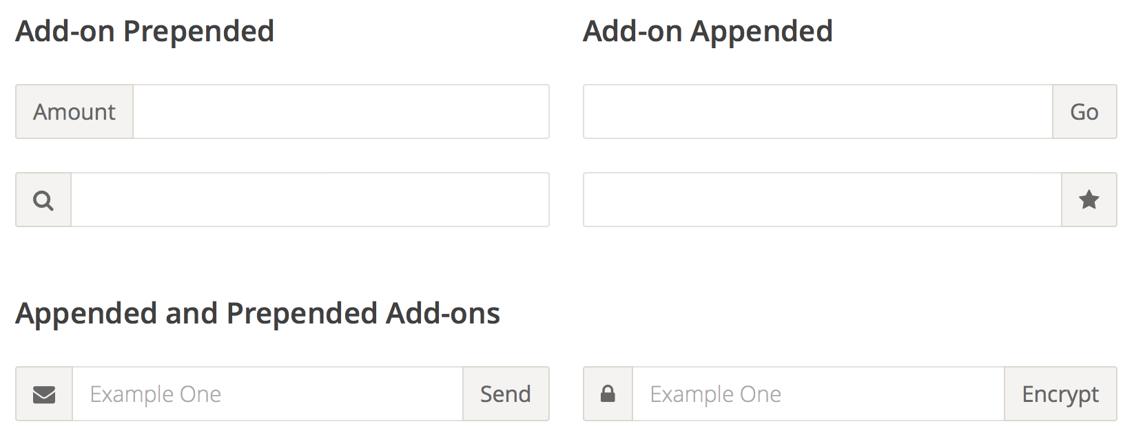
Input Add-ons
Because of the way input sizing works in CSS, it’s almost impossible to append or prepend another element to it and have the input field behave fluidly and take up the remaining space.
The only existing way to do this is to either know the exact width of the input, or to use something like display:table-cell, which has its own set of problems, most notably the difficulty with positioning anything absolutely inside of the add-on in certain browsers.
With Flexbox, all these problems go away, and the code is trivially simple. In addition, you get the input field and the input add-on to be the same height for free.
Use Flexbox Today, As Progressive Enhancement
From the Smashing Magazine email newsletter.
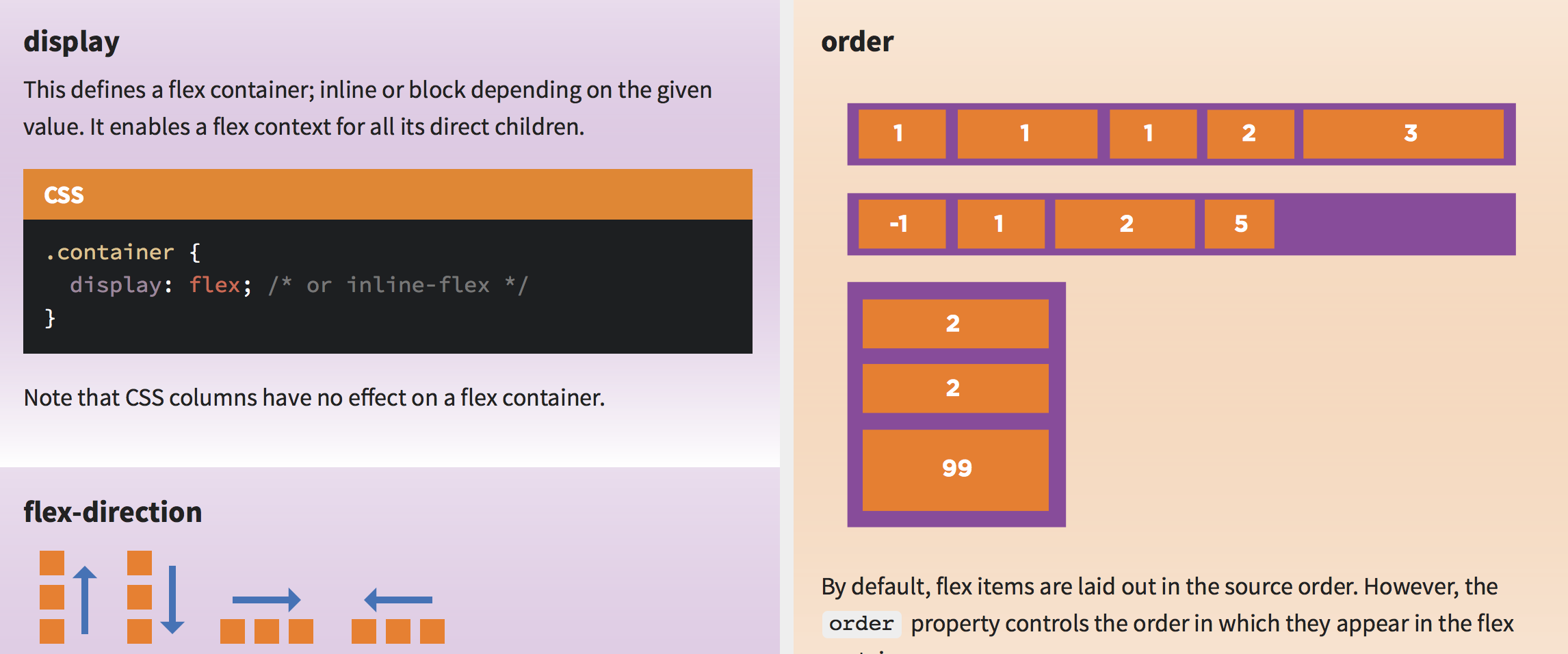
There is still a common misconception that Flexbox isn’t yet widely supported and can’t be used in real projects. Well, it isn’t true. Flexbox is a standardized specification, it’s well-supported (with Opera Mini supporting it since last Monday) with many ready-to-use solutions and in fact, we can use it today on UI components if we treat Flexbox as progressive enhancement. In fact, we can make boxes automatically grow to fill space, lay out boxes in any direction easily, align boxes on any side and place boxes out of order from HTML without duplicate markup.
We can’t build layouts with Flexbox-first approach, but browsers not supporting Flexbox will ignore Flexbox properties, so i.e. we could use
display: inline-blocktogether withdisplay: flex— with Flexbox-properties listed after the fallback properties. There are many resources on Flexbox and if you’d like to understand how to apply Flexbox in actual projects, Zoe M. Gillenwater’s Flexbox talk (47 min) and recent presentation could be very helpful. So, there is no reason not to use Flexbox today! (vf)
Using Flexbox Today
The major challenge that I see with Flexbox is that there’s a distinct gap between what we build today and how we’ll approach tomorrow. The prevailing attitude seems to be “Not for another x years”, or “we’ll wait for X browser to catch up”, but we don’t need to think like this anymore.
The State of Web Type
Excellent article – covers FOUTs and font loading, ligatures, hyphenation & justification, more
Typography has a long and rich history, but much has been lost in the transition to the web. While browser support for typography has advanced a lot in the last couple years, we still have a long way to go. Features print designers take for granted are either nonexistent on the web or have insufficient browser support in order to be useful. Challenges unique to web browsers such as responsive design and web font loading could use some improvement as well. Let’s take a look at some of the features we need for an optimal and beautiful reading experience.
Harnessing Flexbox For Today’s Web Apps
Although the syntax might be initially confounding, flexbox lives up to its name. It creates intelligent boxes that are stretchable, squeezable and capable of changing visual order. It provides simple solutions to layout paradigms that CSS has always struggled with: vertical centering and equal heights. Flex items are truly accommodating and a pleasure to work with.
A Complete Guide to Flexbox
Since flexbox is a whole module and not a single property, it involves a lot of things including its whole set of properties. Some of them are meant to be set on the container (parent element, known as “flex container”) whereas the others are meant to be set on the children (said “flex items”).
If regular layout is based on both block and inline flow directions, the flex layout is based on “flex-flow directions.” Please have a look at this figure from the specification, explaining the main idea behind the flex layout.
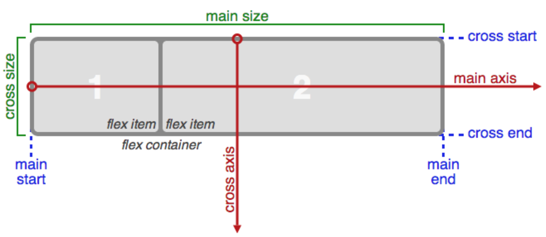
Basically, items will be laid out following either the
main axis(frommain-starttomain-end) or the cross axis (fromcross-starttocross-end).
- main axis – The main axis of a flex container is the primary axis along which flex items are laid out. Beware, it is not necessarily horizontal; it depends on the
flex-directionproperty (see below).- main-start | main-end – The flex items are placed within the container starting from main-start and going to main-end.
- main size – A flex item’s width or height, whichever is in the main dimension, is the item’s main size. The flex item’s main size property is either the ‘width’ or ‘height’ property, whichever is in the main dimension.
- cross axis – The axis perpendicular to the main axis is called the cross axis. Its direction depends on the main axis direction.
- cross-start | cross-end – Flex lines are filled with items and placed into the container starting on the cross-start side of the flex container and going toward the cross-end side.
- cross size – The width or height of a flex item, whichever is in the cross dimension, is the item’s cross size. The cross size property is whichever of ‘width’ or ‘height’ that is in the cross dimension.
RSCSS
Stylesheet structure, along the lines of BEM or SMACSS.
Reasonable Standard* for CSS Stylesheet Structure.
(*: or S can also stand for “suggestions”)
Codrops CSS reference
An extensive CSS reference with all the important properties and info to learn CSS from the basics.
Top 20 Secrets of Coda 2
Great collection of tips for using Coda 2.
- Open A New File in a Split
- Use the Golden HTML + CSS + Live Preview Setup
- Explore the Preferences
- Create Site Groups
- Use Text Tabs
- Hide or Show Specific File Types
- Preview in a Simulated iPhone/iPad
- Access the Code Navigator in the Path Bar
- Add Custom Bookmarks to the Navigator
- Quickly Jump to Line
- Discover the Books
- Browse CSS Styles Inline
- Preview in a New Window
- Quickly Wrap Text in a Tag
- Blockedit Multiple Lines at Once
- Use Quick Open
- Discover the Text Processing Menu
- Drag Your Favorite Folders to Places
- Quickly Jump to CSS in Preview
- Bonus Tip: Customize Keyboard Shortcuts
