When architecting CSS for a large scale project it’s a common aim to abstract visual patterns for re-use, DRY out code and normalise our designs as much as possible. However, for rapidly changing projects, I’m no longer convinced those principles should necessarily be followed to the nth degree, nor that they offer the biggest wins.
This post describes what I consider the most advantageous practices and approaches when authoring CSS for a rapidly changing, large scale web project.
Category: CSS
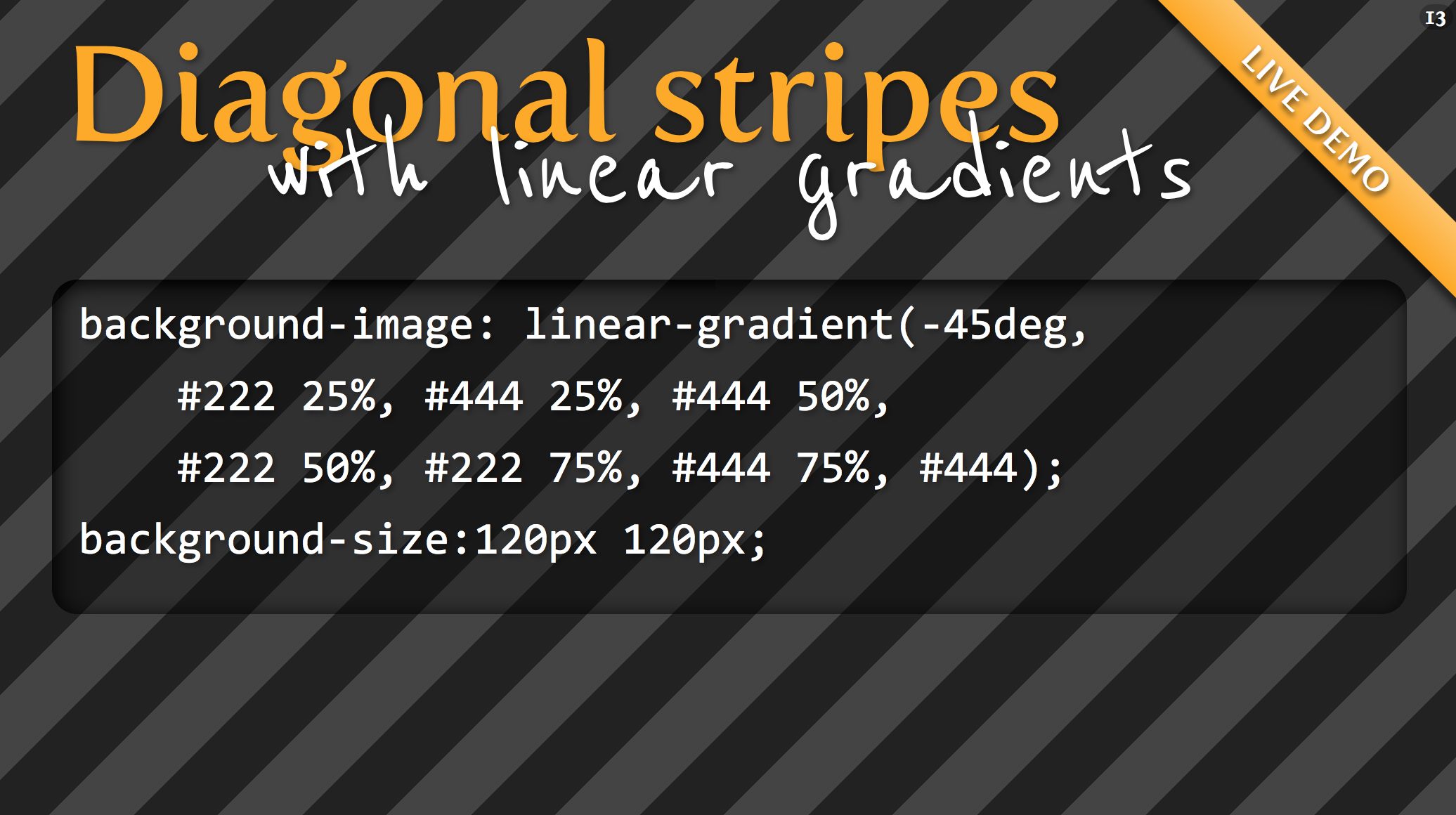
The Pattern Library – Seamless Background Tiles
Scroll/swipe down. The implementation is better than the content. A couple useful patterns.
How we make RWD sites load fast as heck
RWD: Responsive Web Design
In the past year I’ve spent a lot of time researching page loading performance, both for our ongoing client work here at FG and for my soon-to-be-released book for A Book Apart. In the process, I’ve reaffirmed my belief that we don’t need to compromise the well-known benefits of a responsive layout in order to make our sites load as fast as heck.
In this post, I’ll outline some recent observations and approaches to delivering sites for speed and broader access, and link out to various tools we are using to facilitate our approach. All of the tips mentioned in this post are implemented on this very site, and we’ve tested them heavily to ensure that they’re working as well as they can.
Everything You Need to Know About the CSS will-change Property
If you’ve ever noticed “that flicker” in WebKit-based browsers while performing certain CSS operations, especially CSS transforms and animations, then you’ve most likely come across the term “hardware acceleration” before.
The will-change property allows you to inform the browser ahead of time of what kinds of changes you are likely to make to an element, so that it can set up the appropriate optimizations before they’re needed, therefore avoiding a non-trivial start-up cost which can have a negative effect on the responsiveness of a page. The elements can be changed and rendered faster, and the page will be able to update snappily, resulting in a smoother experience.
Grid Style Sheets for Constraint-based Layouts
iOS-like Auto Layout applied to browser displays. Based on the same constraint algorithm.
CSS manages features like color and font selection quite well. But there’s an important fault at the core of CSS that rears its head when designing the actual layout of pages. Despite its declarative syntax it merely describes how a page will fit together, almost in an imperative way. An element will have so many pixels of padding, be a certain width, be floated right – but this doesn’t say anything about where it fits in relation to its neighbours and the page as a whole. It certainly doesn’t account for where it should be displayed on different sized screens, as this requires multiple definitions for a selector with media queries controlling the breakpoints.
Fortunately, there’s a better way. The solution is nothing short of the drastic solution of bypassing the entire browser layout engine, and replacing it with one that doesn’t suck. This way, we get to define what we want the layout to be, not how the layout should be constructed…
The solution is a JS library Grid Style Sheets, and it’s available right now for use in today’s browsers. It’s an implementation of the Cassowary constraint solver algorithm – the very same one used by Apple in its recent Auto Layout tooling – and it feels like something from the future. Note that this has nothing to do with traditional Layout Grids as used by designers, and available in CSS form – The Grid is the startup who has created GSS.
Using the :target pseudo-selector for alternative layouts
I really like the :target pseudo-selector. It enables you to style the target of a so called skip-link. For instance when you link to a section in an article: you could highlight the header of that section. Or you can use it for toggling simple drop-down menus — the ones you see a lot on small screens. But you can also use it to create a completely different layout.
I used this technique on my Daily Rectangle site. As you can see (if your browser supports the vh unit) all the images are as high as the viewport. That’s nice, it enables me to enjoy one single image. But sometimes I want to see all the images on a grid. I could have created a PHP script that responded to a querystring. Or a small JavaScript. But instead I used the :target pseudo-selector. It’s very simple. First I did this…
The new srcset and sizes explained
Uses picture/srcset/sizes polyfill picturefill 2.
There are now two responsive images solutions which can be combined or used on their own. This article focuses on the simpler one, which will do for almost all responsive content images, which aren’t art directed and should just stretch and squish with max-width: 100%;.
Until now we used media queries to determine which size the viewport is and which pixel density the screen has and load a specific source according to that. With srcset we don’t need that anymore.
We don’t tell the browser which source it should display at which screen size and pixel density, because that is inflexible and lead to dozens of lines of code and definitions just for one single image. Even worse, it’s not really future proof and we only support pixel densities that we defined. What if a 4x screens comes along tomorrow? Did you write media queries to support that? I haven’t. But with srcset we are covered.
What we do with srcset and sizes is, we tell the browser which sources, aka files, it has at its disposal and which width they have. Then we also tell the browser how wide the image should be displayed at any given viewport width. The browser now knows everything it needs to know to decide which image is appropriate to use. I like to imagine the img tag as a container. We as developers only define how big the container should be at any given point and the browser decides which source to load to get the best output for the user.
<article>
    <img srcset="large.jpg 1400w, medium.jpg 700w, small.jpg 400w"
         sizes="(min-width: 700px) 700px, 100vw"
         alt="A woman reading">
</article>>

* {
    margin: 0;
    padding: 0;
}

article {
    margin: 0 auto;
    max-width: 700px;
}

img {
    max-width: 100%;
}
CSS Box Shadow
Used in casting shadows off block-level elements (like divs). From CSS Tricks.
Outer Shadow
.shadow {
  box-shadow: 3px 3px 5px 6px #ccc;
}
- The horizontal offset of the shadow, positive means the shadow will be on the right of the box, a negative offset will put the shadow on the left of the box.
- The vertical offset of the shadow, a negative one means the box-shadow will be above the box, a positive one means the shadow will be below the box.
- The blur radius (optional), if set to 0 the shadow will be sharp, the higher the number, the more blurred it will be.
- The spread radius (optional), positive values increase the size of the shadow, negative values decrease the size. Default is 0 (the shadow is same size as blur).
- Color
Inner Shadow
.shadow {
  box-shadow: inset 0 0 10px #000000;
}
One-Side Only
Using a negative spread radius, you can get squeeze in a box shadow and only push it off one edge of a box.
.one-edge-shadow {
  box-shadow: 0 8px 6px -6px black;
}