Selected (filled-in) available. iOS 7 and Android.
![]()
Streamline 1600+ vector icons for iOS and Android. Adapt line thickness. Selected (filled-in) states and Sketch format available.
![]()
New grids for new experiences and applications. Highly recommended.
Using a Hammer When You Need a Nail Gun
Building things is hard. Building things with the wrong tools is even harder. The web has changed over the past several years and will continue to rapidly change. We’re racing away from an advertising web that discusses things to a web of doing and creating things.The shift from native apps to web apps has begun. Yet, we’re using the wrong tool to build these web apps — hacking away at frameworks and grids meant for marketing sites. In other words, we’re still swinging a hammer when we could be shooting a nail gun.
A 960° Look at the Grids of Internet Past
Nearly every grid system today is based on the same principals of the 960 Grid — a grid nearly a decade old — that has affected how nearly every site is coded today. A model that uses rows and columns, set to 12 or 16 numbered increments, to create nearly any layout.The 960 Grid allowed for rapid prototyping on the web and lowered the learning curve for designers to wrangle code. It gave us the start. And more powerful frameworks emerged offering UI libraries, predefined styles and JavaScript capabilities, yet the same grid style remained.
Over the last three years, Foundation has taken this grid style and made huge improvements in functionality. We were the first framework to go responsive with the grid and also the first to take the grid mobile-first. We’ve built upon it, adding offsets, source ordering right-to-left options and block grids. We’ve even harnessed the awesome power of Sass to have powerful Mixins that allow designers to build fully semantic markup with little-to-no presentational classes.
These things are all great, but they were still built for a different type of web experience.
Web Apps are the Future
As we said above, the web is changing. We’re transitioning to a more app-centric web. It’s time our grids followed suit.
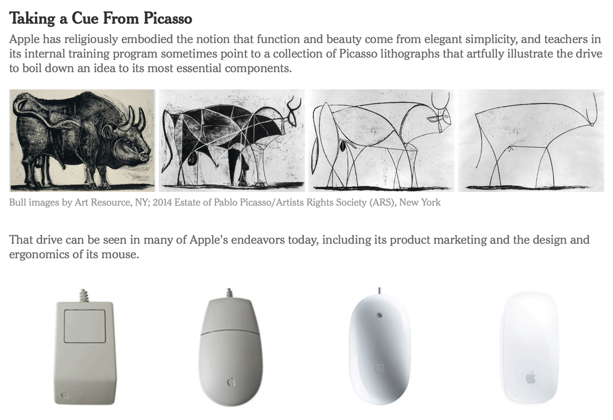
CUPERTINO, Calif. — Apple may well be the only tech company on the planet that would dare compare itself to Picasso.
In a class at the company’s internal training program, the so-called Apple University, the instructor likened the 11 lithographs that make up Picasso’s “The Bull” to the way Apple builds its smartphones and other devices. The idea: Apple designers strive for simplicity just as Picasso eliminated details to create a great work of art.
Steven P. Jobs established Apple University as a way to inculcate employees into Apple’s business culture and educate them about its history, particularly as the company grew and the tech business changed. Courses are not required, only recommended, but getting new employees to enroll is rarely a problem.
Although many companies have such internal programs, sometimes referred to as indoctrination, Apple’s version is a topic of speculation and fascination in the tech world.
It is highly secretive and rarely written about, referred to briefly in the biography of Mr. Jobs by Walter Isaacson. Apple employees are discouraged from talking about the company in general, and the classes are no exception. No pictures of the classrooms have surfaced publicly. And a spokeswoman for Apple declined to make instructors available for interviews for this article.
Curated library of iPhone and iPad user interface patterns, collected since 2011. Based in Prague. Categorized by app type.
Weekly links. Also available via email.
In Prototyping iOS Animations in Swift I introduced the a range of block-based functions that UIKit provides to create tweened animations and how a simple animation can be programmatically altered with some random variation to create more complex scenes.
This alone can create an interesting range of animations, but is still only the tip of the iceberg of what Apple provides as tools for creating animations.
This tutorial looks at some more animation functions that require a little bit more setting up to create, but once mastered opens up an even larger number of possibilities.
Learn UI and animations using Swift.
Swift is much easier to follow, especially if you’ve never done iOS development before. This chapter is for designers and complete beginners… I will focus on executing simple user interfaces and powerful animations instead of the language itself, which can be read in the Swift iBooks. You don’t need to have read the book before this chapter. I’ll include all the important information for designers.
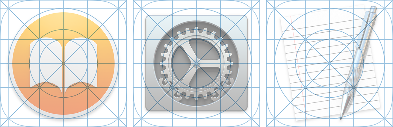
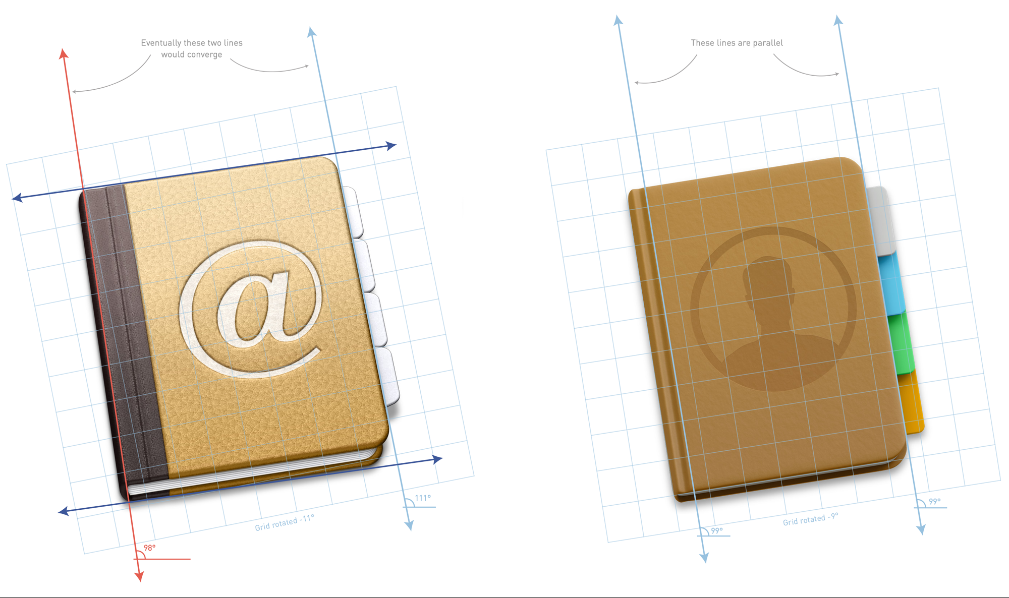
[In June 2014,] Apple released a preview of their new operating system, OS X Yosemite. Following the visual refresh in iOS 7, Yosemite features a significant visual change. Apple has added the familiar blur and translucent materials, a cleaner looking user interface, a new system font and updated icons.
I want to focus on my favorite visual update in Yosemite — the dock icons. Before Yosemite, Apple maintained a system for icon design through a checklist of mostly unstated and understood guidelines paired with a few specific recommendations in the Human Interface Guidelines (HIG). With Yosemite, that system becomes more consistent, and regular, yet the HIG remains silent on the specifics.The first thing people usually want to discuss with an update like this is the look and feel. However, there are plenty of comparisons between the Mavericks and Yosemite icons. They’re cleaner, they’ve removed the gloss, made things happier and brighter looking, and retained some skeuomorphic elements.
Like Marvelapp but more features and more expensive.
The App Design Process is Broken
It’s easy to catch issues in your design when you are testing an interactive prototype. Problem is, that usually doesn’t happen until development starts. At that point, it’s too late to fix things.Fix it With Flinto
You’ll be testing interactive prototypes from the start. Flinto makes it quick and easy to create prototypes that look just like the real thing. And Flinto doesn’t disrupt your current workflow because it uses the screens you’ve already designed.