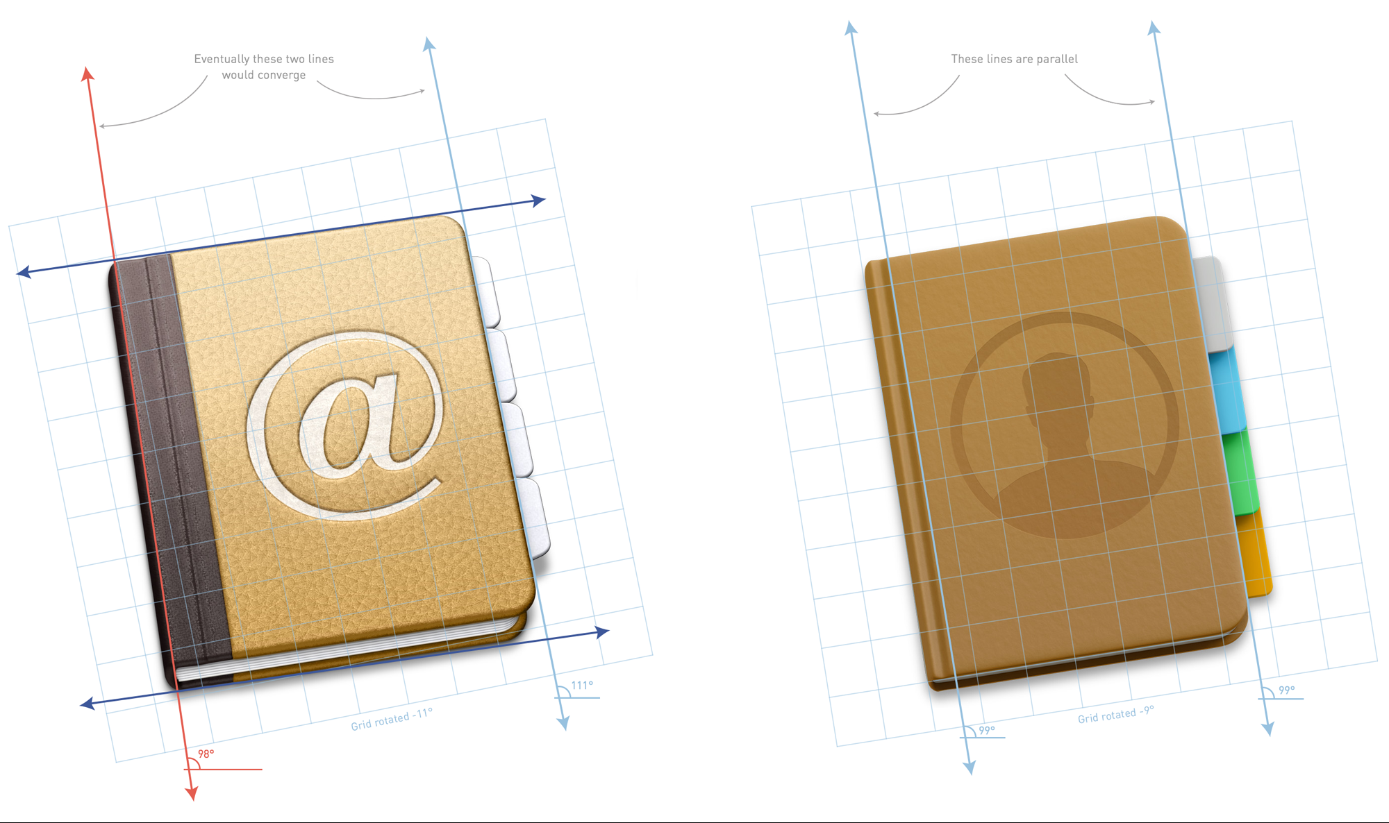
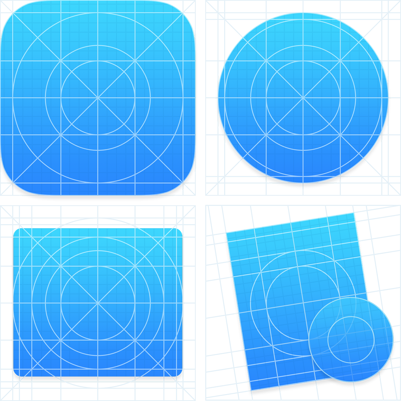
[In June 2014,] Apple released a preview of their new operating system, OS X Yosemite. Following the visual refresh in iOS 7, Yosemite features a significant visual change. Apple has added the familiar blur and translucent materials, a cleaner looking user interface, a new system font and updated icons.
I want to focus on my favorite visual update in Yosemite — the dock icons. Before Yosemite, Apple maintained a system for icon design through a checklist of mostly unstated and understood guidelines paired with a few specific recommendations in the Human Interface Guidelines (HIG). With Yosemite, that system becomes more consistent, and regular, yet the HIG remains silent on the specifics.The first thing people usually want to discuss with an update like this is the look and feel. However, there are plenty of comparisons between the Mavericks and Yosemite icons. They’re cleaner, they’ve removed the gloss, made things happier and brighter looking, and retained some skeuomorphic elements.


