Designing for Apple Watch: Getting Started

In this article you will start to learn how to design an application for the Apple Watch with basic theory and principles to get started in design for wearables.

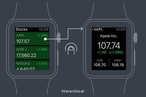
There are three parts to an Apple Watch app: the WatchKit App, a Glance screen, and Notifications. Each has different purposes and their own design challenges.

apple-watch-hierarchical


source

Use Flexbox Today, As Progressive Enhancement

From the Smashing Magazine email newsletter.

There is still a common misconception that Flexbox isn’t yet widely supported and can’t be used in real projects. Well, it isn’t true. Flexbox is a standardized specification, it’s well-supported (with Opera Mini supporting it since last Monday) with many ready-to-use solutions and in fact, we can use it today on UI components if we treat Flexbox as progressive enhancement. In fact, we can make boxes automatically grow to fill space, lay out boxes in any direction easily, align boxes on any side and place boxes out of order from HTML without duplicate markup.

We can’t build layouts with Flexbox-first approach, but browsers not supporting Flexbox will ignore Flexbox properties, so i.e. we could use display: inline-block together with display: flex — with Flexbox-properties listed after the fallback properties. There are many resources on Flexbox and if you’d like to understand how to apply Flexbox in actual projects, Zoe M. Gillenwater’s Flexbox talk (47 min) and recent presentation could be very helpful. So, there is no reason not to use Flexbox today! (vf)

source

Adobe Comp CC, The Best Thing To Happen to Layout Ideation Since The Cocktail Napkin

Free Adobe iPad app for creating comps. Video at the link.

Built on the Adobe Creative SDK, Comp CC couples intuitive iPad gestures, fonts from Typekit, and the personal assets stored in Creative Cloud Libraries to provide designers with the perfect mobile brainstorming and layout work surface. Then, with a single click, comps can be sent to Adobe InDesign CC, Adobe Illustrator CC, or Adobe Photoshop CC (where CC Libraries assets and fonts from Typekit are also synced) to fine-tune and finish the work. It’s this powerful connection back to the desktop, where designers do so much of their work, that makes Comp CC, and all of our mobile apps, so valuable.

adobe-comp-cc


source

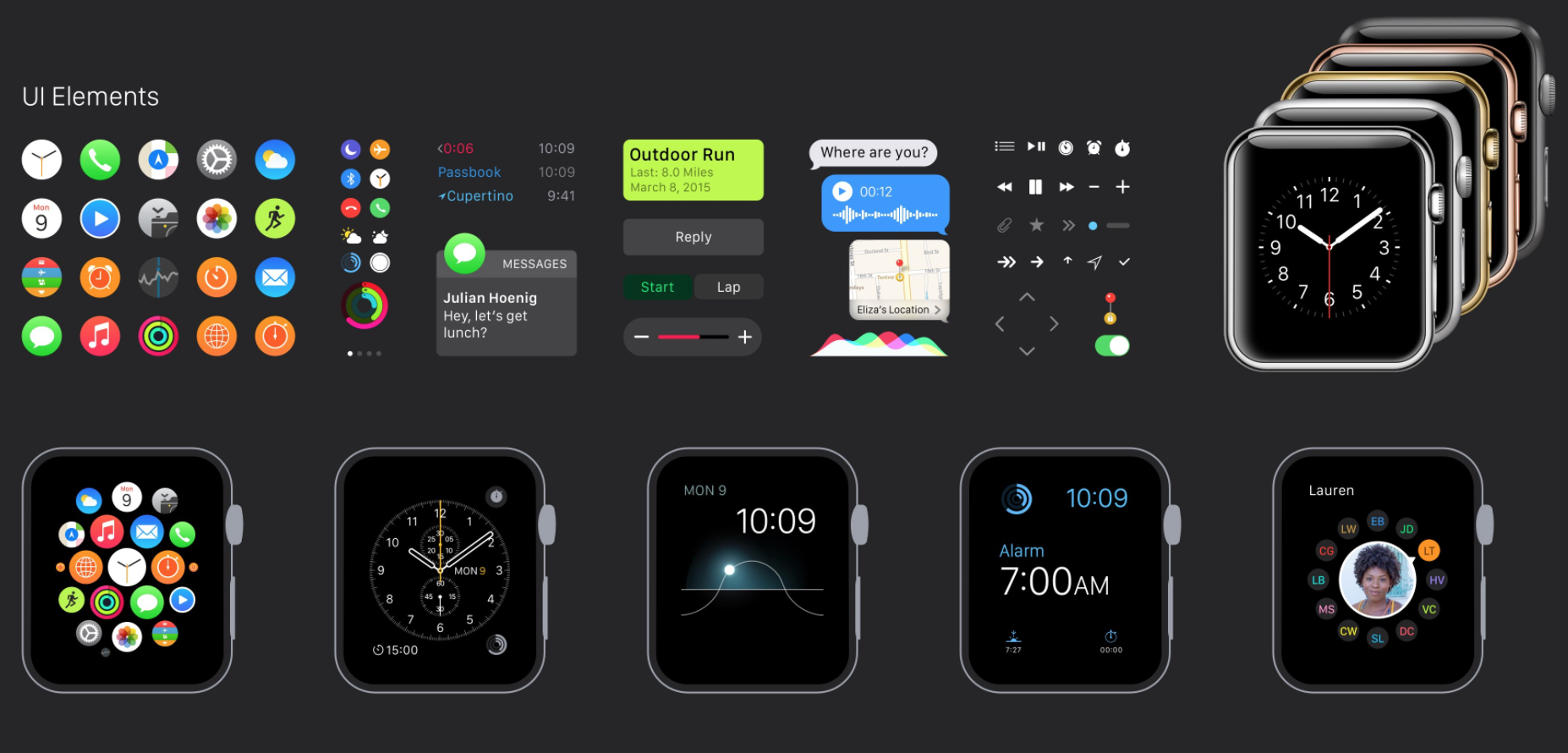
Apple Watch GUI for Sketch

Free download from design+code. Requires the San Francisco font, available from the Apple Watch Design Resources link on the WatchKit page (iOS Developer Certificate required).

100% vector including devices, icons and clocks. Every element, including the Apple Watch devices, icons and clocks have been vectorized in Sketch. You can resize, export and [use] them at any resolution.

apple-watch-for-sketch


source

Unitools

αℓℓ тнє ƒυη υηι¢σ∂є мαρριηgѕ ιη σηє ρℓα¢є
คll tђє Ŧยภ ยภเς๏๔є ๓คקקเภﻮร เภ ๏ภє קlคςє
Λᄂᄂ ƬΉΣ FЦП ЦПIᄃӨDΣ MΛPPIПGƧ IП ӨПΣ PᄂΛᄃΣ
ⓐⓛⓛ ⓣⓗⓔ ⓕⓤⓝ ⓤⓝⓘ©ⓞⓓⓔ ⓜⓐⓟⓟⓘⓝⓖⓢ ⓘⓝ ⓞⓝⓔ ⓟⓛⓐ©ⓔ

ǝuo uʍop ǝpısdn ǝɥʇ ƃuıpnlɔuı

source

The State of Web Type

Excellent article – covers FOUTs and font loading, ligatures, hyphenation & justification, more

Typography has a long and rich history, but much has been lost in the transition to the web. While browser support for typography has advanced a lot in the last couple years, we still have a long way to go. Features print designers take for granted are either nonexistent on the web or have insufficient browser support in order to be useful. Challenges unique to web browsers such as responsive design and web font loading could use some improvement as well. Let’s take a look at some of the features we need for an optimal and beautiful reading experience.

source
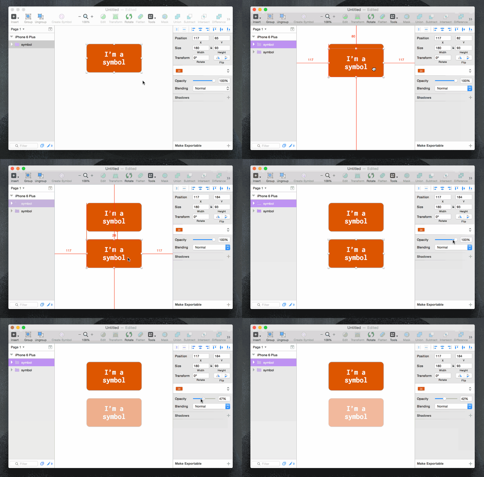
New Features in Sketch 3.3, presented in GIF

  1. Percentage widths
  2. Math in width/height boxes
  3. Suffixes in width/height boxes
  4. Symbols + opacity, blending, shadow
  5. Document color presets

The days of detaching a symbol just to indicate an inactive or some other kinda state are over! With the new update, you can change the opacity, blending mode, or shadows of a Symbol and not muck up the original instance. Huge!

Also, bonus note, there was a visual change in how the symbol groups are displayed. When you’ve got one selected, you get a bright purple active color in the Layers List.

sketch-3.3-new-features


source