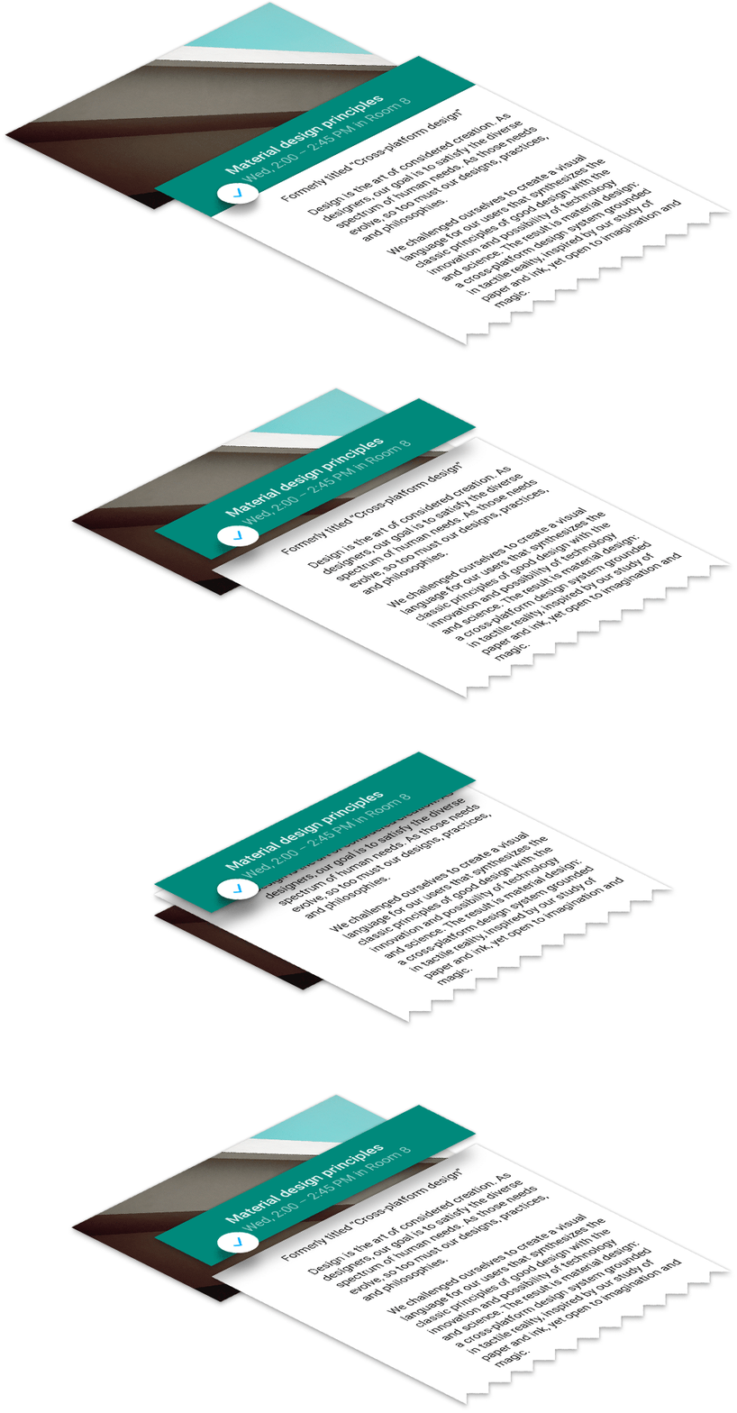
Every year for Google I/O, we publish an Android app for the conference that serves two purposes. First, it serves as a companion for conference attendees and those tuning in from home, with a personalized schedule, a browsing interface for talks, and more. Second, and arguably more importantly, it serves as a reference demo for Android design and development best practices.
On the design front, this year’s I/O app uses the new material design approach and features of the Android L Developer Preview to present content in a rational, consistent, adaptive and beautiful way.
Category: Visual Design
Foundation: A New Grid
New grids for new experiences and applications. Highly recommended.
Using a Hammer When You Need a Nail Gun
Building things is hard. Building things with the wrong tools is even harder. The web has changed over the past several years and will continue to rapidly change. We’re racing away from an advertising web that discusses things to a web of doing and creating things.The shift from native apps to web apps has begun. Yet, we’re using the wrong tool to build these web apps — hacking away at frameworks and grids meant for marketing sites. In other words, we’re still swinging a hammer when we could be shooting a nail gun.
A 960° Look at the Grids of Internet Past
Nearly every grid system today is based on the same principals of the 960 Grid — a grid nearly a decade old — that has affected how nearly every site is coded today. A model that uses rows and columns, set to 12 or 16 numbered increments, to create nearly any layout.The 960 Grid allowed for rapid prototyping on the web and lowered the learning curve for designers to wrangle code. It gave us the start. And more powerful frameworks emerged offering UI libraries, predefined styles and JavaScript capabilities, yet the same grid style remained.
Over the last three years, Foundation has taken this grid style and made huge improvements in functionality. We were the first framework to go responsive with the grid and also the first to take the grid mobile-first. We’ve built upon it, adding offsets, source ordering right-to-left options and block grids. We’ve even harnessed the awesome power of Sass to have powerful Mixins that allow designers to build fully semantic markup with little-to-no presentational classes.
These things are all great, but they were still built for a different type of web experience.
Web Apps are the Future
As we said above, the web is changing. We’re transitioning to a more app-centric web. It’s time our grids followed suit.
Font Awesome Symbols for Sketch
It’s all the goodness of Font Awesome in easily accessible symbols crafted specifically for Sketch 3!
Just go to Insert > Symbols and choose the Font Awesome icon you’d like to include. The icons are organized alphabetically and aliases are included.
You can safely delete the Instructions artboard and/or page and start your own Sketch project with the power of Font Awesome!
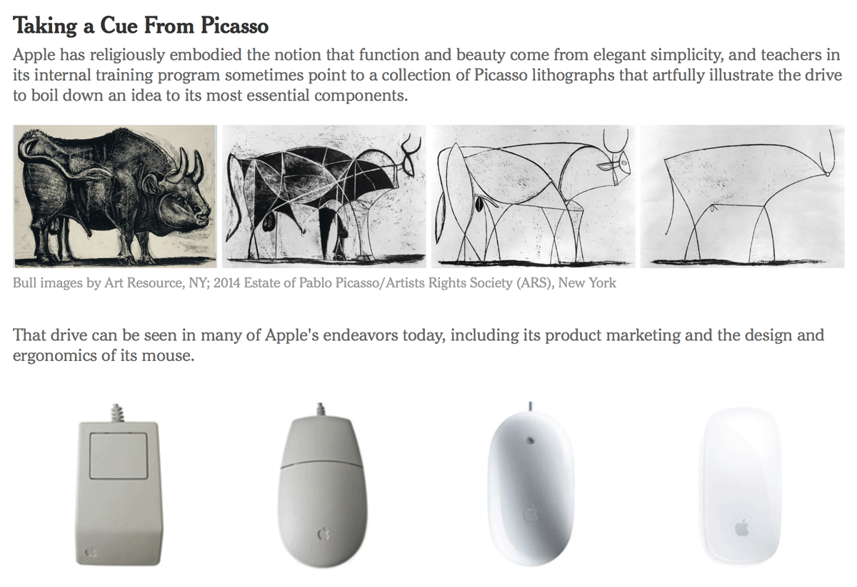
Simplifying the Bull: How Picasso Helps to Teach Apple’s Style
CUPERTINO, Calif. — Apple may well be the only tech company on the planet that would dare compare itself to Picasso.
In a class at the company’s internal training program, the so-called Apple University, the instructor likened the 11 lithographs that make up Picasso’s “The Bull” to the way Apple builds its smartphones and other devices. The idea: Apple designers strive for simplicity just as Picasso eliminated details to create a great work of art.
Steven P. Jobs established Apple University as a way to inculcate employees into Apple’s business culture and educate them about its history, particularly as the company grew and the tech business changed. Courses are not required, only recommended, but getting new employees to enroll is rarely a problem.
Although many companies have such internal programs, sometimes referred to as indoctrination, Apple’s version is a topic of speculation and fascination in the tech world.
It is highly secretive and rarely written about, referred to briefly in the biography of Mr. Jobs by Walter Isaacson. Apple employees are discouraged from talking about the company in general, and the classes are no exception. No pictures of the classrooms have surfaced publicly. And a spokeswoman for Apple declined to make instructors available for interviews for this article.
Affinity Designer – Vector Illustration Software
Vector design software for OS X. Beta available as of 8-11-14.
We don’t do spinning beach balls. Working in Affinity Designer is always live – pan and zoom at 60fps, transform objects in correct z-order, make adjustments or apply effects in realtime and always see live previews of brushes or tools. Whether it’s a 100 megapixel image or the most complex vector drawing with thousands of curves, it’s still the same and never runs out of memory. You have never experienced anything like it.
Pttrns – iPhone and iPad user interface patterns
Curated library of iPhone and iPad user interface patterns, collected since 2011. Based in Prague. Categorized by app type.
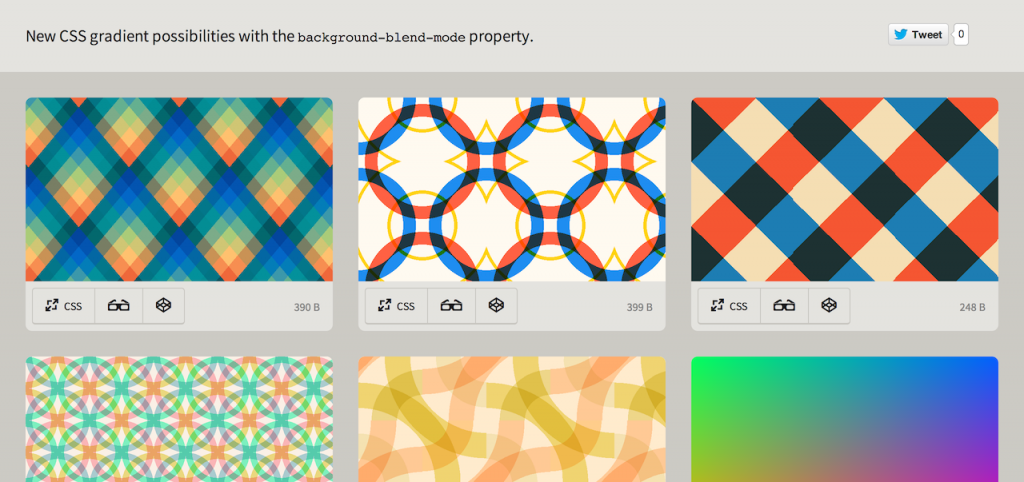
CSS Gradients with background-blend-mode
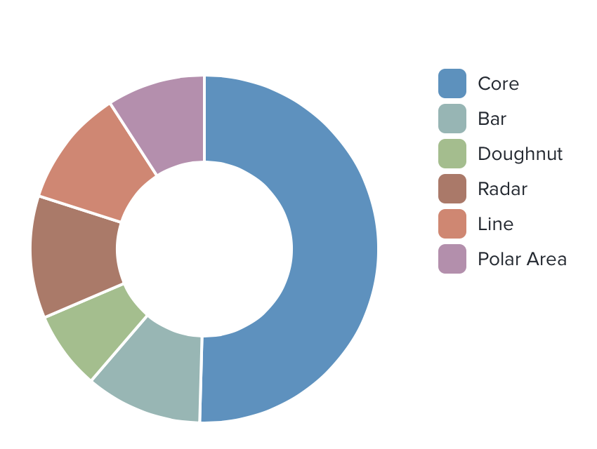
Chart.js: Open source HTML5 charts
Semiotics explained
All design communicates something – no such thing as “neutral” design.
Semiotics is an investigation into how meaning is created and how meaning is communicated. Its origins lie in the academic study of how signs and symbols (visual and linguistic) create meaning.
It is a way of seeing the world, and of understanding how the landscape and culture in which we live has a massive impact on all of us unconsciously.
…Everyone is a semiotician, because everyone is constantly unconsciously interpreting the meaning of signs around them – from traffic lights to colours of flags, the shapes of cars, the architecture of buildings, and the design of cereal packaging.
Learn Sketch 3
Sketch uses one unit, styles only relevant to UI design, a built-in iPhone previewing tool called Mirror and Artboards, the most efficient way to template multiple screens.
Design isn’t hard to learn. That’s because most of us are already building products and are familiar with what design means. What used to be complex and confusing is now simple and effective, thanks to Sketch, an app that is entirely focused on user interface design. Unlike Photoshop, you don’t need to worry about photo editing and the hundreds of other settings that are noises to designing a simple application.
