CSS Shapes allow web designers to wrap content around custom paths, like circles, ellipses and polygons, thus breaking free from the constraints of the rectangle.
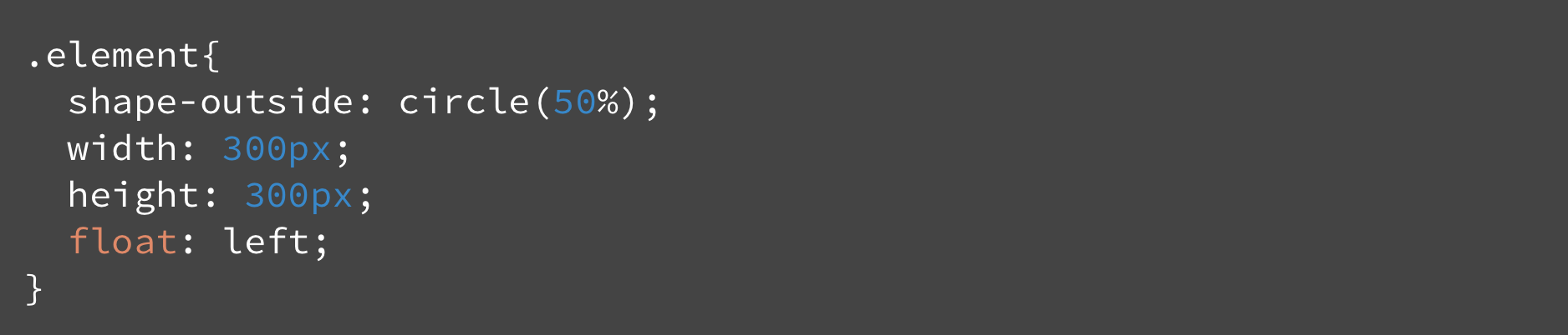
CSS Shapes allow web designers to wrap content around custom paths, like circles, ellipses and polygons, thus breaking free from the constraints of the rectangle.
Side, corner, top and bottom off-menu effects created with CSS transitions and animations plus animated SVGs.

Tutorial from Typekit
In this lesson, we’ll review the essential traits of a good body text typeface: sturdy shapes, even color, and an active texture.

1) The typographic quality of your document is determined largely by how the body text looks…
In turn, the appearance of the body text is determined primarily by these four typographic choices:
2) point size is the size of the letters. In print, the most comfortable range for body text is 10–12 point. On the web, the range is 15–25 pixels. Not every font appears equally large at a given point size, so be prepared to adjust as necessary.
3) line spacing is the vertical distance between lines. It should be 120–145% of the point size. In word processors, use the “Exact” line-spacing option to achieve this. The default single-line option is too tight; the 1½-line option is too loose. In CSS, use line-height.
4) line length is the horizontal width of the text block. Line length should be an average of 45–90 characters per line (use your word-count function) or 2–3 lowercase alphabets, like so:
abcdefghijklmnopqrstuvwxyzabcdefghijklmnopqrstuvwxyzabcd
In a printed document, this usually means page margins larger than the traditional one inch. On a web page, it usually means not allowing the text to flow to the edges of the browser window.
5) And finally, font choice. The fastest, easiest, and most visible improvement you can make to your typography is to ignore the fonts that came free with your computer (known as system fonts) and buy a professional font (like my fonts equity and concourse, or others found in font recommendations). A professional font gives you the benefit of a professional designer’s skills without having to hire one.
If that’s impossible, you can still make good typography with system fonts. But choose wisely. And never choose times new roman or Arial, as those fonts are favored only by the apathetic and sloppy. Not by typographers. Not by you.
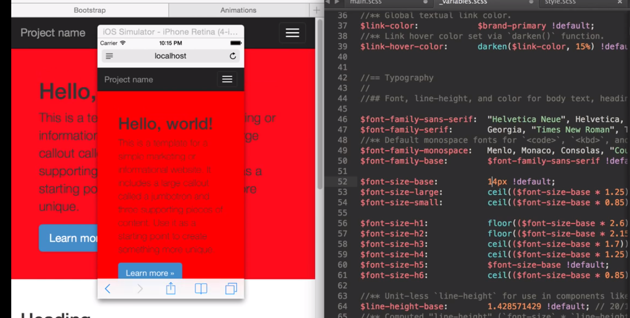
Javascript for live browser updates of SCSS or CSS changes. Install via npm (default package manager for Node.js).
Excellent Illustrator collection of iOS 8 elements. Interface controls and lots of icons included.
Apple’s UI changes from iOS 7 to iOS 8 are often subtle, yet incredibly extensive. Spacing, positioning, and font sizes and weights were liberally tweaked and adjusted. To our surprise, almost every icon was redrawn as well. Even the lowly chevron and back arrow were reworked.
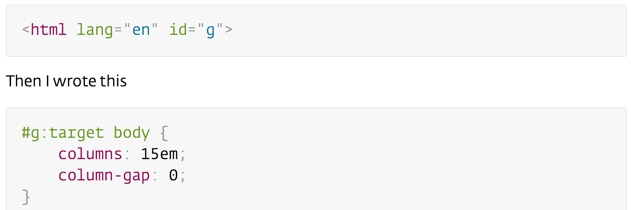
I really like the :target pseudo-selector. It enables you to style the target of a so called skip-link. For instance when you link to a section in an article: you could highlight the header of that section. Or you can use it for toggling simple drop-down menus — the ones you see a lot on small screens. But you can also use it to create a completely different layout.