Reduce jpegs by 30-80% without perceptible quality loss. Web (free, limited) and desktop versions available. Mac, windows. $19.99 for desktop version.
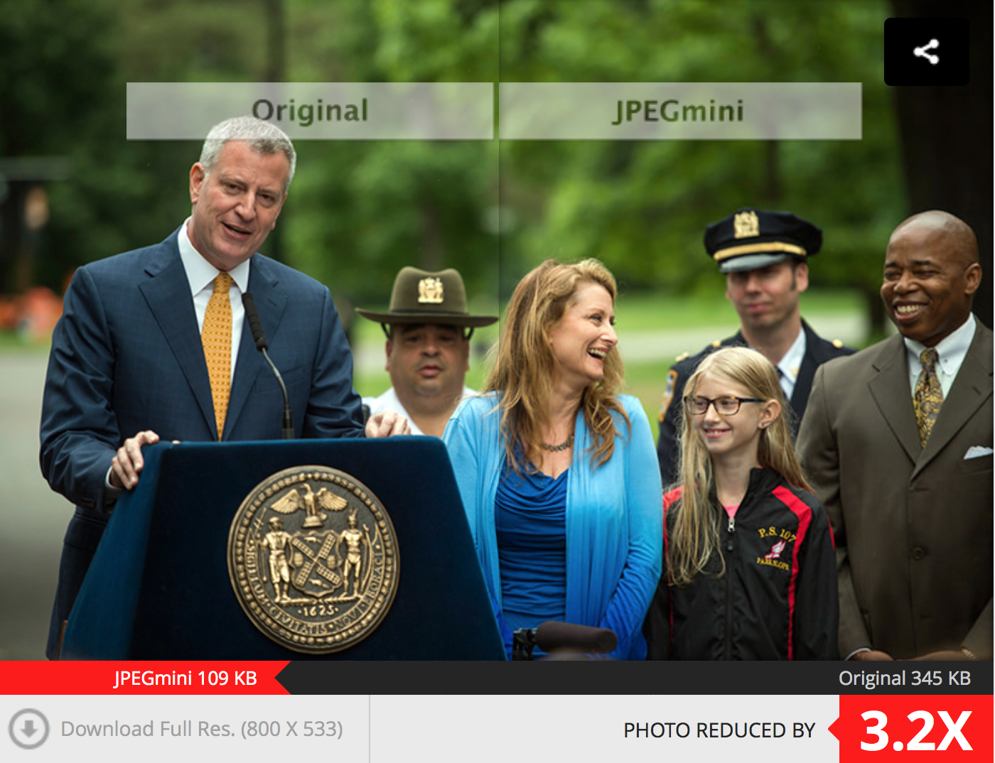
Reduce jpegs by 30-80% without perceptible quality loss. Web (free, limited) and desktop versions available. Mac, windows. $19.99 for desktop version.
Version Control with git – e-book or video course; free cheatsheet and other tools/info at the source
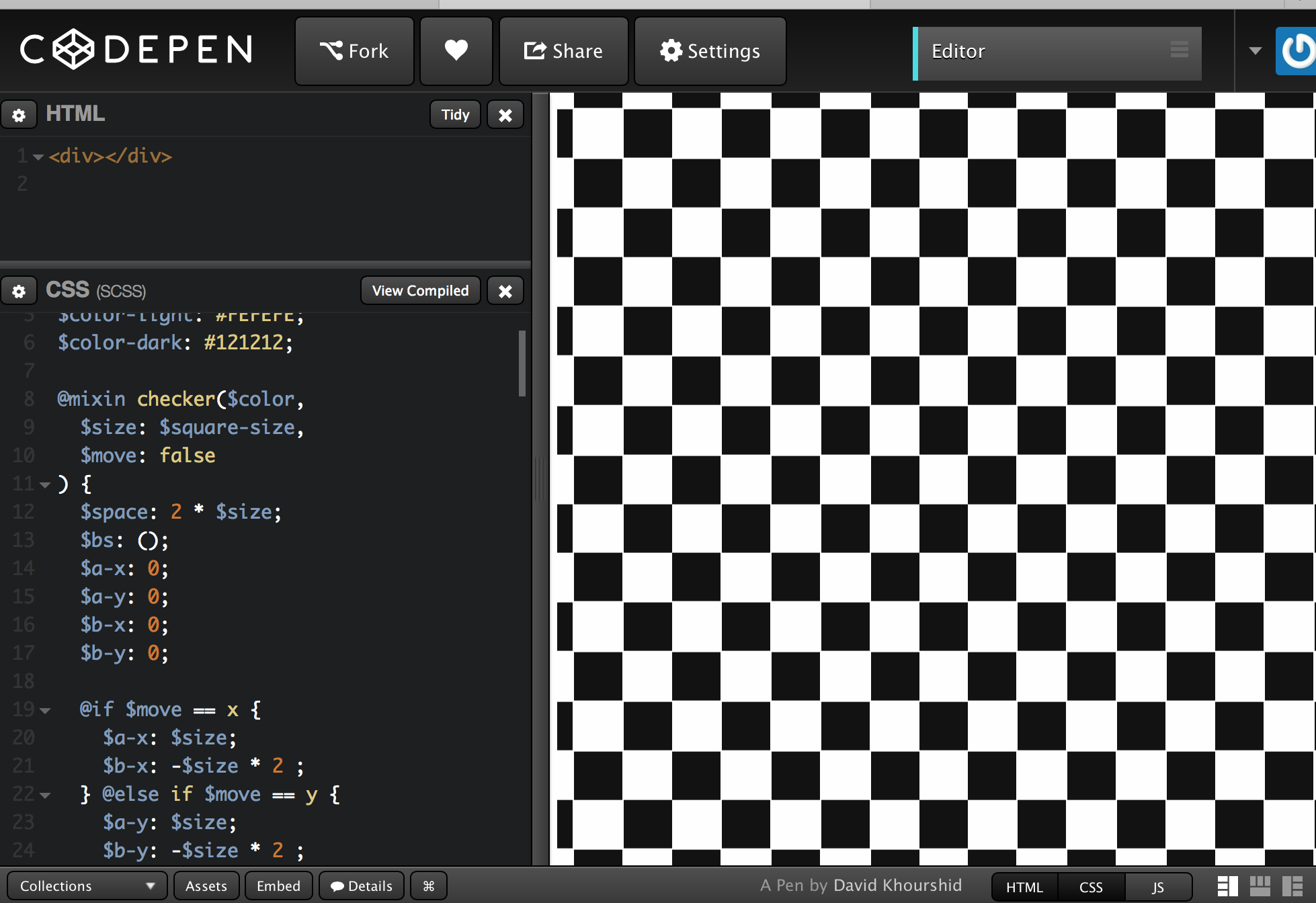
Semitransparent portions of images create (sort of) motion effect. Might be useful at some point.
Low-Contrast Text Is Bad for Usability (But You Already Knew That)
Insufficient contrast between the text color and the background degrades the user experience for the following reasons:
- Legibility suffers. When the contrast is too low, users experience eye strain as they try to decipher the words. Research has also shown that people are less trusting of text that is hard to read — a carryover from the age of ‘fine print.’ (More on trustworthiness in our course on Persuasive Web Design.)
- Discoverability and findability are reduced. Users who cannot perceive an element on the page cannot use it. When placed in an unconventional part of the page, a low-contrast element will not stand out when a user scans the page; for example, a gray-on-gray search icon or login link in the upper left instead of the upper right. Keep in mind that testing for discoverability and findability requires more than analytics, because click-through data may tell you what gets few clicks, but it will not reveal why.
- User confidence diminishes. Which would you rather use: a website that makes you feel like everything is working as you expected, or a website that makes you feel like something is wrong with you for not being able to find what you are looking for? In testing, I have observed many users blame themselves when they are unable to accomplish tasks on a modern-looking website, because they cannot see the text or they struggle to read it. When people don’t feel confident on a site, they are more likely to abandon it and go elsewhere.
- Mobile use becomes even more difficult. Imagine trying to read low-contrast text on a mobile device while walking in bright sun. Even high-contrast text is hard to read when there is glare, but low-contrast text is nearly impossible.
- Accessibility is severely reduced for users with low vision or cognitive impairments. As we get older our vision degrades. Millions of people around the world have some type of vision impairment, including presbyopia (difficulty focusing on close objects), macular degeneration, glaucoma, and cataracts. But not only low-vision users are affected: cognitive conditions that impact short-term memory and ability to maintain attentional focus make using hard-to-see text extremely difficult.
- Cognitive strain increases. When users perceive false affordances, or miscues, they take longer to determine the correct interpretation. For example, by convention, disabled features are dimmed or greyed out. Low contrast treatments risk sending users the wrong signal about the availability of an option.
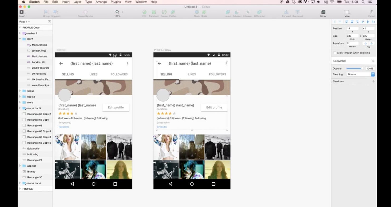
How to use real data with Sketch. Needs plugins.
Using Precious Design Studio and Lukas Ondrej’s Sketch Data Populator plugin we were able to quickly prototype a template for the profile view and use a JSON file to add real data to the design.
To keep your SVGs as small as possible you want to remove anything unnecessary. The most well known and best (at least I think so) tool to post process SVGs is SVGO. This strips out all the code that isnt’t needed — but remember to be careful when using this if you plan to manipulate with CSS / JS as it will also strip out any layer names etc you have added. The best thing with SVGO is it can be added to your build process so it is automatic (or you can use a GUI to do it yourself).