Lean UX: Getting Out Of The Deliverables Business

As organizations struggle to stay nimble in the face of an ever-changing marketplace that is disrupted constantly by incumbents as well as start-ups, getting to market fast becomes top priority. Engaging in long drawn-out design cycles risks paralysis by internal indecision as well as missed windows of market opportunity. In other words, by the time the company decides internally how the product should be designed, the needs of the marketplace have changed.

source

Redesigning Overcast’s Apple Watch app

I originally designed the Apple Watch app for my podcast player, Overcast, with a scaled-down version of the iPhone app’s structure.

This seemed like a sensible adaptation of my iOS app to the Apple Watch. In practice, it sucked.

…Trying to match the structure of the iOS app was a mistake. For most types of apps, the Apple Watch today is best thought of not as a platform to port your app to, but a simple remote control or viewport into your iPhone app.

My initial app was easier to conceptualize and learn, and it closely matched the iOS app. But it just wasn’t very good in practice, and wasn’t usually better than taking out my phone.

The new app is a bit weird and polarizing, and has a learning curve, but it’s great in practice if it fits your preferences. (Just like the Apple Watch.)

…It’s unwise and futile to try to shove iPhone interfaces and paradigms into the Apple Watch. Instead, design for what the Watch really is.

overcast-apple-watch-app


source

An Introduction To Graphical Effects in CSS

There are 16 blend modes available in CSS: normal (which is the default blend mode and means that no blending is applied), multiply, screen, overlay, darken, lighten, color-dodge, color-burn, hard-light, soft-light, difference, exclusion, hue, saturation, color and luminosity. (For the sake of brevity, I will refrain from going into technical detail about each of these modes, and will recommend this article instead to learn all about them.)

These blend modes will modify the colours of a background image resulting in a different effect for each mode.

source

Frictionless Design Choices

Low-Friction Design Patterns

Assuming you’re adding features to a product, the following are six design patterns to follow, each essentially reducing friction in your product. They cause the need to learn, consider, futz, or otherwise not race through the product to get something done.

  • Decide on a default rather than options
  • Create one path to a feature or task
  • Offer personalization rather than customization
  • Stick with changes you make
  • Build features, not futzers
  • Guess correctly all the time

source

Why the Lean Start-Up Changes Everything

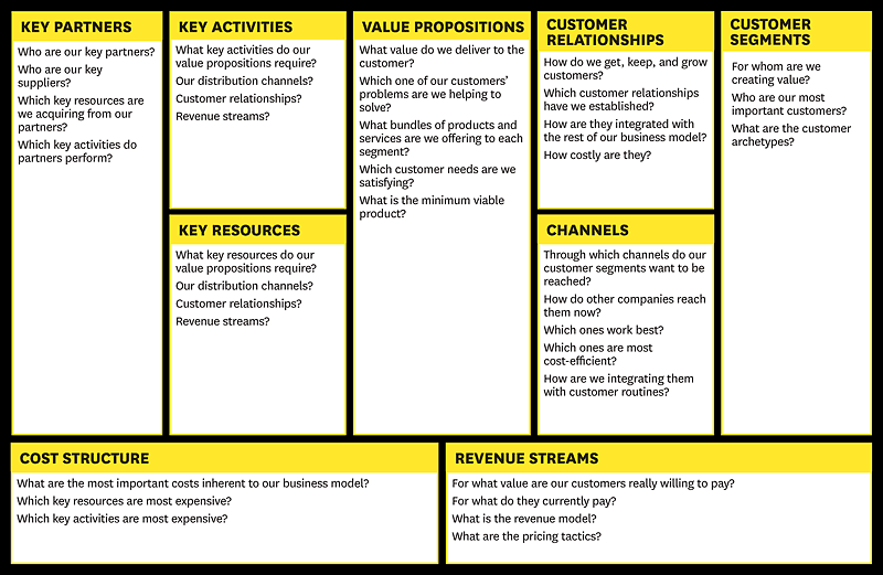
First, rather than engaging in months of planning and research, entrepreneurs accept that all they have on day one is a series of untested hypotheses—basically, good guesses. So instead of writing an intricate business plan, founders summarize their hypotheses in a framework called a business model canvas. Essentially, this is a diagram of how a company creates value for itself and its customers. (See the exhibit “Sketch Out Your Hypotheses.”)

Second, lean start-ups use a “get out of the building” approach called customer development to test their hypotheses. They go out and ask potential users, purchasers, and partners for feedback on all elements of the business model, including product features, pricing, distribution channels, and affordable customer acquisition strategies. The emphasis is on nimbleness and speed: New ventures rapidly assemble minimum viable products and immediately elicit customer feedback. Then, using customers’ input to revise their assumptions, they start the cycle over again, testing redesigned offerings and making further small adjustments (iterations) or more substantive ones (pivots) to ideas that aren’t working. (See the exhibit “Listen to Customers.”)

Third, lean start-ups practice something called agile development, which originated in the software industry. Agile development works hand-in-hand with customer development. Unlike typical yearlong product development cycles that presuppose knowledge of customers’ problems and product needs, agile development eliminates wasted time and resources by developing the product iteratively and incrementally. It’s the process by which start-ups create the minimum viable products they test. (See the exhibit “Quick, Responsive Development.”)

lean-startup-business-model-components


source

Here’s Why You’ll Hate the Apple Watch (and the Important Business Lesson You Need to Know)

Here’s the Gist:

  • Dr. Noriaki Kano developed a revealing model for understanding how various product features affect customer happiness.
  • A “delightful” feature is an attribute of the product customers love but do not expect — for example, new apps in the app store.
  • A “linear” feature is one the user expects and more of that quality increases satisfaction — think more battery life.
  • A “hygienic” feature is a must-have. Customers not only expect these attributes, they depend on them — for example, reliably telling the time on a watch.
  • To save battery life, Apple designed the Apple Watch to only display the time when it thinks you’re looking at it. This violates a hygienic feature and will annoy users.
  • However, like the first versions of the iPhone, users will forgive the watch’s flaws if the delightful features (namely the apps in the App store) knock their socks off.
  • Products can win markets by ensuring their “delighter” features compensate for flaws.

kano-model


source

User Testing How-To Links

Links for guides on usability testing – for HCD documentation

DESIGNING IN THE BROWSER, PRO TIPS TO MAKE IT WORK FOR YOU

Essentially the design and development phases are merging and if you’re naturally good at design and front-end development you will take to designing in the browser like a duck takes to water.

One major benefit of designing in the browser is that we can design based on realistic expectations. Sometimes designing in software can create unforeseen problems for front-end development. UI elements could be designed wonky or maybe they just don’t make any sense, it’s hard to explain to a client why you changed something, not because they won’t understand but because you’ve already pitched it in the design and had it approved. Designing in the browser lends itself to the idea of simplicity.

source