Vector icons and fonts, line and block. Sets from $10 to $199.

SurveyMonkey blog post on survey timing, question order, goals and priming (“occurs when a person is exposed to a stimulus, and it influences how they respond to another stimulus. For example, if you were to see the word “yellow,” you’d be slightly faster than other people (who hadn’t seen that word) to recognize the word “banana.” That’s because people closely associate words like “yellow” and “banana” in their memory.)”
It’s possible you’ve heard this one before: Go hungry to a grocery store and you’re likely to come out with a shopping cart full of everything in the store except the refrigeration cases. Go on a full stomach, and you’re more apt to stick to your grocery list.
Why are we talking about shopping? Well, just as a person’s physical state can influence how they shop, a person’s mental state can influence the way they respond to your survey. Their answers—and your results—might differ dramatically based on priming (psychological effects of question order) and timing (when you send your survey).
RWD: Responsive Web Design
In the past year I’ve spent a lot of time researching page loading performance, both for our ongoing client work here at FG and for my soon-to-be-released book for A Book Apart. In the process, I’ve reaffirmed my belief that we don’t need to compromise the well-known benefits of a responsive layout in order to make our sites load as fast as heck.
In this post, I’ll outline some recent observations and approaches to delivering sites for speed and broader access, and link out to various tools we are using to facilitate our approach. All of the tips mentioned in this post are implemented on this very site, and we’ve tested them heavily to ensure that they’re working as well as they can.
Also see Part I. Tools and techniques to optimize and improve speed of responsive web sites.
Building off of my previous post on RWD Bloat, the following is step-by-step how I made my site faster over the course of a few days. For the purposes of this test, I’m hyper-focused on my Speed Index numbers for my Home and Article templates (the 2 most visited templates of my site).
I’ve nearly doubled the speed of my site. Not too shabby for a responsive design with jQuery, two webfonts, third-party ad, third-party comments, all while being tested on a 3G Connection. My Speed Index on Cable is currently 400~414 for both templates.
Hopefully that helps underline the point, as Scott Jehl so eloquently puts it , “How we load assets matters just as much as how many assets we’re loading.”
SVG elements can be transformed by scaling, translating, skewing, and rotating—much like HTML elements can be transformed using CSS Transforms. However, there are certain inevitable differences when it comes to the coordinate systems used and affected by these transformations. In this article we’ll go over the SVG transform attribute and CSS property, covering how to use it, and things you should know about SVG coordinate system transformations.
SVG elements aren’t governed by a CSS box model like HTML elements are. This makes positioning and transforming these elements trickier and may seem—at first glance—less intuitive. However, once you understand how SVG coordinate systems and transformations work, manipulating SVGs becomes a lot easier and makes a lot more sense. In this article we’re going to go over three of the most important SVG attributes that control SVG coordinate systems: viewport, viewBox, and preserveAspectRatio.
- Learn the “Insert”-Shortcuts
- Always have the right zoom
- Scrolling
- Hide/Show sidebars
- Presentation mode
- Ruler
- Moving objects
- See margins while moving
- Resizing objects
- Naming and grouping objects
- Bonus: Resources
On sketchappsources.com you can find a great collection of free design resources for Sketch 3 – I can recommend you to use them in your projects.
[In June 2014,] Apple released a preview of their new operating system, OS X Yosemite. Following the visual refresh in iOS 7, Yosemite features a significant visual change. Apple has added the familiar blur and translucent materials, a cleaner looking user interface, a new system font and updated icons.
I want to focus on my favorite visual update in Yosemite — the dock icons. Before Yosemite, Apple maintained a system for icon design through a checklist of mostly unstated and understood guidelines paired with a few specific recommendations in the Human Interface Guidelines (HIG). With Yosemite, that system becomes more consistent, and regular, yet the HIG remains silent on the specifics.The first thing people usually want to discuss with an update like this is the look and feel. However, there are plenty of comparisons between the Mavericks and Yosemite icons. They’re cleaner, they’ve removed the gloss, made things happier and brighter looking, and retained some skeuomorphic elements.

Friends don’t let friends load 300kb PNG images on their websites no matter how cool the transparent photo of a happy customer waving over a gradient background looks. That said, when raster graphics are required, one should always optimize them. My favorite tools for this are ImageOptim and ImageAlpha. The more I use them, the more they inform how I design.
CONCLUSION
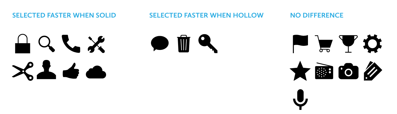
Johnson’s warning against using hollow icons in user interfaces just isn’t supported by evidence from real users. For one thing, an icon’s style doesn’t exist in isolation, but interacts with other attributes like color to create compounding effects on usability. Furthermore, less than half of the icons in my set of 20 performed better in a solid style than a hollow style. A different set of icons would likely result in a different overall result.
In any case, the small differences in recognition speed that I observed are not likely to cause any lasting fatigue for users. Research has shown that users begin to map the meaning of icons to their positions in the interface, so it’s not like users have to reinterpret each icon during every use. It is also important to consider that a two-style approach may have an accessibility benefit over using color alone to show an icon’s state, since it gives people with color blindness additional visual feedback. Of course, the first image in this article shows that Apple uses a combination of style, color, and labeling to reinforce usability.
My ultimate conclusion is one that most designers probably felt intuitively upon encountering the solid/hollow debate: designing icons to be both semantically clear and visually attractive is a complex exercise that doesn’t lend itself to simple binary rules. In fact, a closer look at Apple’s Human Interface Guidelines, which lay out its recommendations for solid/hollow icon design, acknowledge that some icons simply won’t work well in both styles.
Finally, I hope that this study highlights the importance of using real evidence to back up UI design decisions. Designers of all types need to think critically about best practices and back up their recommendations with solid (pun not intended, but embraced) research.