Are Hollow Icons Really Harder to Recognize Than Solid Icons? A Research Study

CONCLUSION

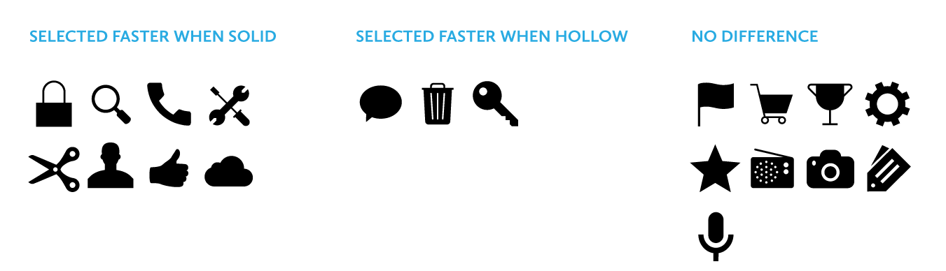
Johnson’s warning against using hollow icons in user interfaces just isn’t supported by evidence from real users. For one thing, an icon’s style doesn’t exist in isolation, but interacts with other attributes like color to create compounding effects on usability. Furthermore, less than half of the icons in my set of 20 performed better in a solid style than a hollow style. A different set of icons would likely result in a different overall result.

In any case, the small differences in recognition speed that I observed are not likely to cause any lasting fatigue for users. Research has shown that users begin to map the meaning of icons to their positions in the interface, so it’s not like users have to reinterpret each icon during every use. It is also important to consider that a two-style approach may have an accessibility benefit over using color alone to show an icon’s state, since it gives people with color blindness additional visual feedback. Of course, the first image in this article shows that Apple uses a combination of style, color, and labeling to reinforce usability.

My ultimate conclusion is one that most designers probably felt intuitively upon encountering the solid/hollow debate: designing icons to be both semantically clear and visually attractive is a complex exercise that doesn’t lend itself to simple binary rules. In fact, a closer look at Apple’s Human Interface Guidelines, which lay out its recommendations for solid/hollow icon design, acknowledge that some icons simply won’t work well in both styles.

Finally, I hope that this study highlights the importance of using real evidence to back up UI design decisions. Designers of all types need to think critically about best practices and back up their recommendations with solid (pun not intended, but embraced) research.

selection-differences


source

Improving the hamburger button

hamburger-nycgovThe hamburger button is the three-line “collapsed nav” indicator on a mobile app or mobile display of a website.

It’s pretty safe to assume that this guy will stick around on our screens for some more time. So instead of sounding like a jerk talking about the pros and cons of the mobile icon, I’d rather discuss potential improvements in the context of website navigation.

When we created the new Holtzbrinck.com, one of the world’s leading media companies, we had to reduce all the existing information to one single page. Readability was key, but we also realized that the page became far to long to browse on a small screen. We needed to provide users a means to navigate at all times. A Tab-bar like menu would have been far too intrusive, even if we had applied the “scroll up and show” pattern. Instead of using the classic sticky navigation bar on top, we decided to implement a different behavior.

source

Exporting SVG for the web with Adobe Illustrator CC

As an artist and a web designer, I am excited about the possibilities that Adobe Illustrator CC offers in its support of Scalable Vector Graphics (SVG) and the flexibility it gives me when creating high-quality graphics. Since SVG is vector-based, I have a lot more freedom to create images that will automatically scale on all modern devices.

source

Flinto – iPhone, iPad and Android Prototyping

Like Marvelapp but more features and more expensive.

The App Design Process is Broken
It’s easy to catch issues in your design when you are testing an interactive prototype. Problem is, that usually doesn’t happen until development starts. At that point, it’s too late to fix things.

Fix it With Flinto
You’ll be testing interactive prototypes from the start. Flinto makes it quick and easy to create prototypes that look just like the real thing. And Flinto doesn’t disrupt your current workflow because it uses the screens you’ve already designed.

source

Famou.us – Javascript Library for iOS Animations

Famo.us is a free, open source JavaScript framework for creating smooth, complex UIs for any screen.

Famo.us is the only JavaScript framework that includes an open source 3D layout engine fully integrated with a 3D physics animation engine that can render to DOM, Canvas, or WebGL.

Choosing a development platform is more than just a technical decision—it’s a career decision. Whether you’re a seasoned developer expanding your skills, a designer looking to bring your ideas to life, or just learning to code, we’re building Famo.us for you.

Getting started is easy. Famo.us University will teach you to code in Famo.us with lessons, live code examples, and real app projects. And the Famo.us community is always here when you need help.

source

Ideo – Introducing Avocado: A new toolbox for interaction designers

Interaction design for non-coders. Mobile-only?

Bounce, swivel, spin. Today’s interface design is all about making things move. But the tools we use to create those interactions haven’t kept pace with our smart, intuitive enough for a 3-year-old child devices.

As an interaction designer with a software engineering background, I usually bring ideas to life through coding.

For those who don’t code, there are tools that offer a less technical approach, such as Quartz Composer (a nearly decade old visual programming language) and Origami (a new tool built by Facebook that streamlines Quartz Composer).

The effort to make interaction design accessible to a broader set of people is a worthy cause, and crucial to the fast-paced live prototyping process at IDEO. That set me on a path to explore a new set of prototyping tools—ones that work for designers who don’t code.

Taken together, Quartz Composer and Origami offer a set of basic interface building blocks called patches. It’s an inspired start, and I saw ways to build upon those tools and conceal some of their complexity. http://facebook.github.io/origami/

source

SVG ‘text’ and Small, Scalable, Accessible Typographic Designs

SVG element – typography, accessibility

Let’s say you designed something with custom fonts that was a little bit fancy. Perhaps a certain word is positioned between the ascenders of another word below it. Some text is kerned out below to match the width of that same word.

This is something we might tell a graphic designer switching from print to web to avoid. It’s too finicky. Too much touchy, unscalable absolute positioning. Too much risk from different font rendering behavior.

But with inline SVG, we can do it, and do it well.

SVG <text>

The big “trick” here is that SVG has a <text>  element that is just that: text. Not outlines of text, just regular ol’ selectable, accessible web text.

source

Inside the Guardian’s CMS: meet Scribe, an extensible rich text editor

The team behind the Guardian’s digital content management system talk about how and why they built and open sourced Scribe.

As part of the Guardian’s new digital content management system, Composer, we needed a rich text editor to enable our journalists to write rich content. More than that, we needed a rich text editor we could extend, to provide our journalists with an elegant interface for producing and formatting rich content. Unhappy with existing solutions, we built and open sourced Scribe, our own rich text editor. But how and why did we build it?

source