The new srcset and sizes explained

Uses picture/srcset/sizes polyfill picturefill 2.

There are now two responsive images solutions which can be combined or used on their own. This article focuses on the simpler one, which will do for almost all responsive content images, which aren’t art directed and should just stretch and squish with max-width: 100%;.

Until now we used media queries to determine which size the viewport is and which pixel density the screen has and load a specific source according to that. With srcset we don’t need that anymore.

We don’t tell the browser which source it should display at which screen size and pixel density, because that is inflexible and lead to dozens of lines of code and definitions just for one single image. Even worse, it’s not really future proof and we only support pixel densities that we defined. What if a 4x screens comes along tomorrow? Did you write media queries to support that? I haven’t. But with srcset we are covered.

What we do with srcset and sizes is, we tell the browser which sources, aka files, it has at its disposal and which width they have. Then we also tell the browser how wide the image should be displayed at any given viewport width. The browser now knows everything it needs to know to decide which image is appropriate to use. I like to imagine the img tag as a container. We as developers only define how big the container should be at any given point and the browser decides which source to load to get the best output for the user.


<article>
    <img srcset="large.jpg 1400w, medium.jpg 700w, small.jpg 400w"
         sizes="(min-width: 700px) 700px, 100vw"
         alt="A woman reading">
</article>>

* {
    margin: 0;
    padding: 0;
}

article {
    margin: 0 auto;
    max-width: 700px;
}

img {
    max-width: 100%;
}
source

Understanding Vector Shapes in Illustrator

illustrator-bezier-shapes


Today’s Syllabus

Understanding Vector Shapes
Selection and Direct Selection Tools
Drawing Rectangles and Circles
Basic Bézier Curve Modification
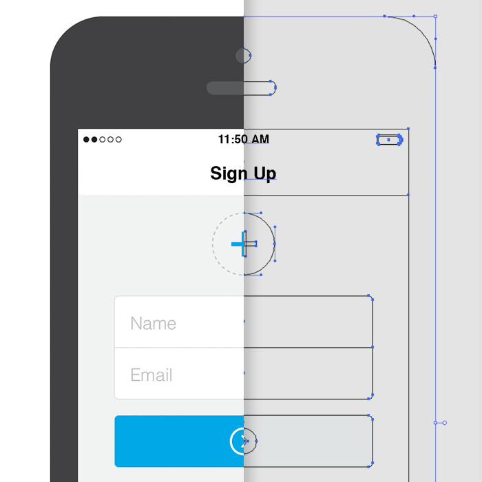
Real World Use Case – iPhone Sign Up Screen

Understanding Vector Shapes

Before we jump in too deep, you need to have a basic understanding of vector shapes, points, paths, and the tools used to manipulate them.

First, we’re going to draw a square in Illustrator. To do this, hit the M key on your keyboard. This is the quick key for selecting the rectangle tool. If you’re going to use Illustrator and want to get fast and furious with it, you must learn this quick key along with all of the others I subsequently mention. Don’t you dare go clicking on that tool panel without trying to remember the quick key first.

source

So What’s the Big Deal with Horizontal & Vertical Bezier Handles Anyway?

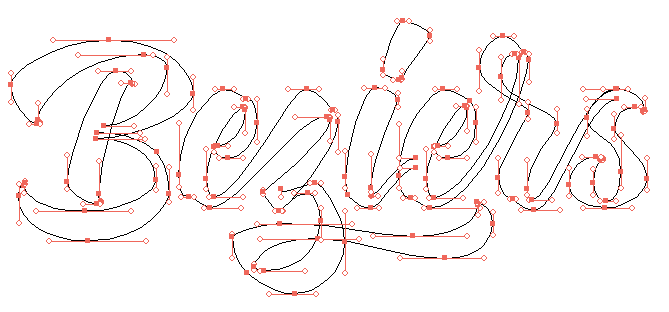
Have you ever seen Illustrator progress shots from your favourite designers and wondered how and why their bezier handles are so obsessively arranged? We’re hoping to shed a little light on this seemingly unnecessary process. Note: this tutorial assumes a solid grasp of Illustrator & the pen tool.

beziers-filledin

beziers-controlpoints


source

The Future of Javascript Animation with Famo.us

After much anticipation, hype and controversy, Famo.us is finally being released today for limited public consumption. When I first saw the Famo.us webpage in late 2012, I was intrigued by what I thought was impossible to do on the web. Suspending disbelief for a moment, I began to wonder what code would look like if the animation magic I was seeing were suddenly possible to write in JavaScript.

Ultimately, developing in Famo.us is straightforward; however the concepts do differ from standard web development. In this primer I’m going to go over why Famo.us is different, the basics of writing Famo.us apps, and a list of resources to help you become a guru.

These days, web browsers apply hardware acceleration to certain CSS properties. When rendering a typical webpage, you can gain the benefits of this acceleration if you trigger CSS based animations. The browser still has to work hard to recompute the layout of your page from a change to the DOM. In practice this means that if your app is making changes to the DOM that require the browser to re-layout your page, you’ll lose hardware acceleration and generally see inconsistent and slow performance.

Famo.us is built around a neat idea: by directly using the CSS matrix3d transform in combination with the window.requestAnimationFrame function, you can describe the complete layout and animation of your app in a way that’s hardware accelerated with consistent performance.

Surfaces

The basic building blocks of a Famo.us application are Surfaces. Surfaces are simply divs that contain HTML. They make up your app at the most granular level and often do not contain sophisticated layout or content that you want to animate within the surface. A typical app is built out of many surfaces containing mostly text or images and targeted with basic visual CSS.

The Scene Graph contains your app’s surfaces along with Transforms. Transforms are used to position surfaces and thereby layout the UI of your app. They are also used to describe animation.

source

The Z-Axis: Designing for the Future

Building interfaces as a system of layers.

For years we’ve thought about the web as a two-dimensional space filled with pages that sit side by side on a flat, infinite plane. But as the devices we design for take on an increasingly diverse array of shapes and sizes, we should embrace new ways of designing up and down. By building interfaces using a system of layers, we solve tricky design problems, flexibly adapt to a variety of screens, and create new patterns that will point the way to future interactions.

In geometric terms, the z-axis is the vertex that measures space above and below the x- and y-axes. Translation for those of us who napped through geometry: it’s how we describe panels and layers that sit above or below one another.

Designing on the z-axis simply means incorporating three-dimensional physics—as represented by the z-axis—into our interface designs. Not the faux-depth of skeuomorphic text shadows and button highlights, but an interface made of components that exist on distinct layers and move independently of one another.

z-axix-layers


source

7 Top Typography Tools and Resources

Mashable collection of 25 useful resources for typography “from fundamentals to modular scales.”

Typography is the foundation of design on the web. Back in 2006, designer and founder of iA Oliver Reichenstein even went so far as to proclaim “web design is 95% typography.”

It’s imperative, then, to have a thorough, grounded education in optimizing and utilizing typography to create a balanced, harmonious, accessible hierarchy of content, when working on the web.

source

CSS Box Shadow

Used in casting shadows off block-level elements (like divs). From CSS Tricks.

Outer Shadow

.shadow {
  box-shadow: 3px 3px 5px 6px #ccc;
}
  1. The horizontal offset of the shadow, positive means the shadow will be on the right of the box, a negative offset will put the shadow on the left of the box.
  2. The vertical offset of the shadow, a negative one means the box-shadow will be above the box, a positive one means the shadow will be below the box.
  3. The blur radius (optional), if set to 0 the shadow will be sharp, the higher the number, the more blurred it will be.
  4. The spread radius (optional), positive values increase the size of the shadow, negative values decrease the size. Default is 0 (the shadow is same size as blur).
  5. Color

Inner Shadow

.shadow {
  box-shadow: inset 0 0 10px #000000;
}

One-Side Only

Using a negative spread radius, you can get squeeze in a box shadow and only push it off one edge of a box.

.one-edge-shadow {
  box-shadow: 0 8px 6px -6px black;
}

source